MIDGAARD: Difference between revisions
No edit summary |
No edit summary |
||
| Line 67: | Line 67: | ||
== Disadvantages of Midgaard == | == Disadvantages of Midgaard == | ||
* visualization of treatment | * visualization of treatment plan characteristics (e.g. hierarchical structure, execution sequence, execution states, temporal uncertainties of execution) requires some learning effort | ||
== Suitable Datatypes == | == Suitable Datatypes == | ||
Latest revision as of 06:20, 29 May 2009
Title
MIDGAARD - Connecting Time-Oriented Data and Information to a Coherent Interactive Visualization
Participants
Ragnar Bade2, Silvia Miksch1, Stefan Schlechtweg2
Institutions
- Information Engineering Group (ieg), Institute of Software Technology and Interactive System, Vienna University of Technology, Vienna, Austria, Europe
- Otto-von-Guericke University of Magdeburg, Department of Simulation and Graphics, Magdeburg, Germany
Description
In modern intensive care units (ICUs), the medical staff has to monitor a huge amount of high-dimensional and time-oriented data, which needs to be visualized user- and task-specifically to ease diagnosis and treatment planning. Available visual representations, like diagrams or charts neglect the implicit information as well as a-priory or associated knowledge about the data and its meaning (e.g., 38.5°C (101.3°F) is moderate fever and 41°C (105.8°F) is critical fever). Another challenge is to provide appropriate interaction techniques to explore and navigate the data and its temporal dimensions. In this context one major challenge is to connect time-oriented data and information to a coherent interactive visualization.
The goal of the Midgaard project [Bade et al., 2004] is to
- Present different interactive visualization techniques which enable the users to reveal the data at several levels of detail and abstraction, ranging from a broad overview to the fine structure.
- Introduce a time visualization and navigation technique that connects overview+detail, pan+zoom, and focus+context features to one powerful time-browser.
Challenges are the visualization of huge amounts of clinical parameters with respect to the temporal dimension (including occurrence time and valid time), measurement deviations, and trustability.
To overcome the problem of restricted display space Bade et al. use sophisticated visualization techniques.
Qualitative data is visualized by color-coded timelines similar to the LifeLines approach [Plaisant et al., 1996].

Figure 1: Color-coded timelines to visualize qualitative data.
To visualize a quantitative data stream they combine quantitative representations of data with qualitative representations which is called hybrid technique. For instance a fever curve is enhanced with color-coded qualitative regions which add additional knowledge to the presentation, i.e. if a particular value is critical or not (see Figure 2).

Figure 2: Qualitative - Quantitative Hybrid: the fever curve is enhanced with color-coded qualitative regions.
When displaying high-frequency data the problem of limited space is even more critical. A huge amount of data values would have to be depicted at one small display region (e.g. a pixel or a row of pixels). Thus, they use a redesign of John Tukey's box-plot - inspired by [Tufte, 1983]. The space between the minimum and the maximum is represented by a light color and the space between the 25% and 75% percentile is colored slightly darker; the median is marked as a black line. By these means, a lot of small box-plot-bars can be connected to a full data stream representation on very limited display space (see Figure 3).

Figure 3: A redesign of John Tukey's box-plot - inspired by [Tufte, 1983]: allows for visualizing a full data stream of high-frequency data on limited display space.
The valid time of a data point is represented by a horizontal line indicating the data value over a specified period of time. If the granularity of the specified point in time differs from the granularity of the actual timeline scale of the representation (e.g. a more coarse or a more precise occurrence time) the point in time is represented by a small mark or by an extended mark capturing the uncertainties.

Figure 4: The valid time of a value is represented by a gray horizontal line. The granularity of a data point (left: a more coarse occurrence time than the actual timeline scale, right: a more precise occurrence time) is represented by a small mark or by an extended mark capturing the uncertainties.
Measurement deviations (e.g. ± 1%) are represented by marking the corresponding range of values as illustrated in Figure 5.

Figure 5: Visualization of measurement deviations (e.g. ± 1%): the corresponding range of values is marked.
The trustability of a data value is indicated by the fill level of a vertical bar plotted right above the data value.

Figure 6: The trustability of a data point is represented by a green filled bar.
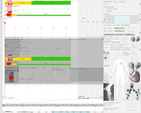
Midgaard can also be used to visualize the patient data in combination with treatment plans (treatment plans are indicated by gray areas in the background of the patient data) and it provides different views for physicians, nursing staff, and patients (see top right panel in Figure 7).

Figure 7: Screenshot of the Midgaard prototype.
Advantages of Midgaard
- space-saving approach to visualize huge amounts of data – even high-frequency data
- visualization of patient data in combination with applied treatment plans
- visualization of values, occurrence time, valid time, measurement deviations, and trustability of parameters in one visualization
- aimed at visualizing intensive care data, but visualization techniques were also applied to the field of stock-exchange
Disadvantages of Midgaard
- visualization of treatment plan characteristics (e.g. hierarchical structure, execution sequence, execution states, temporal uncertainties of execution) requires some learning effort
Suitable Datatypes
- time-oriented data
- qualitative data
- quantitative data
- high-frequency data
Interaction
- filtering
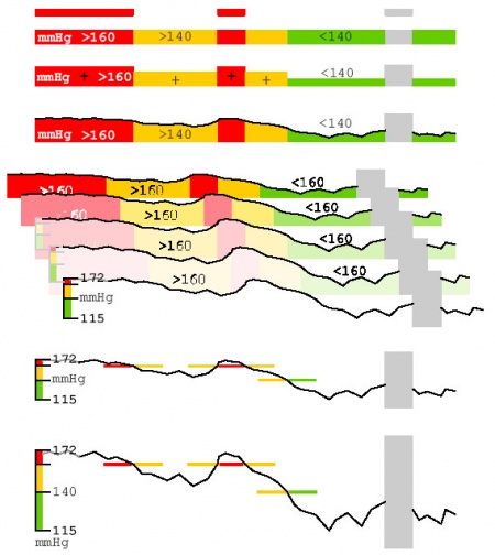
- semantic zoom: browsing through different visualization techniques and abstraction levels of the data from a broad overview to a fine structure (see Figure 8)
- pan+zoom (in time)
- focus+context
- details on demand

Figure 8: Semantic Zoom: Different representations of on data stream provide a broad overview as well as the fine structure of the data and several representations in-between (gray areas indicate missing values).
Evaluation
no evaluation found
Related Work
- The Asgaard Project [Shahar et al., 1998] (project page)
- LifeLines [Plaisant et al., 1996] (project page)
- CareVis [Aigner and Miksch, 2006] (project page)
- Graphical Summary of Patient Status [Powsner and Tufte, 1994]
Project Pages
- Midgaard project page at the Vienna University of Technology, Institute of Software Technology and Interactive System, Vienna, Austria
- Midgaard project page at the Otto-von-Guericke University of Magdeburg, Department of Simulation and Graphics, Magdeburg, Germany
References
- [Aigner and Miksch, 2006] Wolfgang Aigner and Silvia Miksch. CareVis: Integrated visualization of computerized protocols and temporal patient data. Artificial Intelligence in Medicine (AIIM), 37(3):203-218, July 2006. (pdf)
- [Bade, 2002] Ragnar Bade. Methoden zur Visualisierung von und Interaktion in zeitbasierten Patientendaten und Behandlungsplänen. Master's thesis, Department of Simulation and Graphics, University of Magdeburg, 2002. (pdf)
- [Bade et al., 2004] Ragnar Bade, Stefan Schlechtweg, and Silvia Miksch. Connecting Time-oriented Data and Information to a Coherent Interactive Visualization. In Proceedings of the SIGCHI Conference on Human Factors in Computing Systems (CHI 04), pages 105–112, Vienna, Austria, ACM Press, April 2004. (pdf)
- [Plaisant et al., 1996] Catherine Plaisant, Brett Milash, Anne Rose, Seth Widoff, and Ben Shneiderman. LifeLines: Visualizing Personal Histories. In Proceedings of the SIGCHI Conference on Human Factors in Computing Systems (CHI 96), pages 221-227, Vancouver, British Columbia, Canada, ACM Press, April 1996. (html)
- [Powsner and Tufte, 1994] Seth M. Powsner and Edward R. Tufte. Graphical Summary of Patient Status. The Lancet, 344:386-389, August 1994. (html)
- [Shahar et al., 1998] Yuval Shahar, Silvia Miksch, and Peter Johnson. The Asgaard Project: A Task-Specific Framework for the Application and Critiquing of Time-Oriented Clinical Guidelines. Artificial Intelligence in Medicine (AIIM) , 14(1-2):29-51, September 1998. (pdf)
- [Tufte, 1983] Edward R. Tufte. The Visual Display of Quantitative Information . Graphics Press, Cheshire, CT, USA, 1983.