Teaching:TUW - UE InfoVis WS 2009/10 - Gruppe 06 - Aufgabe 2
Jump to navigation
Jump to search
Aufgabenstellung
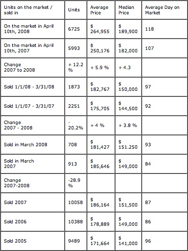
Zu beurteilende Tabelle
Critique about the table
- The grid encloses the entire table. This should be avoided, because it breaks up the data. (Use white spaces or rules under the header and over the footer instead) (Page 136).
- Time based data should be arranged in columns from left to right rather than in rows from top to bottom (Page 142).
- Groups and Breaks: All the content is put in one table. Split the table instead in all the data groups that belong together (Page 143).
- No whitespacing between different groups of the table (Page 144).
- Headers are not repeated over the different group sections (Page 144).
- Text align of numbers should not be aligned to the left side (Page 147).
- Number format is not consistent: Column "Median Price" uses two different formats (Sold in March 2007 vs. Sold in March 2008: Thousand sepatator is once a point and once a comma). Column 1 ("Units") doesn't use any separators at all (Page 149).
- $ sign is not necessary in every cell.
- Columns are to small, so the data is split in two rows.
- difficult formulations: 1/1/08 - 3/31/08 instead of 1st Quartal 2008
- Text align is left and makes it difficult to compare the numbers.
- % values don't have the same number of positions after decimal point.
- The change rows shouldn't be in the same columns because they do not even have the same measurement than the other columns.
- Different meanings in the same column. For example 4 different Meanings of 'Units':
- Units on the market
- Units sold in one period
- Change of Units on the market between to periods
- Change of Units sold between two periods
- 'Average Day on the market' is illogical in context of a defined period
- The order of the values that are compared (2007 and 2008) is confusing because the summary (change) is the wrong way around (6725 compared to 5993 is not an increase of 12%).
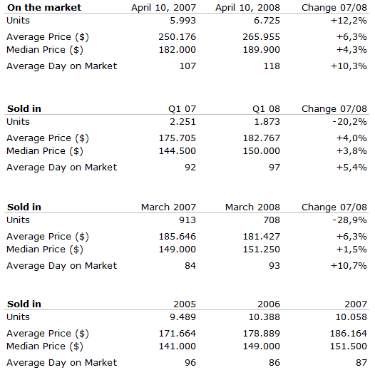
New Table
Explanation of the changes
- Table is split into two different tables because the data doesn't really belong together.
- The grid is removed, just a ruler under the header is kept to make a difference between the data and the header.
- The ruler is in a very light grey (black bold rulers seperates them)
- Simpler formulation (Quartal instead of 1/1 - 3/31), so that the meaning of the column is seen at first sight.
- Columns and Rows are switched because time based data should be put in columns.
- Consistent form of percentage values (1 digit after the comma).
- $ sign is removed and put in the header.
- Text align is right, so numbers can be compared easliy.
- Consistent use of thousands separators (comma).
- Whitespaces are added, so the data is optically split into groups that belong together
Explanation of the changes
- Compared to the first table, the rows and columns are in the same way as in the original table.
- Data is split in two groups because it does not really belong together.
- Whitespaces seperate the summary rows from data rows.
- Whitespaces are used to separate the different tables too.
Improvement
We made the changes according to the discussion page, except putting 0.0% in empty cells, because we thought it is irritating to write that there is a change of 0% although the values have changed. So we calculated the appropriate value and put it in there.
References
[Few, 2004] Stephen Few. Show Me the Numbers: Designing Tables and Graphs to Enlighten. Analytics Press, 2004, Chapter 8 – Table Design
[Wallace, 2004] Rosa Wallace, NC State University. Designing Tables. http://www.ncsu.edu/labwrite/res/gh/gh-tables.html


