Teaching:TUW - UE InfoVis WS 2009/10 - Gruppe 04 - Aufgabe 2
Jump to navigation
Jump to search
Aufgabenstellung
Zu beurteilende Tabelle
Links
Ausarbeitung
Improved Table
Criticism
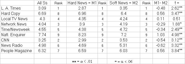
- The column "Rank" is used too often. Multiple "Rank" columns would be necessary if the table spreads over more pages, but this is not the case.
- It is not obvious what "t" and "alpha" means.
- Same with the title "All Ss", as long as there is no column called "S". The reader can just guess what "S" means.
- Rankings should always be sorted, so that the reader needs less time to read the table.
- The allignment of the columns could be better arranged.
- Headers should usualy not be much longer than the longest entry in their column.
- Missing headers are very bad, so hardly none can imagine what the content means. If the first column doesn´t use any header, the font-style should be at least different to the rest, i.e. just big letters.
- By the way you can argue about the title of the first column, but no title of the second one. You can summarize the two columns, if you chose a title that includes the information that the lines are ordered by a rank.
- Abbreviations should not be used. They cant be understood by someone who is not familiar with the table's content.
- The grid is not necessary. A wisely chosen white-space would be enough.
- Numbers should have the same format, so its easier for the reader.
- Calculations within the table should always be displayed next to the column which is used for calculation.
- The use of a separated space for explanations could also be used for definitions, what HN, t,... means.
Explanation of Improvements
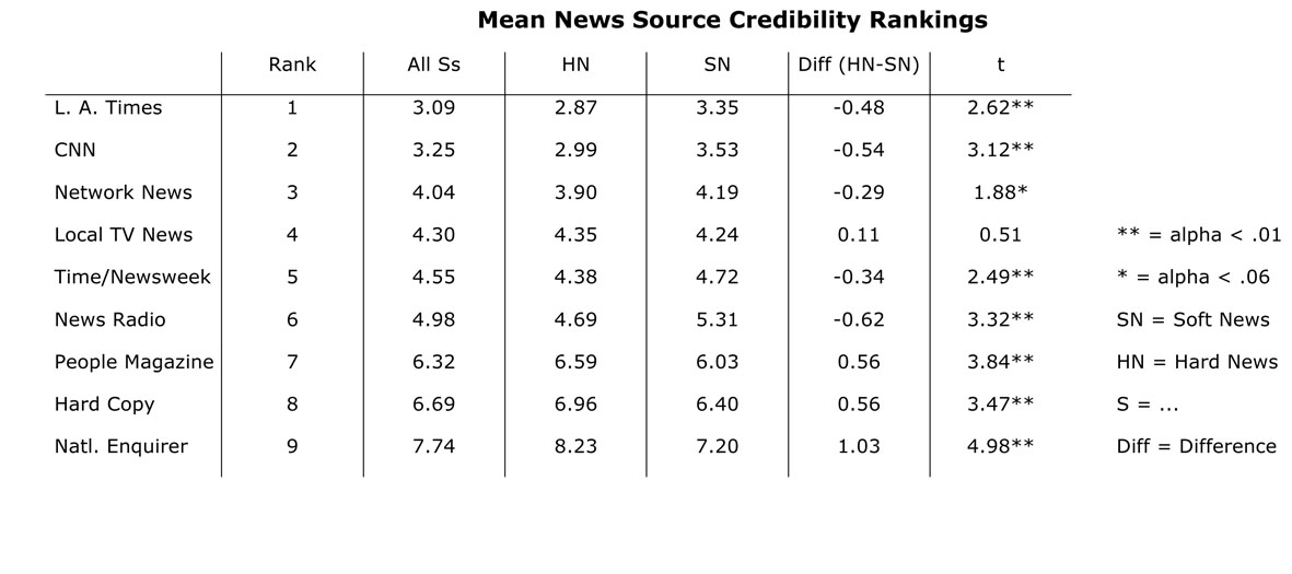
- Our opinion is, that the table displays the Top 9 of something. So we sorted the table accordingly to their ranking.
- We put the Ranking in the first column, because its better for the reader, so he can quickly see how the ranking is and its not that irritating when reading the table.
- We alligned the columns correctly.
- Numbers should be alligned to the right, because thats easier to read
- Ranking should also be alligned to the right, because the only thing that should be center alligned are values which always have the same size (e.g. "Y", "N").
- All numbers have now the same format. (-xx,yy)
- The usage of alpha is not obvious to an average reader.
- It would be readable for a whider spread if you used % instead --> by the way a nicer format
- Instead of footnotes you could define alpha in the seperated space
- The column "t=" is the only number column which is alligned to the left, because the "*" at the end varies and so its easier for the reader.
- The calculation of the difference between Hard and Soft News is now next to the columns Hard News and Soft News. That way it´s easier to see a connection between them.
- Instead of M1 and M2 we useIt is easier to find a connection if you use HN and SN for Hard and Soft Use instead of new letters (M1, M2). The column "M1-M2" should be better named "difference (HN-SN)". This way you also see how it is calculated.
- We removed the grid, because its not needed. Instead of it we made a light grey line underneath the headers.
- For the readability we sepparated the columns and rows through white-spaces.

