Teaching:TUW - UE InfoVis WS 2009/10 - Gruppe 03 - Aufgabe 2
Jump to navigation
Jump to search
Aufgabenstellung
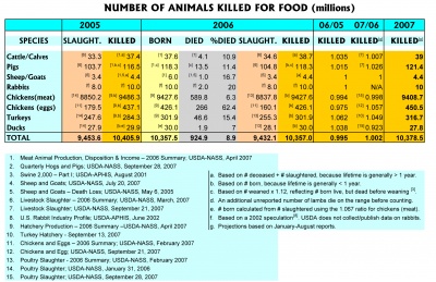
Zu beurteilende Tabelle
critic view on the table
- too much color (distracts reader from content)
- too many grids and lines used
- fonts aren't used consitently
- potential insignificant content included (e.g. "born" has no clear relation to the rest of the data labeled as "number of animals killed")
- the columns used for the different years contain different data, which makes comparison difficult, also from a spacial view
- the columns "06/05" and "06/07" have an unclear header. they could be read as dates (06/05 -> June 2006 / June 5th). also the values of these columns (as factors) aren't very intuitive as e.g. percent values
- the values in the table have different precision, which makes comparison more difficult
- the values that are represented as % don't have their %-sign next to them. they could be misinterpreted if you read a row at once (without looking at the header)
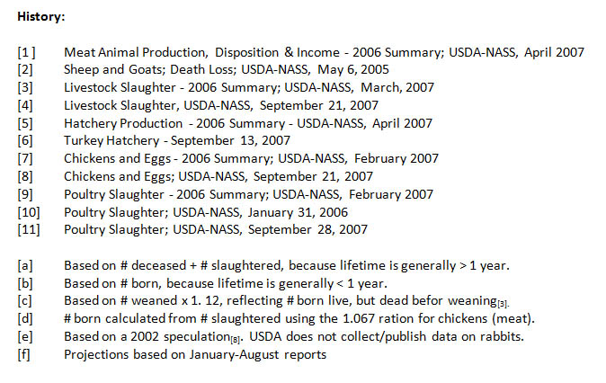
- the "rabbit" row is a bit dodgy, as the references [f] state, that these values are just speculations
Revised tables
improvements
- data from columns "killed" and the data connected to it are put in one table and the rest of the data (columns
"born", "slaught", "died", ...) in a seperate table. this makes comparison between related values easier. - references to used sources are put behind the values, and made smaller, for less distraction
- rows are ordered by occurrence, and hence by relevance for this example
- columns are reordered, so connected data is easier to compare
- blank space is used instead of lines, to group to make the tables more readable
- lines and grids are only used were necessary. they're best to seperate headers and summaries (not only sums) from the data
- the precision of the values (in millions) is unified to one number after the comma (2 numbers after the comma for % values). this makes reading through the columns much easier.
- results of "06/05", "06/07" are shown as % reflecting the change between the years. interpreting those values is easier than thinking in factors.
- also if it's recommended to keep data that uses vales from an other colums should stay beneath each other, we decided to append the two columns "06/05" and "06/07" at the end of the table, because it relates two other columns and would worsen the readability of the table


