Teaching:TUW - UE InfoVis WS 2007/08 - Gruppe 08 - Aufgabe 2
Aufgabenstellung
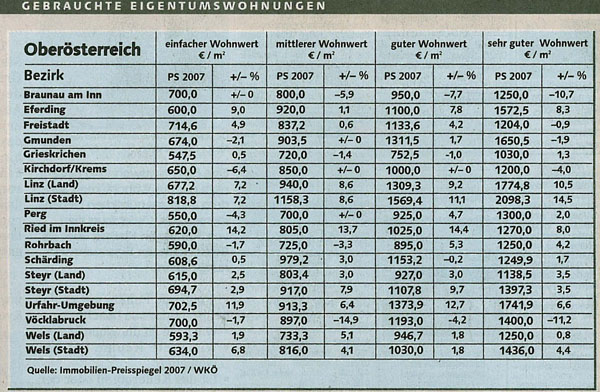
Zu beurteilende Tabelle
Links
Design Problems of the Table
While the original table displays valid data the data isn't presented well and so is hard to read. In particular:
- White space – There is no white space, neither between columns nor between rows.
- Grid – The whole table is paritioned with one grid format therefore tt is not easy to determine what data belongs together.
- Background/fill color – The original table only uses one background color. There is no fill color usage to highlight specific data or to group data. Tracking a row horizontally becomes difficult, one might fall into a different row.
- Percentage values - These should always use the same amount of decimal spaces. The +/- 0 also makes reading the data more difficult.
- Table terminology –
- Header - The header contains redundant information (e.g. „einfacher Wohnwert“, „PS 2007“).
- Some information should be in the table's headline, such as „PS 2007“. The whole table is about PS 2007 and repeatingly stating the same information the table becomes difficult to read.
- Orientation –
- The numbers in the lines „PS 2007“ represent quantitive values and should be placed right.
- Alignment – the 'percent' data should be aligned to the right side
- Percentage signs – These should appear on the right of the percentage value.
- Headers – It is unclear to the reader what the headers actually mean:
- „Wohnwert“ - is this the actual market value or something else?
- +/- % - is this the procentual change compared to the last year?
- „gebrauchte Eigentumswohnungen“ - is this the number of flats needed or the number of flats in use?
- What charactaristics are represented by the values „sehr gut“, „gut“?
New Table
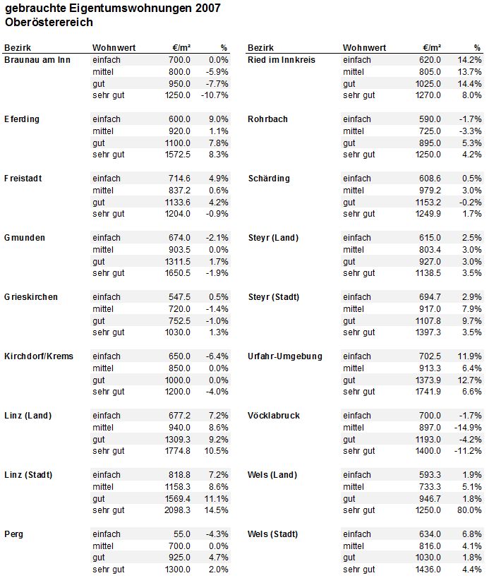
With the problems of the initial table in mind the following table was designed:

Modifications
The following modifications where made:
- The whole table was redesigned. The table needs to be designed to fit its puprose. The following solution allows you to easily compare the seperate regions e.g. with one glance one can see that Braunau am Inn has a lower "einfach" percentage than Eferding.
- Better choice of headers – One major and many minor headers, minimal redundancy.
- Fill color – Every second line is colored, allowing you to follow a row easily.
- White space – Seperates the different regions to improve readability.
- Background color – a neutral color which can fits most color schemes.
- Regions are bold for quick finding.
Improvement
Additionally, the following improvements where made:
- A more sensible header choice.
- Improved readability due to a new formating (no longer row by row but clustered).
- More white space between data that does not belong together.
- Minimal black line usage.
- Less data per row.
- Comparable data can be found opposite/below each other.
Second Solution
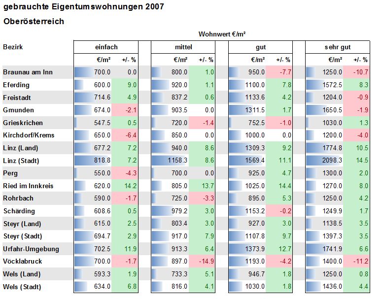
An alternative solution is the table below. This table similar to the initial table but uses white space to seperate data, color to highlight postive and negative percentage changes and "bars" to allow one to easily compare the m3. Using this visualization it is for example easy to see Linz has the largest m3. This table has been included to show how the exact same data can be visualised in different forms to highlight different aspects of the data, even though the underlying data is exactly the same.
Third Solution
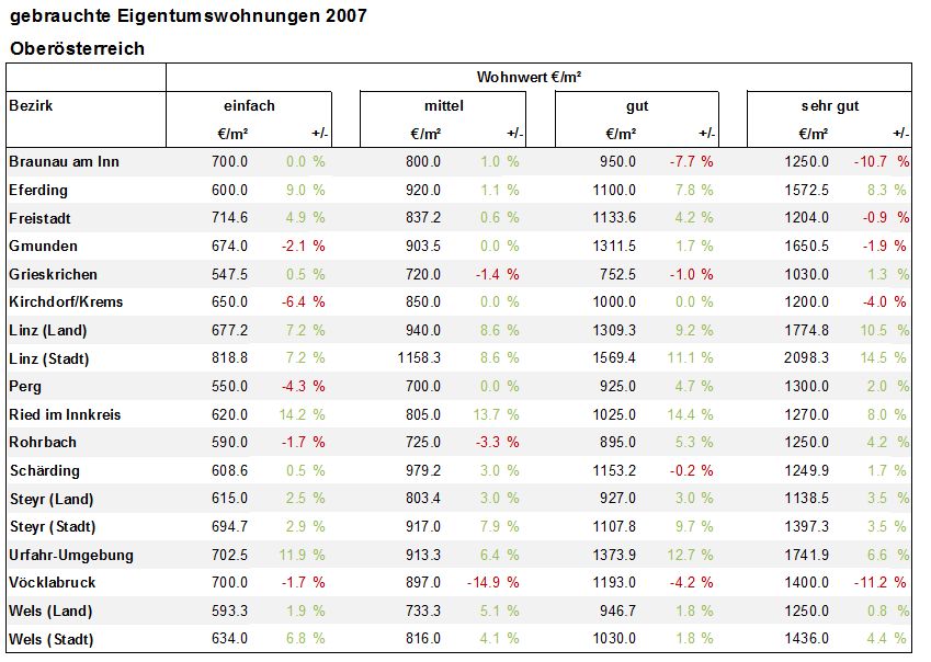
Finally this last solution is optimized for horizontal reading. It removes the lines and bars of the second solution and reduces color usage. While it is more difficult to now compare the vertical data, for example determining the city with the highest m3 compared to the other areas, it is now easy to compare the regions own values and to see at one glance where the values have changed positively and negatively.


