Teaching:TUW - UE InfoVis WS 2007/08 - Gruppe 07 - Aufgabe 1 - Boxplot
Definitions[edit]
Boxplots are able to visually show different types of populations, without making any assumptions of the underlying statistical distribution. The spacings between the different parts of the box help indicate variance, skewness and identify outliers. Boxplots can be drawn either horizontally or vertically.

Explanation[edit]
Several terms need to be explained in order to make the definition from the section above clear.
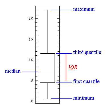
- The box itself contains the middle 50% of the data.
- the smallest observation - This term specifies the lowest value from the data set.
- the lower quartile (Q1) - This term specifies a value that splits the data set into two parts, one with 25% of all data with lower values and the other with 75% of data with higher values.
- median - This term specifies a value that splits the data set into two equally big parts (both parts have the same number of elements).
- the upper quartile (Q3) - This term specifies a value that splits the data set into two parts, one with 75% of all data with lower values and the other with 25% of data with higher values.
- the largest observation - This term specifies the highest value from the whole data set.
- Not uncommonly, real datasets will display surprisingly high maximums or surprisingly low minimums called outliers.
Boxplots can be drawn in any orientation - horizontal or vertical.
Symmetry of a Boxplot[edit]
A Boxplot also gives a picture of symmetry of a dataset and visualises outliers clearly. But just due to the shape of a boxplot, someone should be careful with making any statement about the data distribution. E.g. a normally distributed dataset gives a symmetric boxplot, but a symmetric boxplot is not necessarily a visualisation of normally distributed data. Displaying a histogram in conjunction with the boxplot helps in this regard, and both are important tools for exploratory data analysis.
Example[edit]
As an example we consider values given from the table below to create a boxplot (right image). Notice that the dataset is approximately balanced around zero. Evidently the mean is near zero. However there is a variation in the dataset which ranges approximately from -6 to 6. The maximum and minimum values are showed as whiskers. Hence it is obvious that the boxplot is a powerful visualisation that has the ability to outframe characteristic attributes of the given dataset, in a way that viewers can quickly gain important informations from the visualisation that characterises the data.
|
 |
||||||||||||||||||||||
Related Links[edit]
- On-line box plot calculator with explanations and examples
- Using Excel for creating Boxplots
- How to draw a Boxplot
References[edit]
- [Wikipedia, 2007] Wikipedia, Box plot. Retrieved at: November 01, 2007. http://en.wikipedia.org/wiki/Box_plot
- [Kirkman, 2007] Dr. Tom Kirkman, Box Plot: Display of Distribution. Tools for Science. Retrieved at: November 09, 2007. http://www.physics.csbsju.edu/stats/box2.html
- [Murdoch, 2007] Murdoch University, Boxplots. Mathematics & Statistics. Retrieved at: December 01, 2007. http://www.maths.murdoch.edu.au/units/statsnotes/samplestats/boxplot.html