Teaching:TUW - UE InfoVis WS 2007/08 - Gruppe 07 - Aufgabe 1 - Histogram
Definitions[edit]
Explanation[edit]
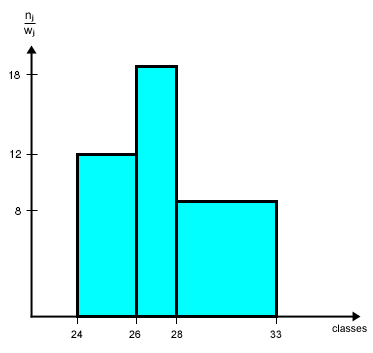
For drawing the histogram, the numerical values are first put in ascending order. Then the data field is split into j classes. Each class has a defined width (class interval) - normally it is 1, but in special cases it is useful to choose a width > 1 - e.g. for displaying frequencies concerning distinct age groups. Under "Examples" we consider a histogram of varying class intervals.
Example[edit]
As an example we consider values given from the table below to create a histogram (right image). The data derived from the first column of the table shows the class affiliation. According to the table values these classes are aligned along the x-axis of the histogram. The heigth of each histogram bar (frequency density) can be obtained by dividing the absolute frequenzy values (second column) by the corresponding class intervals. The resulting value of each class is then printed along the y-axis of the histogram. Once this is properly done, the histogram shows the amount of frequency according to any of the classes. Hence the histogram is a powerful visualisation that can make information accessable in just a few seconds, considering that the table on the left side is representing the same information, it is easy to understand the power of graphical visualisation.
Related Links[edit]
- Definition of Histogram on Wikipedia
- Understanding Histograms in digital photography
- Histogram applet
References[edit]
- [Lancaster, 1974] H.O. Lancaster, An Introduction to Medical Statistics. John Wiley and Sons. 1974. ISBN 0 471 51250-8
- [Wallgreen et al., 1996] Anders Wallgreen, Britt Wallgreen, Rolf Persson, Ulf Jorner and Jan-Aage Haaland. Graphing Statistics & Data: Creating Better Charts. SAGE Publications, Thousand Oaks, London, New Delhi, 1996.
- [Evans, 2004] Geraint Evans, Histograms. CensusAtScool. Retrieved at: November 08, 2007. http://www.censusatschool.ntu.ac.uk/files/histogram.pdf
