Teaching:TUW - UE InfoVis WS 2007/08 - Gruppe 06 - Aufgabe 3
Jump to navigation
Jump to search
Poor Graphic
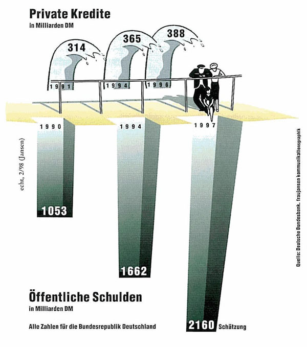
Private Kredite & öffentliche Schulden in der Bundesrepublik Deutschland
Critics
- It is the goal to maximize the data ink ratio and to reduce the non – data ink. In our example there is definitely too much non – data ink and even unnecessary data ink. For example the waves of credits, the balustrade, the people or the cores and the rest of the ship and harbor metaphor.
- There are two possibilities to highlight data as visual means. One possibility is to visualize more important data greater, the other one is to work with contrast to highlight the data. In our example the highlighting of any data failed, because of the low contrast.
- The Label – what it is, when it is and who produced it, should stand in the title of the graphic. In our example there is no title, so there is no explaining of the coherence between private credits and public debts.
- The headlines and the explaining notes have a bad position. For example the note: “Schätzung”, is definitely on the wrong position.
- If it was the intension of the graphics' creator to compare the values, its hard to do so, because the values are from different years.
- The 'Private Kredite'-bars and the 'öffentliche Schulden'-bars differ in form and design.
- Because of the 3D effects, its harder to read the graphic.
- The readability is additionally hindered by the bars, which go in opposite directions, although there is no comparison between positiv and negative values.
- The color gradient in the bars further decrease the readability of the graphic.
- The vertical aligned source text is hard to read and should be aligned horizontal.
- Because the chosen color for the bars has little contrast compared to the background (the bars are not highlighted enough), the reader has to search for the important information.
Redesign
Declaration of improvements
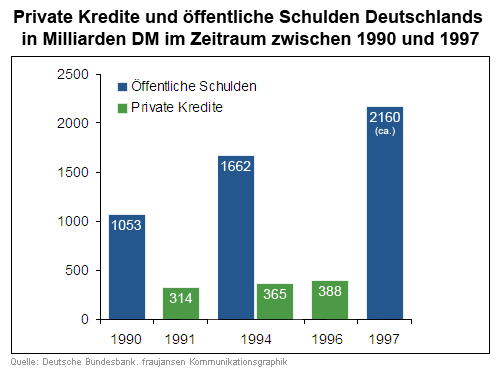
- A significant label with a short declaration, the period of data collection and from whom it is.
- The next step is to reduce the non – data ink, remove unnecessary data ink and emphasize the most important data ink. So we remove all the non – data ink like the balustrade and the people. To emphasize the most important data ink it will be necessary to replace the representations of the waves and the cores through simplicity like bars.
- We separate the two sections (credits and debts) with a colour separation. The spatial separation was not really clearly arranged. Further more we defined a declaration of the colours in the legend, to avoid the problem with the misplaced data.
- For a better comparison we would need more data. There should be collected data from the same years or at least the same bench marks. It is not possible to compare apples and oranges.

