Teaching:TUW - UE InfoVis WS 2005/06 - Gruppe 10 - Aufgabe 3 - Design
Application Area and given Dataset[edit]
Application Area Analysis[edit]
The application area for this task is to visualize a music archive with the data provided by ID3/iTunes tags. These tags include information such as songname, artist, year, album and so on. The challenge in visualizing this information is to select suitable attributes for being used in relation to each other because of the high number of discreet and "organizational" attributes.
Dataset Analysis[edit]
| Attribute | Data type | Description |
|---|---|---|
| Name | Nominal | Song title |
| Artist | Nominal | Artist name |
| Album | Nominal | Album name |
| Genre | Discrete | Genre the song belongs to |
| Composer | Nominal | The composer of the song |
| Size | Continuous | The file size |
| Total time | Continuous | The total time of the song |
| Disc number | Ordinal | Number of the disc |
| Disc count | Discrete | Total number of discs |
| Track number | Ordinal | Track number of this song on the disc |
| Track count | Discrete | Total number of tracks on the disc |
| Year | Discrete | Year of origin |
| Date Modified | Discrete | Date of modification |
| Date added | Discrete | Date when song was added to archive |
| Bit rate | Continuous | Bit rate of song (e.g. 128kbit/s) |
| Sample rate | Discrete | Sample rate of song (e.g. 44100Hz) |
| Play count | Continuous | Number of time the song was played |
| Play date | Discrete | Date of last play |
| Play date UTC | Discrete | Date of last play in UTC |
| Location | Nominal | File location |
| Kind | Nominal | Kind of file (e.g. MPEG audio file) |
| Rating | Ordinal | Personal rating (1-5 stars) |
One data record consists of a concatenation of attributes listed in the table above. Those attributes are all 1-dimensional. As a result of this one record is multi-dimensional. A data record contains only necessary attributes or attributes with data.
Target Group Analysis[edit]
Who should use this visualation technique?[edit]
The visualisation of our concept is mainly designed for people collecting mp3s who like to use creative and new ways for finding songs to play in their music archive they won't find in the usual tools. Moreover it's for people who like to explore their music collection using different approaches. This will fit the exploring character of information visualisation.
Our visualisation will make it possible to browse through the music collection in different ways than what iTunes offers. It's meant for people who want to find music to play, e.g. songs they didn't listen to for a long time. They will see from which period the songs are, which genre they fall into and how they have been rated. This is a different starting point than usual approaches and will allow the user to potentially find other music than without it.
The people that will use our tool are familiar with the internet and use it quite often. Moreover they are using their computer a lot at home and have their pc or mac in the living room where it is not only used for work, but also as multimedia station. That means they play video, music and watch TV with their computer.
This group is specially interested in music and is buying songs over the internet and not buying music CD's frequently anymore. If they buy a CD they rip the content onto the PC to have it in their music library.
What are the special interests of our target group?[edit]
Probably our target group is quite young, probably creative and they potentially have some sort of interest in exploring data visualisations in alternative ways. As can be assumed by analyzing iTunes, the target group likes nice and neat design, cool features and gimmicks. They probably use the visualisation mainly for playing around with their music collection.
Our target group has more interest in mp3s than they have in buying CDs and playing them in their CD player. They have all their music stored on their computer and want to have many possibilities to browse through their collection. They are looking for new ways of finding music so that they can listen to the music they like and the music matching upcoming emotions at every point of time. Instead of manually choosing a music CD they want to use a tool to help them selecting music out of their archive that suits their mood.
Are there any known / often used Methods / Visualisation Techniques?[edit]
Up to now there are no real visualisation techniques in the area of music players like iTunes. The only visualisation technique that can be found on most music tools is the sound visualisation of a playing song, implemented as frequency response or graphical art responding to the music progress.
For representing the songs of a library, ususally lists or tables are used. List-like and tabular approaches can not really be considered as graphic visualisation - they just are textual representations of the data that the user can read and use. Especially in iTunes the possibilities of combining different ID3 attributes to get a filtered playlist are vast. The user is for example able to choose only songs from 1980 to 1984 that are in the rock genre, have a rating between 1 and 3 stars and are not from Guns n' Roses. So you can do quite a lot of things with it, but there is no visualisation behind it. You can choose all that, but you can not choose it graphically which can make this much easier, faster, or just more interesting.
Purpose of the Visualisation[edit]
What should be achieved with the visualisation?[edit]
- An expressive and effective representation of the data records and contained information enabling users to gain an overview of the music in the library as fast as possible using this visualization. Therefore only a few correlating attributes are used for the visualization.
- An explorative visualisation of the data records. A good presentation of the contained information helps users to obtain information better.
- A new approach for finding music to play by bringing genre, year of creation, rating and size of the data set into relation.
Which tasks should be solved?[edit]
Using the nowadays available music library tools is effective and suitable for standard tasks like the following ones most of the time:
- Searching for music by textual fields like artist, album, genre etc.
- Filtering lists of music by selecting criteria on different attributes
- Ordering lists of music by different attributes
- Scrolling through lists of different items searching for songs that will be played next
All these standard tasks are more or less well known nowadays and implemented into most of the modern music libraries. Interestingly indeed is the fact that there are so much more approaches on finding music using alternative ways that have not been designed or implemented even after years like the following:
- Computer-aided decision of music to play based on user behavior (music types often skipped quickly, music types often played loud...)
- Graphical representations of relational visualisations of the music archive
This second task was being analyzed for the design of the here discussed visualisation trying to solve the following tasks:
- Representing a quick overview of the different types of music in the archive
- Guiding the user to good rated music using color coding
- Marking different sized song groups using different sizes of the representing graphic objects (boxes)
- Providing a focused view for selected music groups using a multi-view window layout
- Giving statistical information on selected music groups via a separated but linked window of the rating-distribution of the selected music group
- Filtering the representation by selecting range and scale
Questions that can be solved using this Visualisation[edit]
- Which Jazz songs of the 80's do I have im my library, how have I evaluated them in average?
- How many songs of one special genre of one special year do I have?
- How do I have them rated?
- Which albums do I have of a selected genre and year of publishing?
- Which songs are included on an album?
- How often do I have played a song?
- When did I last play a song?
- Of which genre and how old are most of the songs in my archive?
- Which genre do I like (which genre is best rated)?
- Selecting genre and year/decade, which alternative music do i find to one other?
- Which albums match each other in terms of genre and age?
Designproposal[edit]
Which kinds of Visualisation should be used?[edit]
The actually existing music library systems mostly don't really visualize the contained music using its attributes but simply use lists of items (artists, albums, songs, playlists...). While this concept is easily understandable for the end-user it only allows for simple browsing using the following techniques:
- Searching for specific artists, albums, titles and so on.
- Filtering the list by choosing ranges or values for some attributes
- Sorting the list by different attributes
- Scrolling the list up and down
Some attributes of song items like artist, album and title are of hierarchical character and therefore suited mainly for being displayed in a list or being used for browsing in multi-step lists. One example of such a multi-step list is the media library in Winamp: After selecting an artist in the first list, the second list gets filled with the available albums of this artist. Selecting an album fills the next list with the associated songs of this album and so on.
While hierarchical attributes can be considered essential and are very useful for a multi-level selection process or direct textual searching/filtering, they only can be used if the user exactly knows what he or she wants to listen to. In opposite users often want to listen to randomly chosen or special pattern matching song lists like "My Top 10 Most Played Ones".
Considering these facts we chose other criteria than hierachical attributes of music items for creating new concepts of how to find interesting music without exactly knowning what to listen to. Using attributes like genre, year of creation, rating, playcount and date of last play different approaches of browsing music came up to our minds.
Visual Mapping[edit]
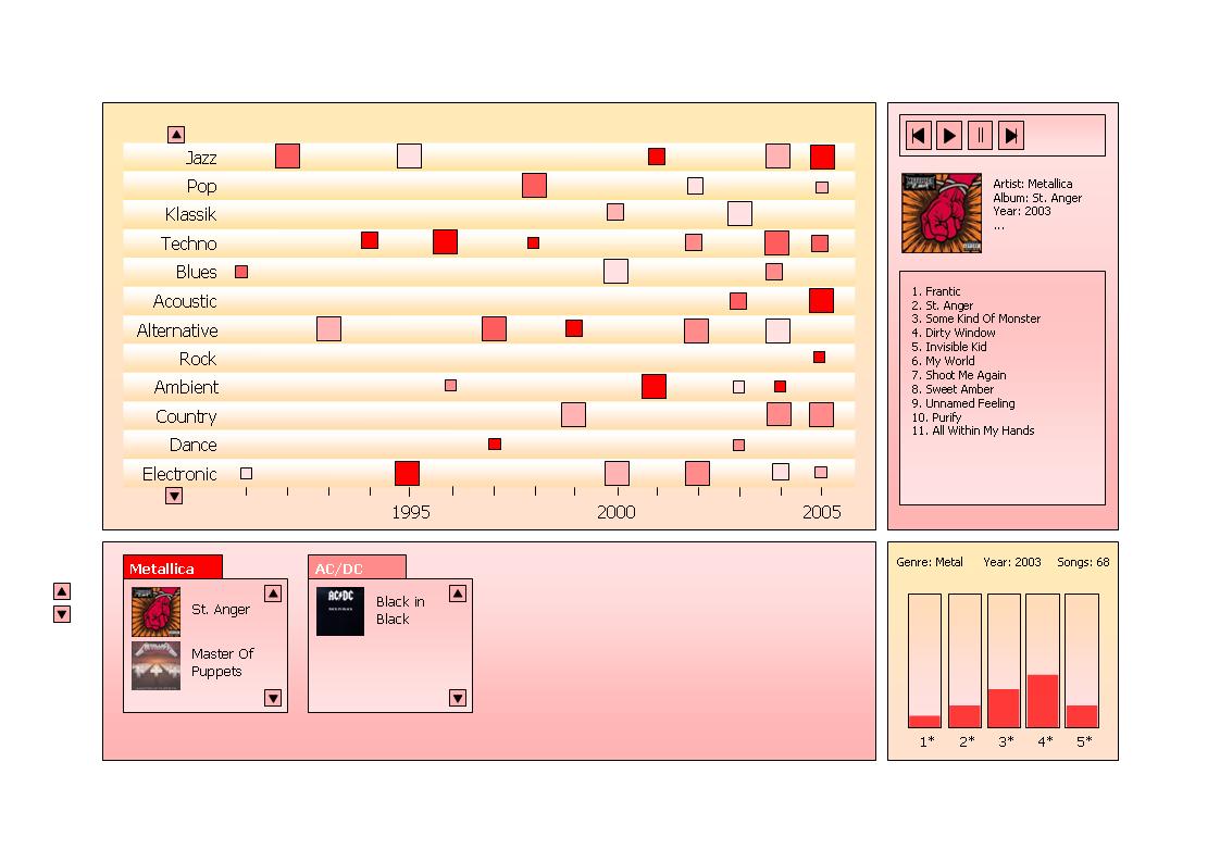
In the context of this task a "Music Type Selection" browsing approach was chosen for being designed in detail and worked out as a prototype. This approach uses the following visual mapping:
- The approach bases on a 2D diagram containing:
- The year of creation on the x-axis
- The genre on the y-axis
Using this grid groups of similar music with respect to genre and year are getting plotted into the diagram as filled boxes. Additionally another two attributes are being mapped:
- The absolute number of songs within a specific group is mapped as the size of the box.
- The mean rating of all songs within this group is mapped as the intensity of the color used for filling the boxes.
Used Techniques / Applied Principles[edit]
- Focus & Context: Tiled Multi-Level Browser [Plaisant, 1995]
- Overview Window
- Zoomed Window
- Details On Demand Window
- Scatterplot [Wikipedia, 2005]
- This concept is used in the upper left window. On the x-axis the year of publishing is displayed and on the y-axis the genre.
- Linking & Brushing: Detail window containing rating distribution of selected songs (Slides 0, Page 25)
- Visual Encoding: area and color [Munzner, 2000]
- With the color of the shapes the average rating is displayed (white: bad rating; red: best rating) and with the volume the number of songs.
Interaction[edit]
As you can see in the advanced concept we have a multi windwow view. The starting point is in the big main window. In the beginning the other windows are empty. In the main part the user sees all the songs availible represented in boxes of different shade and size. It is possible to scale the x- and the y-axis to have a better overview, or to see the boxes larger. It is also possible to re-order the items on the y-axis. When he clicks at one of those boxes more detailed information will appear in the other windows. In the lower left window the user will see the different Artists that suited his selection. There will be one box for each artist containing all the albums of this artist that correspond with the users selection of genre and year. In the lower right window the user can see a more detailed view on the ratings of his selection. So the mean value is split up and one can see how many songs there are for each rating star. In the upper left window the first album of the first artist will be presented, showing the songs.
In the next step the user can interact in the three smaller windows to change the artist, the album, or choose only specific ratings. When the user clicks on a new album or artist the details in the upper right window will be updated. Moreover there is the possibility to choose only some of the ratings represented in the lower right window. For example only 4 to 5 stars. Then the songs in the upper right window will be updated correctly and only albums which contain songs with this rating will be shown in the lower left window.
Mockup(s) / Fake Screenshot(s)[edit]


References[edit]
[Wikipedia, 2005] Wikipedia, Scatterplot. Retrieved at: November 22, 2005. http://en.wikipedia.org/wiki/Scatterplot
[Plaisant, 1995] C. Plaisant, D. Carr, B. Shneiderman. Image-browser taxonomy and guidelines for designers. IEEE Software, Volume 12, Issue 2, Pages:21 - 32, March 1995
[Munzner, 2000] Tamara Munzner, Interactive Visualization of Large Graphs and Networks, Ph.D. dissertation, Stanford University, June 2000.