Teaching:TUW - UE InfoVis WS 2007/08 - Gruppe 06 - Aufgabe 3: Difference between revisions
Jump to navigation
Jump to search
No edit summary |
No edit summary |
||
| Line 31: | Line 31: | ||
*We separate the two sections (credits and debts) with a colour separation. The spatial separation was not really clearly arranged. Further more we defined a declaration of the colours in the legend, to avoid the problem with the misplaced data. | *We separate the two sections (credits and debts) with a colour separation. The spatial separation was not really clearly arranged. Further more we defined a declaration of the colours in the legend, to avoid the problem with the misplaced data. | ||
*For a better comparison we would need more data. There should be collected data from the same years or at least the same bench marks. It is not possible to compare apples with | *For a better comparison we would need more data. There should be collected data from the same years or at least the same bench marks. It is not possible to compare apples with oranges. We create a solution for this problem. There for we calculate some more values (estimated values) to compare the same years and the same data. To get a better impression we have highlighted the original values with a brighter colour, because it would stand out more than a lighter or less saturated colour. | ||
== Links == | == Links == | ||
Revision as of 22:05, 10 December 2007
Poor Graphic
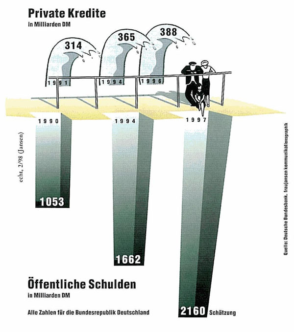
Private Kredite & öffentliche Schulden in der Bundesrepublik Deutschland
Critics
- It is the goal to maximize the data ink ratio and to reduce the non – data ink. In our example there is definitely too much non – data ink and even unnecessary data ink. For example the waves of credits, the balustrade, the people or the cores.
- Visual means to highlight data is split into two possibilities. You could visual data as greater or you could use contrasting visual data. But in our example the trying of highlight any data is failing.
- The Label – what it is, when it is and who produced it, should stand in the title of the graphic. In our example there is something like a title but very small at the end of the graphic. Even more there is no explaining of the coherence between private credits and public debts.
- The headlines and the explaining notes have a bad position. For example the note: “Schätzung”, is definitely on the wrong position. It gives you the impression that it is only guilty for this core.
- It is hard to compare the data because of the values in different years. The timeline is not complete.
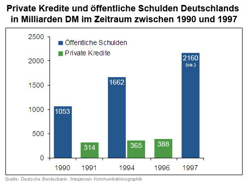
Redesign
Declaration of improvements
- A significant label with a short declaration, the period of data collection and from whom it is.
- The next step is to reduce the non – data ink, remove unnecessary data ink and emphasize the most important data ink. So we remove all the non – data ink like the balustrade and the people. To emphasize the most important data ink it will be necessary to replace the representations of the waves and the cores through simplicity like bars.
- We separate the two sections (credits and debts) with a colour separation. The spatial separation was not really clearly arranged. Further more we defined a declaration of the colours in the legend, to avoid the problem with the misplaced data.
- For a better comparison we would need more data. There should be collected data from the same years or at least the same bench marks. It is not possible to compare apples with oranges. We create a solution for this problem. There for we calculate some more values (estimated values) to compare the same years and the same data. To get a better impression we have highlighted the original values with a brighter colour, because it would stand out more than a lighter or less saturated colour.

