InfoSky
Authors
- Michael Granitzer
- Wolfgang Kienreich
- Keith Andrews
- Vedran Sabol
- Werner Klieber
Short description
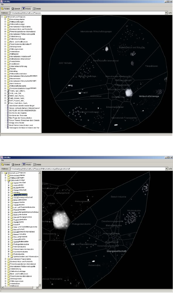
Navigation through InfoSky (Current Version)
- Selecting a collection: Left-clicking a collection label selects the collection and auto-centres it.
- Selecting a document: Left-clicking an individual star selects the corresponding document and auto-centres it.
- Selecting the parent collection: A toolbar button allows to place the focus on the parent collection. The viewport is zoomed out to display the collection.
- Continuous hierarchical zoom: After selecting a collection, zooming in on the visualisation continuously selects deeper hierarchical levels based on magnification and position.
- Panning: Dragging with the left mouse button pans the viewport. Collections are auto selected based on magnification and position.
- Zooming: Using the mouse-wheel, the magnification factor of the display can be adjusted.
Algorithms used for Implementation
Suitable Datatypes
Suitable Datatypes for this information visualization technique are hierarchical information structures. The goal of InfoSky is to reduce the complexity of large amounts of text-data (for examples collections of newspaper articles) by presenting it through the metapher of a telescope view in a hierarchically structured form. Text-data can be either Word documents, PDF or HTML files.
Figures
Pictures of the InfoSky Browser 2002

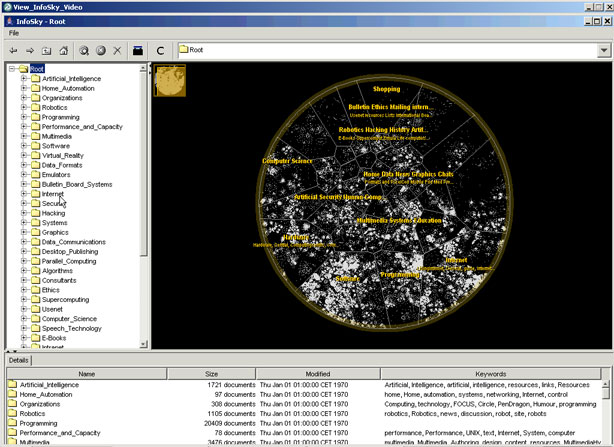
Reengineered InfoSky Browser 2004

Important Citations
Main challenges of Infosky:
Evaluation
Initial Study
The goal of the first prototype in 2002 was to compare the InfoSky tree browser, wich is quite similar to usual tree browsers like Microsoft Explorer, and the InfoSky telescope browser. Test persons had to perform several tasks, where they used either the tree browser or the telescope browser. Time to complete a task was measured and the test results showed, that people could find documents with a certain depth in the hierarchy much faster with the intuitive teleskope brwser.
Study in 2004
Tested User Interface
The interface of the tested prototype was divided into three distinct areas, the tree view (top-left), the galaxy view (top-right) and the list view (bottom). Combinations of tree and galaxy view were tested in the experiment, with the list view remaining in place.
Changes derived from initial study
- a list of documents in the selected collection was added
- layouting of labels in the galaxy view was revised to minimize cluttering
- interactions were optimized based on user feedback received during the initial study
Test Setup
Nine employees of the Know-Center were recruited for the
study and divided randomly into three groups of three. Users of
the first group began with the telescope browser (condition GV),
then used the tree view (condition TV), and finally the mixed
view (condition MV) displaying both the tree and the telescope
view . The other two groups used alternating ordering of test
conditions. Before using the telescope browser (either stand-alone
or in conjunction with the tree view), users were given a brief
training on the browser’s features.
The test dataset consisted of 80000 newspaper articles from the German Sueddeutsche Zeitung. Tasks included locating a document or collection within the hierarchy, counting the number of documents in a collection, comparing the number of items in different collections and counting the number of similar documents in a collection.
At the end of each test, an
interview was conducted with the test user to gain additional
feedback. The entire session was videotaped.
Interpretation of Results
- A combination of the tree browser and the galaxy browser (mixed mode) yields significantly better results than the use of the galaxy browser alone.
- While not directly comparable, the difference between mixed mode and the tree view in stand-alone mode approach the difference between the telescope view and the tree view found in the initial evaluation.
- When using the tree browser in stand-alone mode, users reported seven time-outs, indicating that they could not solve a given task at all (in reasonable time), while only four time- outs occurred when using the combination of tree and
telescope view. It is interesting to note that most users reported time-outs when they got completely lost in the hierarchy and were unable to find a promising path of navigation towards a desired destination. Obviously, the telescope view is useful for comprehending the overall structure of the collection hierarchy and the current position in context.
- In both stand-alone views, about half of all time-outs occurred in task 2, which asked users to locate an item deep in the hierarchy by navigation. However, in mixed mode view only one user reported a time-out for task 2. This further underlines the importance of having both views to keep an overview.
- The labelling problems (i.e. “jumping” labels, overlaps, occlusion) reported in the initial evaluation were rarely mentioned by users in the interviews.
References
- Granitzer, M., Kienreich, W., Sabol, V., Andrews, K., and Klieber, W. 2004. Evaluating a System for Interactive Exploration of Large, Hierarchically Structured Document Repositories. In Proceedings of the IEEE Symposium on information Visualization (infovis'04) - Volume 00 (October 10 - 12, 2004). INFOVIS. IEEE Computer Society, Washington, DC, 127-134. DOI= http://dx.doi.org/10.1109/INFOVIS.2004.19
Further Information
- Andrews, K., 2006. Evaluating information visualisations. In Proceedings of the 2006 AVI Workshop on Beyond Time and Errors: Novel Evaluation Methods For information Visualization (Venice, Italy, May 23 - 23, 2006). BELIV '06. ACM Press, New York, NY, 1-5. DOI= http://doi.acm.org/10.1145/1168149.1168151
- Andrews, K., Kienreich, W., Sabol, V., Becker, J., Droschl, G., Kappe, F., Granitzer, M., Auer, P., and Tochtermann, K. 2002. The InfoSky visual explorer: exploiting hierarchical structure and document similarities. Information Visualization 1, 3/4 (Dec. 2002), 166-181. DOI= http://dx.doi.org/10.1057/palgrave.ivs.9500023