Evaluating Visual Table Data Understanding: Difference between revisions
No edit summary |
No edit summary |
||
| Line 93: | Line 93: | ||
context visualization for tabular information in Proceedings of the SIGCHI conference on Human factors in computing systems: celebrating interdependence ACM Press, Boston, Massachusetts, United States 1994 318-322 | context visualization for tabular information in Proceedings of the SIGCHI conference on Human factors in computing systems: celebrating interdependence ACM Press, Boston, Massachusetts, United States 1994 318-322 | ||
*[[ | *[[Shneiderman%2C_Ben|Ben Shneiderman]], The Eyes Have It: A Task by Data Type Taxonomy for Information Visualization. in IEEE Symposium on Visual Languages, (1996), p 336. | ||
Revision as of 15:41, 14 April 2007
Authors
Short description
Evaluation of how information visualization supports exploration for visual table data. A controlled experiment designed to evaluate how the layout of table data affects the user understanding and his exploration process. This experiment raised interesting problems from the design phase to the data analysis. In this paper, we focus on evaluating how information visualization supports exploration for visual table data. We present a controlled experiment designed to evaluate how the layout of table data affects the user understanding and his exploration process. This experiment raised interesting problems from the design phase to the data analysis. A a task taxonomy, the experiment procedure and clues about data collection and analysis are presented. Concluding with lessons learnt from this experiment and the discussion of the format of future evaluation.
Controlled Experiment
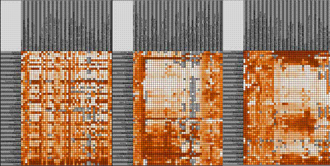
In the experiment three table ordering algorithms commonly used to reorder rows and columns of table data where used. The first order is alphabetic (A) and considered as a control order. The two others (C) and (T) are issued from the field of bioinformatics. (C) is a hierarchical clustering followed by a linearization. (T) is based on the traveling salesman problem. They are used to reorder DNA microarrays (visual table data presenting gene expressions).
Datasets
Two real datasets where chosen for the experiment. The datasets had to be interesting and of reasonable size to keep the experiment subjects interested. One dataset was the university master´s grades and the second dataset was from the CIA World Factbook. This dataset consists of statistics of productivity, export, transportation for most of the countries in the world.
Tasks
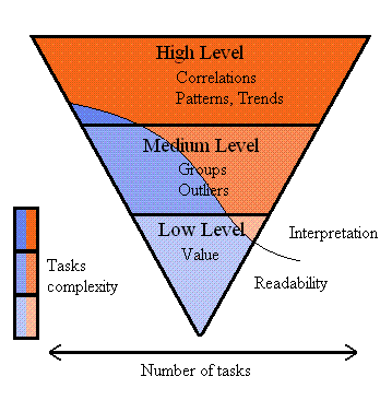
The experiment subjects had to complete tasks of different difficulties. The datasets where divided in three difficulties. At a high difficulty level of the dataset the experiment subjects have interpret a lot of the data, while looking at easier parts of the dataset the readability of the datasets where tested.
The experiment consisted of the following tasks:
- Low Level: on represenation visual coding
Readability:
Find a specified student or course
Give the grade for a given student and course
Find how many students followed a given course
Interpretation:
Find the course where students performs better/worse
Find the student with the highest/lowest grades
- Medium Level: on groups and outliers
Readability:
Circle a group
Give it a representative element of the group
Circle outliers
Interpretation:
Give it a meaningful name
Give a representative element of the group
Explain why the are outliers
- High Level: on correlations and trends
Readability:
Give two Courses correlated/uncorrelated
Interpretation:
Give two Courses correlated/uncorrelated
Give the main trends of this master (in terms of topics)
Explain how students/courses have been ordered
Figures
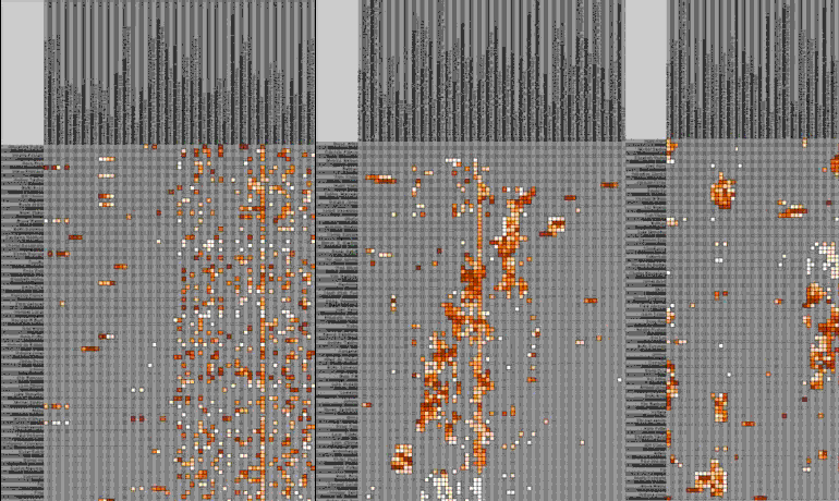
Pictures of the data sets in different sort orders.


Task complexity

Lessons Learned
- Do not use real datasets
- Do not ask too much
- Do not exclude free comments or open questions
- Do not leave too much freedom
- Do not underestimate training
Important Citations
Main challenges of Infosky:
Reference articles
- Ramana Rao, Stuart Card. The table lens: merging graphical and symbolic representations in an interactive focus +
context visualization for tabular information in Proceedings of the SIGCHI conference on Human factors in computing systems: celebrating interdependence ACM Press, Boston, Massachusetts, United States 1994 318-322
- Ben Shneiderman, The Eyes Have It: A Task by Data Type Taxonomy for Information Visualization. in IEEE Symposium on Visual Languages, (1996), p 336.