Teaching:TUW - UE InfoVis WS 2009/10 - Gruppe 03 - Aufgabe 2: Difference between revisions
Jump to navigation
Jump to search
(reduced size of old image) |
(completed the 2 points "critic" and "improvements") |
||
| Line 4: | Line 4: | ||
[[Image:AnimalsKilledforFood7S.jpg|800px]] | [[Image:AnimalsKilledforFood7S.jpg|800px]] | ||
=== | === critic view on the table === | ||
* too much color (distracts reader from content) | * too much color (distracts reader from content) | ||
* too many grids and lines used | * too many grids and lines used | ||
* fonts aren't used consitently | * fonts aren't used consitently | ||
* potential insignificant content included | * potential insignificant content included (e.g. "born" has no clear relation to the rest of the data labeled as "number of animals killed") | ||
* the columns used for the different years contain different data, which makes comparison difficult, also from a spacial view | |||
* the columns "06/05" and "06/07" have an unclear header. they could be read as dates (06/05 -> June 2006 / June 5th). also the values of these columns (as factors) aren't very intuitive as e.g. percent values | |||
* the values in the table have differnet precision, which makes comparison more difficult | |||
* the values that are represented as % don't have their %-sign next to them. they could be misinterpreted if you read a row at once (without looking at the header) | |||
* the "rabbit" row is a bit dodgy, as the references [f] state, that these values are just speculations | |||
=== | === improvements === | ||
* data from columns "killed" and the data connected to it are put in one table and the rest of the data (columns "born", "slaught", "died", ...) in a seperate table | * data from columns "killed" and the data connected to it are put in one table and the rest of the data (columns <strike>"born"</strike>, "slaught", "died", ...) in a seperate table | ||
* references to used sources are put behind the values | * references to used sources are put behind the values, and made smaller, for less distraction | ||
* rows are ordered by commoness | * rows are ordered by commoness | ||
* columns are reordered, so connected data is easier to compare | * columns are reordered, so connected data is easier to compare | ||
* lines and grids are only used were necessary | * blank space (instaed of lines) is used to make the tables more readable | ||
* lines and grids are only used were necessary | |||
* the precision of the values (in millions) is unified to one number after the comma, 2 numbers after the comma for % values | |||
* results of "06/05", "06/07" are shown as %, so meaning of the values is more clear to the reader | * results of "06/05", "06/07" are shown as %, so meaning of the values is more clear to the reader | ||
* also if it's recommended to keep data that uses vales from an other colums should stay beneath each other, we decided to append the two columns "06/05" and "06/07" at the end of the table, because it relates two other columns and would worsen the readability of the table | |||
== Links == | == Links == | ||
| Line 27: | Line 35: | ||
* [http://ieg.ifs.tuwien.ac.at/~gschwand/teaching/infovis_ue_ws09/ UE InfoVis] | * [http://ieg.ifs.tuwien.ac.at/~gschwand/teaching/infovis_ue_ws09/ UE InfoVis] | ||
*[[Teaching:TUW - UE InfoVis WS 2009/10 - Gruppe 03|Gruppe 03]] | * [[Teaching:TUW - UE InfoVis WS 2009/10 - Gruppe 03|Gruppe 03]] | ||
Revision as of 22:18, 16 November 2009
Aufgabenstellung
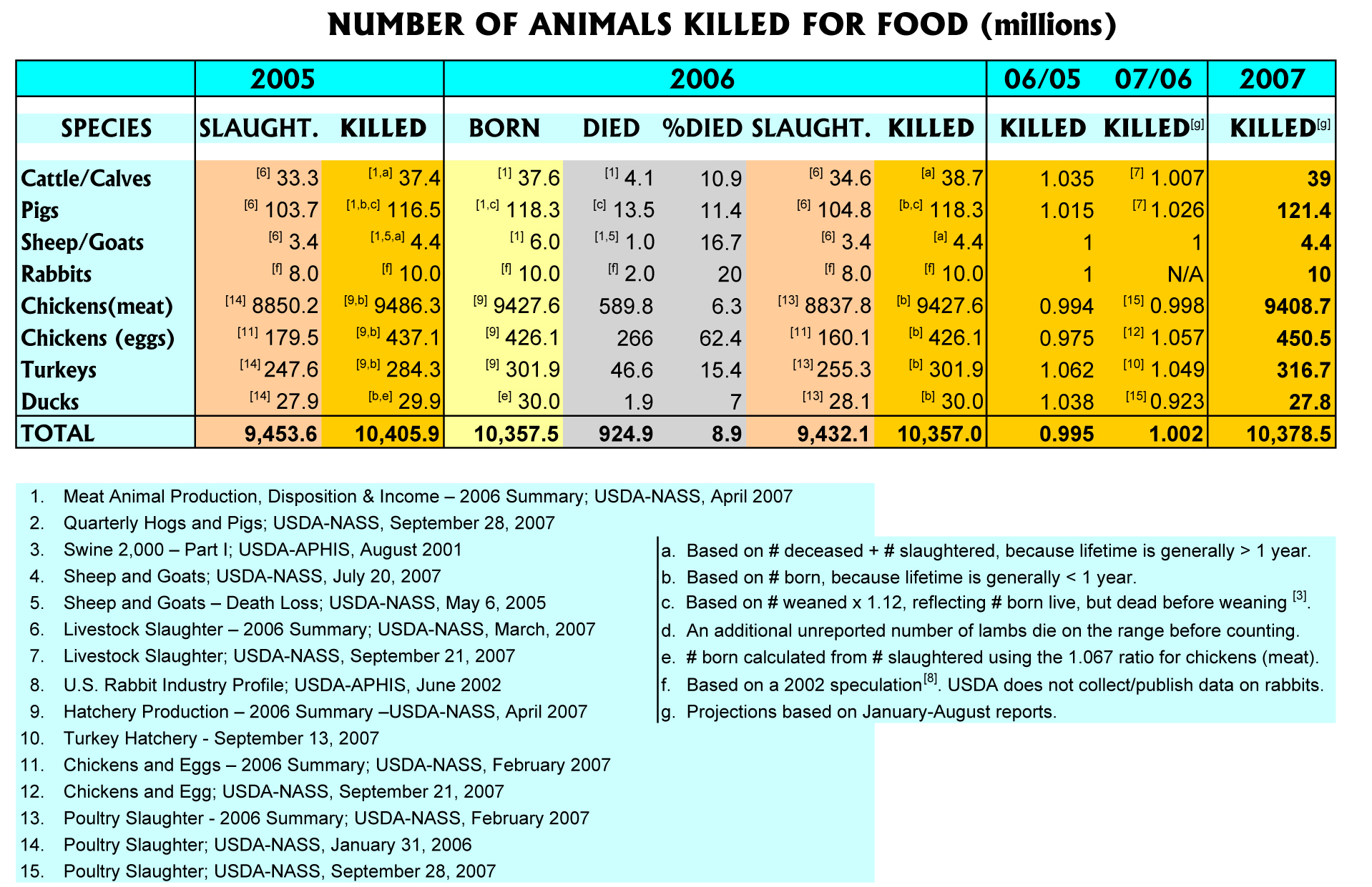
Zu beurteilende Tabelle
critic view on the table
- too much color (distracts reader from content)
- too many grids and lines used
- fonts aren't used consitently
- potential insignificant content included (e.g. "born" has no clear relation to the rest of the data labeled as "number of animals killed")
- the columns used for the different years contain different data, which makes comparison difficult, also from a spacial view
- the columns "06/05" and "06/07" have an unclear header. they could be read as dates (06/05 -> June 2006 / June 5th). also the values of these columns (as factors) aren't very intuitive as e.g. percent values
- the values in the table have differnet precision, which makes comparison more difficult
- the values that are represented as % don't have their %-sign next to them. they could be misinterpreted if you read a row at once (without looking at the header)
- the "rabbit" row is a bit dodgy, as the references [f] state, that these values are just speculations
improvements
- data from columns "killed" and the data connected to it are put in one table and the rest of the data (columns
"born", "slaught", "died", ...) in a seperate table - references to used sources are put behind the values, and made smaller, for less distraction
- rows are ordered by commoness
- columns are reordered, so connected data is easier to compare
- blank space (instaed of lines) is used to make the tables more readable
- lines and grids are only used were necessary
- the precision of the values (in millions) is unified to one number after the comma, 2 numbers after the comma for % values
- results of "06/05", "06/07" are shown as %, so meaning of the values is more clear to the reader
- also if it's recommended to keep data that uses vales from an other colums should stay beneath each other, we decided to append the two columns "06/05" and "06/07" at the end of the table, because it relates two other columns and would worsen the readability of the table
