Teaching:TUW - UE InfoVis WS 2010/11 - Gruppe 06 - Aufgabe 3
Introduction
One of the Millenium Development Goals (MDG 7) is to halve, by 2015, the proportion of people without sustainable access to safe drinking-water and basic sanitation[Unicef, 2010]. Therefore the World Health Organization (WHO) and the United Nations Children's Fund (UNICEF) collected several data and published the intermediate results in 2010. Starting from this report and involving the collected data an interactive information visualization was designed and implemented using the JavaScript Framework Protovis.
Analysis of the data
The data shows the temporal development of the access to safe drinking-water and basic sanitation. The data collection started in the year 1990 and was from then on upraised every 5 years. One exception is the last dataset which was collected in 2008, so the time difference is here only 3 years. The data was collected for every country separately with the possibility to build up dependencies by grouping the countries. The basic structure of the data is as follows. Several nominal scales are linked to the two main categories water and sanitation. This nominal scales are improved, piped, other improved and unimproved for water and improved, shared, open defecation, other improvement and unimproved for sanitation. Moreover each of the above mentioned nominal scales can be split to two additional nominal scales, namely rural and urban. The values of the nominal scales contain absolute values as well as relative ones.
Target Group analysis
The visualization is focused on southeast asia. Thus it may be of interest for medical stuff in this region because it gives an overview of the development in improved water and sanitation progress. Combined with additional (medical) data conclusions about diseases caused by bad water or sanitation may be drawn. Moreover this visualization may be also of interest for the analysis of infrastructure development in this region.
Used Visualization Techniques
The two main instruments of control over the visualizations created, are the Year-Slider above the three types of panels and the map below the scatterplot.
Scatterplot

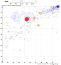
The Scatterplot [Cleveland, 1993] displays the countries of the world according to the ratio of the supply with improved water and improved sanitation. The features displayed are the following ones:
- Horizontal axis: proportion of population served with improved sanitation
- Vertical axis: proportion of polulation server with improved water
- Dots: countries of the World encoded by color and size
- Size: size of the Dots is oriented on the population of the country(/1000) between a min and a max size for keeping up readability
- Color: yellow for countries in the southeastern region and blue for all other countries of the world
LinePlot

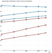
The LinePlot displays (click on a certain country on the map) information about improved water and sanitation supply on demand(in percentage rural, urban and total population)of a certain country selected within the map over time.
- Horizontal axis: Year (1990 - 2008)
- Vertical axis: Percentage of total, urban or rural population served with improved water or sanitation
- Lines: Trend of developement between the data points of each year provivided by the WHO data; The used colors represent the kind of data displayed in the following way
- Blue: improved water supply
- Brown: improved sanitation supply
- "Dots"(Symbols): exact data of the year (related to the vertical axis);
The used symbols represent the kind of data displayed in the following way
- "Cross": Rural
- "Diamond": Urban
- "Circle": Total
Map

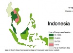
The map provides interactive control over the displayed content. Clicking on a country on the map marks the corresponding countrydata in the scatterplot and shows detailed information in the lineplot. The areas represent the proportion of population supplied with improved water encoded with color (changing data with chosen Year)
- Pink <= 50% of the total population supplied with improved water
- Lightgreen 50%-75% of the total population supplied with improved water
- Green 76-90% of the total population supplied with improved water
- Darkgreen 91-100% of the total population supplied with improved water
Available forms of Interaction
The forms of interaction available differ throughout the 3 plots
- Year-Slider: The year-slider allows the user to choose a certain year of interest modifying the displayed data in the scatterplot and the map.
It also enables the user to execute a "play" function which iterates through the years, generating some sort of "animation" making it possible to follow the developement of the southeastern-asian areas in relation to the other countries of the world.
- Scatterplot: "Mouseover" on displayed dot shows the countryname and the population of that country
- Indexchart: "Mouseover" on the displayed "dots" shows the specific percentage value
- Map: "Mouseover" displays the name of the country
"Click" on a country highlights the according country"dot" in the scatterplot which stays highlighted and hence can be followed throughout the available years(also in slider "playmode") also the clicked country's name gets displayed.
Prototype
Link to the interactive visualization prototype. http://web.student.tuwien.ac.at/~e0325435
Possible Improvements
- Improvement of scatterplot interaction - by clicking on the countrydot the selected country gets highlighted in the map and detailed information is displayed in the lineplot. (was implemented but we ran into problems with protovis event handlers)
- Improvement of lineplot - adding additional data (not necessarily in the same plot) to demonstrate the ratio between rural and urban population.
External Links
- Progress on sanitation and drinking-water - http://www.wssinfo.org/fileadmin/user_upload/resources/1278061137-JMP_report_2010_en.pdf
- Protovis - http://vis.stanford.edu/protovis/
References
- [Unicef, 2010] Unicef. Progress on Sanitation and drinking-water: 2010 Update. JMP report - World Health Organization and UNICEF 2010, 1–55, 2010 . http://www.wssinfo.org/fileadmin/user_upload/resources/1278061137-JMP_report_2010_en.pdf
- [Cleveland, 1993] Visualizing Data., W. S. Cleveland (1993), Hobart Press, Summit, New Jersey, U.S.A.
- Source of the displayed data - http://www.wssinfo.org/data-estimates/table/