Teaching:TUW - UE InfoVis WS 2010/11 - Gruppe 05 - Aufgabe 3
Interactive visualization
Introduction
Based on a report [1] of the Unicef, who tries to enable a greater access to drinking-water and sanitation for people all over the world. A visualization was created that shows the access to these resources in addition to the amount of population. The situation of the urban population is by far better, in comparison to the rural population. The main reason behind this are the worse living conditions of the rural population.
884 Million people do not use improved sources of drinking - water. 2.6 Billion people do not use improved sanitation, just 61 percent of human civilization have access to improved sanitation. With this in mind a visualization was created which enables the viewer an easy way to view and understand the presented data.
The visualization can be found here:
Analysis of the dataset
The dataset[2] is contains datapoints for the years 1990, 1995, 2000, 2005 and 2008.
Some data instances had missing values. Therefore just complete data instances were used.
The main characteristics of the dataset are:
- multivariate
- temporal
- mostly numeric values (except country names)
- hierarchies
- countries are part of continents
- piped and other are part of improved for water
- open defecation, shared and other are part of unimproved
The composition of the data is the following:
- all data (totals)
- urban
- rural
- water
- improved (totals)
- piped
- other improved
- unimproved
- improved (totals)
- sanitation
- improved
- unimproved (totals)
- open defecation
- shared
- other
Analysis of the users
The main audience for the created visualization are people with interest in global politics. But also viewers with an other background should be able to use the visualization and find the information they need in a fast way. The visualization mainly focuses on showing the viewer the development of the attributes, so that users are able to investigate how the conditions changed over time.
Analysis of the tasks
The main intend behind this is to show how the attributes develop over time in the single countries and continents. A easy away has to be provided, comparing the development of single countries, to find out which countries are in need of humanitary help.
Different questions can be answered by this interactive visualization, e.g.:
- Which continent has more access to important resources?
- How has the growth of access to a resource in a continent improved that the countries on that continent?
- How much did a specific attribute grow in the last few years?
Visualization design
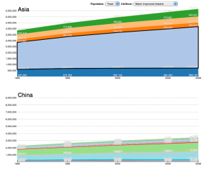
The Job Voyager[3] visualization was chosen as basis for the created visualization. The main focus is to represent a stacked time series of the data. The data which should be shown can be filtered by population and its attributes. The visualization mainly consists of two charts. The first one shows the attribut development for the continents. The user is able to move the mouse over single continentes to display the name of this continent. It's also possible to select a continent by clicking. If a continent is selected a second chart compares the development of the countries of this continent. If the user is moving the mouse over the area of a country, the actual name of the country is shown as label in the left upper corner of the chart. The values of the different years are shown as additional permanent labels inside the chart.

advantages
- main focus on development over time
- the ability to extend the chart
- main information on one site
- fluent workflow
- dependencies of different variables
- big dataset shown in an easy to understand way
disatvantages
- big differences among attributes are hard to represent
- many countries in one chart are confusing sometimes
- details hard to read
- sometimes difficult to find a specific country
Conclusion
The chosen visualization focuses on time oriented data. Main focus was to show the development of the specific attributes over time. Overall the visualization satisfies this purpose in an easy readable way.
References
- [1] [Unicef, 2010] Unicef. Progress on Sanitation and drinking-water: 2010 Update. JMP report - World Health Organization and UNICEF 2010, 1–55, 2010.http://www.wssinfo.org/fileadmin/user_upload/resources/1278061137-JMP_report_2010_en.pdf.
- [2] [WHO, Unicef, 2003-2010] WHO - UNICEF. Protovis: Joint Monitoring Programme (JMP) for Water Supply and Sanitation. Created at: 1990. Retrieved at: January 15, 2011. http://www.wssinfo.org/data-estimates/table/.
- [3] [Bostock, Heer, 2009] Michael Bostock and Jeffrey Heer. Protovis: A graphical tool for visualization. Created at: March 31, 2009. Retrieved at: January 15, 2011. http://vis.stanford.edu/protovis/ex/jobs.html.