Teaching:TUW - UE InfoVis WS 2010/11 - Gruppe 03 - Aufgabe 3
The BRICs
Abstract
The goal of our visualization is to compare the so-called BRIC (Brazil, Russia, India and China) countries in relation of their values for unimproved water, unimproved sanitation and open defecation over the past years. We think it’s very interesting to see how these vitally important things changed as their economy advanced.
Data
Source
The WHO and UNICEF are offering data on the web (http://www.wssinfo.org/data-estimates/table/) which makes our comparison possible.
Application area
The goal is to make it visible how the water and hygiene situation of the BRIC countries developed over the past years. The data set includes the following years: 1990, 1995, 2000, 2005 and 2008. There is always a five-year gap between the sets only between the last two it’s a three-year gap, which has to be considered while comparing the changes.
Data set
Year Discrete Country Nominal Unimproved Water Total Discrete Unimproved Water Total in % Discrete Unimproved Sanitation Total Discrete Unimproved Sanitation Total in % Discrete Open Defecation Total Discrete Open Defecation Total in % Discrete
Data structure used: 3-dimensional (Year, Country, Data) for each visualization
Users
This visualization might be useful for economic and medical researchers to see if there is a necessary connection between economic development and the improvement of water quality and hygiene. To compare it to economic development more data would be needed, but we think our visualization is a good starting point to see how the BRIC countries have done in these areas over the past years.
Visualization Design
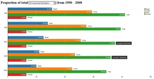
Bar chart

For the nominal comparison we used a simple bar chart with vertical bars, one bar for each country. The length of the bar is mapped to the specific value (Unimproved Water Total, Unimproved Sanitation Total or Open Defecation Total) in % which could be either. To easily switch between these different data values we added a drop-down box to our visualization. We also wanted to include the time component (years) of our data into the visualization so we created a grouped bar chart and for every year the countries are grouped on the y-axis. An other interaction possibility of the bar chart is to hoover over the bars and a popup shows up with the absolute value. We think the bar chart is really good in visualizing the trend of the specific country but also the difference between the BRIC countries and how this difference develops over the displayed years. For a detailed view on the barchart look here.
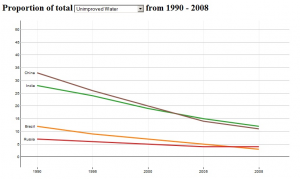
Line chart

The second method we choose to visualize our data is a line chart. We mapped the data value (Unimproved Water Total, Unimproved Sanitation Total or Open Defecation Total) in % to the y-axis and the years to the x-axis. For every country there is a separate line. As in the bar chart we used a drop-down box to easily switch between the different data sets. This chart is very helpful to see trends. You can clearly see that all countries are improving over time. But it’s also very easy to see if a country outperforms another (if the lines are crossing). For a more detailed visualization, the user can zoom in with the scroll wheel, and pan, if the appropriate section disappears from the screen through zooming. The scale gets automatically adjusted to the zoom level. A vertical and horizontal rule follow the mouse movement, so the user can easily read off the correct values. The linechart is available here.
References
- WHO / UNICEF Joint Monitoring Programme (JMP) for Water Supply and Sanitation," 2010. [Online]. Available: http://www.wssinfo.org/data-estimates/table