Teaching:TUW - UE InfoVis WS 2010/11 - Gruppe 03 - Aufgabe 2
Perceptual Guidelines for Creating Rectangular Treemaps
The following article is a summary of the work of Nicholas Kong, Jeffrey Heer, and Maneesh Agrawala [Nicholas Kong et al., 2010]. It discusses the advantages and disadvantages of treemaps as visualization tool.
1. Treemaps - Basics

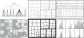
Treemaps are used for space efficient visualizing large, hierarchical datasets. Therefore every node in a tree is represented by a rectangular area, where the size is proportional to the value of the node. The hierarchy of the tree is encoded by recursively subdividing the parent areas in the treemap. Following parameters have to be configured carefully to design perceptually effective treemaps:
- aspect ratio of rectangles (affected by the chosen layout algorithm)
- luminance of rectangles (used to encode additional variables)
- thickness of borders (used to encode hierarchy)
The problem with using treemaps is the use of area for encoding data. Studies have shown that people generally underestimate area, which leads to more inaccurate decoding than with other visualization types, like bar charts. Bar charts, on the other hand, are less space-efficient, not useful for visualization of hierarchies with more than two levels and more difficult to read at higher data densities. The paper gives a design guideline, based on three experiments, when to use treemaps and when to use other visual encodings and how to choose the parameters.
2. Pilot Study – True Percentage and Luminance
The authors first conducted a pilot study on true percentage and luminance to prove prior studies. The term true percentage means the physical difference of two values measured in percent. Following results were discovered:
- true percentage has a strong effect on judgment accuracy
- More accurate judgment at either small (5%) or high (95%) percentage, more accurate judgment at multiples of 5 (due to our behavior to specify numbers at factors of 5)
- luminance has no significant effects on judgment accuracy
- Because area and luminance are separable perceptual dimensions, luminance does not interfere with area judgment.
3. Experiment #1: The Effects of Aspect Ratio
The first experiment presented by Kong et al. [Nicholas Kong et al., 2010] assessed both the effects of aspect ratio on rectangular area judgments and the effects of aspect ratio on proportional judgments.
They further hypothesized three things:
- extreme aspect ratios hamper judgment accuracy
- squares would hinder judgment accuracy
- different primary orientation would increase the error rate
3.1. Method

They conducted a series of controlled experiments to explore their hypothesis:
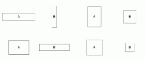
Kong, Heer & Agrawala asked participants to compare rectangular areas with varying size and aspect ratios. For this purpose they showed subjects images (Fig. 2) containing two rectangles (A or B) and asked them to identify which is the smaller one. Further they had to guess the percentage the smaller was of the larger rectangle.
3.2. Results
They collected 2,600 responses to analyze:
- No effects of orientation on judgment accuracy were found.
- They did find a significant interaction effect between orientation and aspect ratio.
- Average judgment accuracy improves when comparing rectangles with varied aspect ratios.
- The highest error occurred comparing two extreme aspect ratios or squares.
3.3. Discussion
Their results support the general intuition against creating treemaps using rectangles with extreme aspect ratios.
4. Experiment #2: The Effects of Data Density
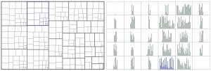
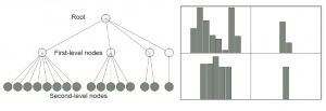
They presented participants with either a treemap or a hierarchical bar chart and asked them to compare two elements. They were asked either to compare leaf to leaf (LL), leaf to non-leaf (LN) or non-leaf to non-leaf (NN).
- With a treemap, participants were asked to compare two rectangular areas.
- With a hierarchical bar chart, participants were asked either to compare two bars (LL), or to compare groups of bars to one another (LN or NN).
4.1. Method
4.2. Results
There were 8,640 responses collected.
- Leaf-Leaf comparison: Treemaps excel at high density
- Bar charts were more accurate than treemaps on average
- at higher data densities, errors equalized
- in general responses became less accurate as density increased
- as density increased, responses with treemaps became significant faster
- (nearly 5 seconds at 8000 leaf nodes)
- Treemaps more accurate for Non-Leaf nodes
- for LN and NN comparison: strong main effect of chart on accuracy
- as data density increased, treemaps maintained their accuracy...
- while responses of bar charts reached higher error rates
- treemaps were more accurate at all densities in NN-comparisons and
- outperformed bar charts in LN comparisons at the higher leaf node conditions.
4.3. Discussion
Furthermore treemaps were not significantly faster than bar charts in either NN or LN comparisons.
- At low data densities, bar charts are more accurate
- As data desndity increases, the accuracy difference equalizes
- Treemaps result in significantly better estimation times at higher densities
- this could be, because bars (in the bar chart display) are small and difficult to find at higher densities
5. Design Guidelines
Based on the experimental results the paper offers the following four guidelines for creating treemaps.
- Use treemap layouts that avoid extreme aspect ratio
- The graphical perception suffers at extreme aspect ratios and diverse orientation. Because of this squarified treemap layouts should be preferred to slice-and-dice layouts even tough comparison of squares also reduces judgment accuracy.
- User bar charts at low denisty, treemaps at high denisty
- Bar charts have a lower error rate at low densities, but as the data denisty increases treemaps become more faster. With around the same accuracy as bar charts. The transition point is 4096 leaves.
- Use treemaps when comparing non-leaf nodes
- Treemaps are more accurate than bar charts when comparing leaf nodes to non-leaf nodes and comparing two non-leaf nodes.
- Use Luminance to encode secondary values in treemaps
- Area preception is not affected by luminance of the rectangles. Therefore luminance can be used to encode an additional variable.
6. Limitations and Future Work
There are some limitations for the studies presented in this paper. Just five different aspect ratios were tested in Experiment 1 and during the experiment only stand-alone, out of the context of treemaps rectangles were compared. In Experiment 2 a algorithm was used which created fixed-depth trees with only second level leaves. Also the fixed image size of 600x400 might have been a downside.
Future work in this area might include optimizing treemaps for a 3/2 aspect ratio and investigate their performance. Also including structural question to the study might be an interesting idea.
References
[Nicholas Kong et al., 2010] Nicholas Kong, Jeffrey Heer, Maneesh Agrawala. Perceptual Guidelines for Creating Rectangular Treemaps. IEEE Transactions on Visualization and computer Graphics, 16(6):990-998, November/December 2010.

