Teaching:TUW - UE InfoVis WS 2009/10 - Gruppe 15 - Aufgabe 2
Jump to navigation
Jump to search
Aufgabenstellung
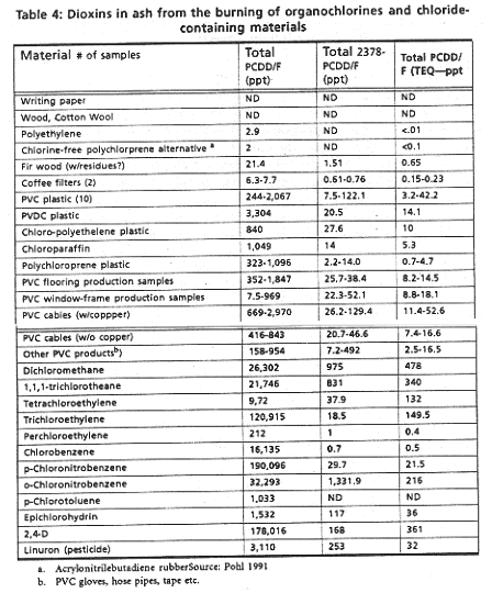
Zu beurteilende Tabelle
Critics
The main point of failure is the bad readability of the table. The eye of the reader gets distracted by the grid. The missing vertical white spaces intensify this effect.
There should be annotations that explain the abbreviations in the header.
Because of the missing knowledge in this matter, we can't comment on the importance of the number of decimal places.
According to Stephen Few, numbers should be aligned at the right end of a field.
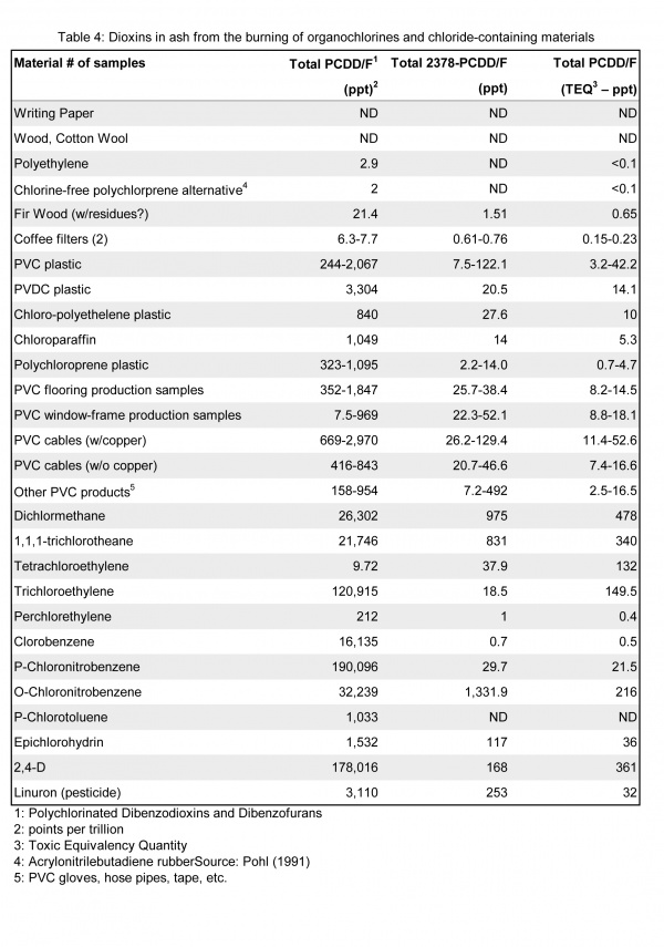
New Table
Changes
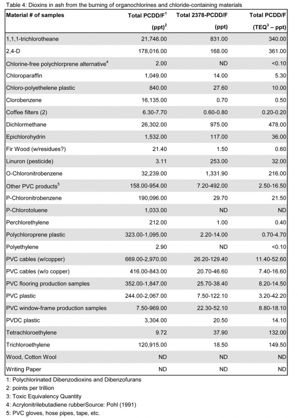
- changed the grid into bigger white spaces and changed the background of every second row to 10% grey. This enhanced the readability significantly.
- Added annotations to explain the abbreviations to help understanding the table.
- Devided header into header spanner header and spanner rule.
- Changed orientation for numbers to right alignment.
Redesigned Table


