Teaching:TUW - UE InfoVis WS 2009/10 - Gruppe 13 - Aufgabe 2
Aufgabenstellung
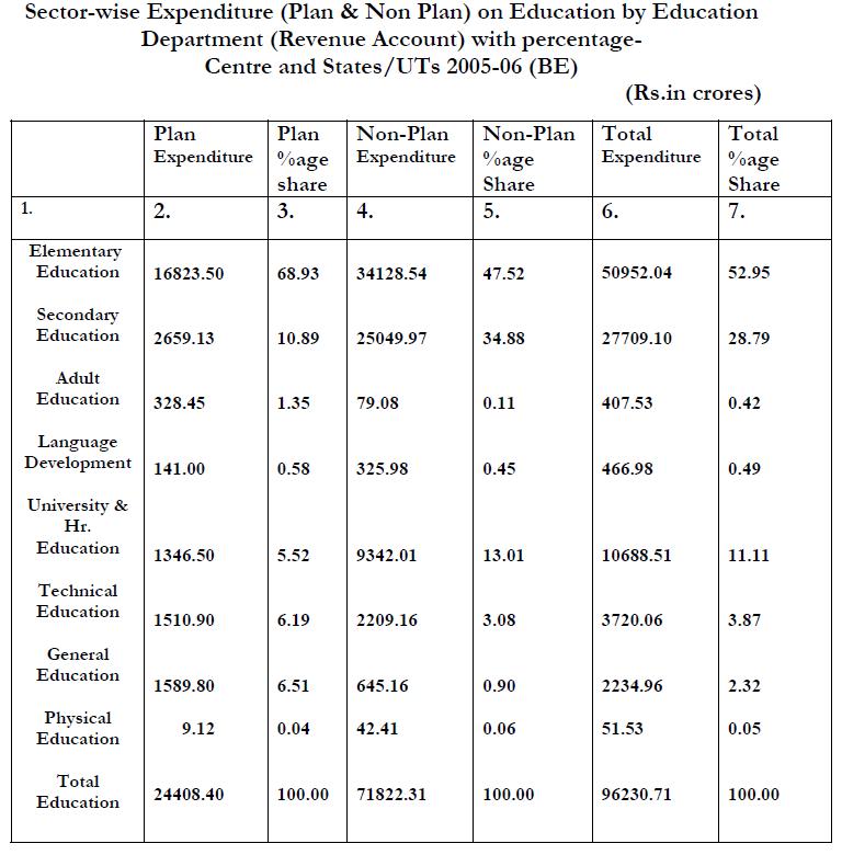
Original table
Critic on original table
Even the table seems to be structured it is difficult to compare the data. The unsteady intervals between the horizontal and vertical lines make it difficult to group the data intuitive. It is hardly possible to track the data accross the table without confusing lines and columns. Furthermore the vertical rule divides the numbers just vertically which draws the attention to the vertical sections.
Beside that it is not clear at once which columns belong together or how they are grouped. It takes you a while to read and compare the headers and the text describing the row information. Especially the summaries at the right side and the end of the table should be highlighted in some way.
Another weak point of this table is the differing alignment and the maybe unfamiliar format of the numbers.
Missing unit in expenditure columns.
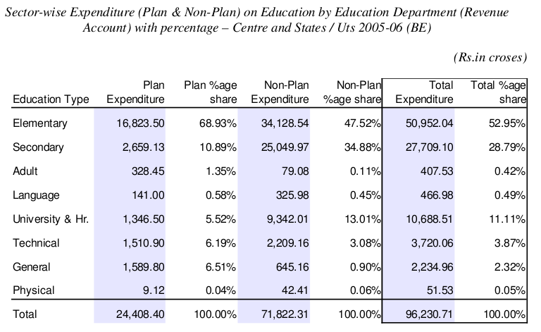
Redesigned table
Changes applied to table
Second row, the one with ordinal numerals had no meaningful function. Because of that we decided to remove it completely from the table.
It is a convention that numbers are aligned to the right. When the numbers in column are displayed with the same precision, i.e. two decimal places like in this table, reader can more easily compare numbers one under another because hundreds are under hundreds, thousands under thousands and so on.
There should be units declared for each column at least in header. However there were no units declared in original table so we cannot say what currency is the amount displayed in. However there was added % sign to each cell in percentage columns. It is a convention too. Reader sees that the number describes percentage without looking into header row.
We changed also a format of the numbers, to make processing and comparing of numbers easier for reader. Comma was placed to the left of every three whole-number digits to divide thousands from millions, millions from billions, etc. Reader can more easily count digits in the number.
Another change we made is addition of "Education type" into header row and removing of word "Education" from each row in first column. Thus the cells are shorter and don't have to be wrapped to two or more lines because of redundant information. Each line has now the same height.
Almost all rules were removed. They remained only on places where they are used to divide header or summary from the rest of data. After removing of rules we got body of table without any guideline in which direction data should be read. Because of that we decided to use light background color for columns. This has also the positve effect that it is now more easier to identify the different types of the presented data(% and amount of money). Between the rows and columns it is not necessary to include any additional seperators due to the steady interval and the right choice of space. This has the advantage that no more components have to be used which would maybe draw the attention away from the more important numbers. Reader can now easily compare expenditures for each type of education and find the results for each row and each column.

