Teaching:TUW - UE InfoVis WS 2009/10 - Gruppe 12 - Aufgabe 2
Jump to navigation
Jump to search
Assignment
Description of the second exercise (German)
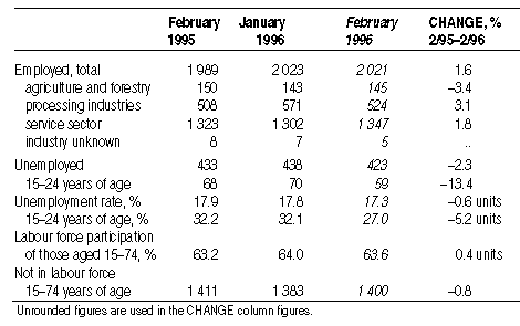
The Original Table
Critique of the Given Table
- It is not apparent for which region this statistic was made
- The table lacks a concise and meaningful title, which would offer the reader a short description of the table
- The table reflects various contexts:
- The absolute number of the employed people in various industries
- The absolute number of the unemployed people and the unemployment rate
- The labour force participation rate
- The absolute number of the people who are not in labour force
- The subgroups aren't comparable due to the differing contexts mentioned above
- Mixed percentage and absolute values (row- and column-wise)
- References to so-called "units" for percentage values
- The lack of percent signs for percentage values, which would make the cognition of the percentage values easier
- The alignment of the columns suggest constant time intervals between the time instants
- The age ranges are inconsistent and therefore not comparable
- Inconsistent row headers (e.g. "Employed, total" and "Unemployed")
- Inconsistent declarations for age ranges ("years of age" and "of those aged")
- Inconsistent date declaration for the column header "CHANGE"
- Inconsistent formatting (block letters, various text alignments, italic type, etc.)
- Too little vertical whitespace between rows
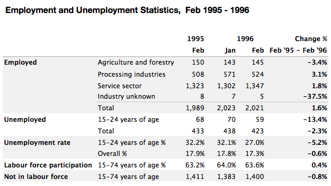
The Revised Table
Description of the Undertaken Improvements
- A concise and meaningful title has been added, which offers the reader a short description of the table
- The varying contexts or rather groups have been separated more clearly by applying bold row headers and alternating the fill color
- The declarations of the rows have been put in a designated column to separate the groups more clearly and to enhance readability
- Misleading references to "units" have been removed
- Percentage signs have been added to denote percentage values
- Special considerations have been made regarding the consistency of row headers, declarations, date formats and text formatting to enable fast processing of information
- The years in the header have been aggregated to avoid distracting redundancy
- A different font and more vertical whitespace have been used to increase readability
- The number of lines has been reduced to avoid distraction from the content
- A comma have been placed to the left of every three whole-number digits
- Sums and summarizing values have been placed at the bottom of each group
- Missing values have been calculated wherever possible

