Teaching:TUW - UE InfoVis WS 2009/10 - Gruppe 10 - Aufgabe 3
Jump to navigation
Jump to search
Aufgabenstellung
Zu verbessernde Grafik
Criticism
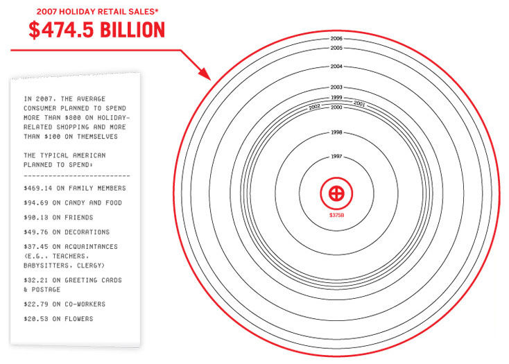
- Detailled information exists only from 2007 so it cannot be grouped according to the purpose of spent money.
- The graphic only stresses the rising trend but no exact values within the years.
- We can only read two amounts of money and the year numbers. Furthermore the lie factor of this graphic cannot be evaluated, because we don't know the exact amounts of the spent money, so we can't compare them with the "graphical amount" represented through the area of the circles.
- We assumed the data density to be okay if you stick with this type of visualization, since a reduction of the area size would make it not readable anymore. If visualized in another way the density could be maximized.
- The big red cross in the centre is unnecessary non data ink and therefore visual clutter.
- This type of visualization is not well chosen for the given type of data.
- Because the circle size grows with the amount of spent money and not the sequence of years, its not acceptable to hide the Information of the year (in the inner red circle $375B), because it cannot be understood from reading the graphic.
Verbesserte Graphik:
Corrections
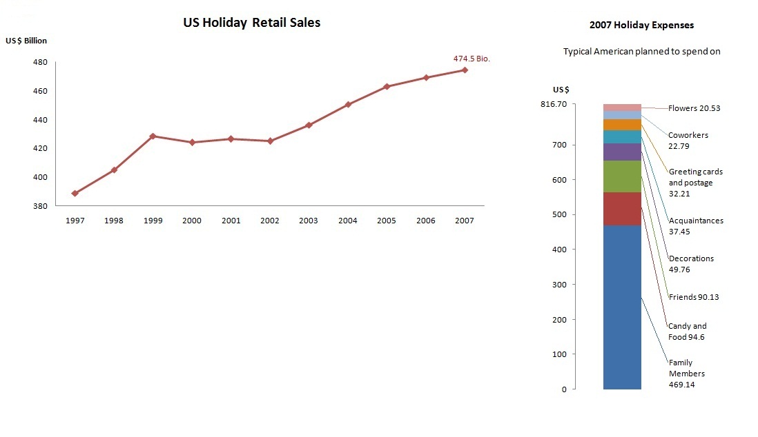
- We maximized the data ink-ratio by replacing the old graphic with a graphic that shows the developing of values continuously from 1997 to 2007. We looked up the numerical US-Dollar value per year and visualized them, so that the viewer of the graphic can easily perceive the data values.
- We changed the bill on the left side (with the detailed information of trends in 2007) to a table in order to keep the exact values, that would get lost in many other kinds of visualizations(for instance: pie chart). We assumed the exact dollar values per person are important for the single reader. Correction of the Correction: Instead of a table we made a bar chart for the "bill" of the old graphic and kept the exact values through writing them in the legend. Furthermore we didn't use the first paragraph on the receit since we couldn't find a correlation to the data below.
- Obviously we left out unnecessary information like the two red inner circles, and some side-information of the receit to maximize data ink-ratio.

