Teaching:TUW - UE InfoVis WS 2009/10 - Gruppe 09 - Aufgabe 4
Aufgabenstellung
Zu erstellende Visualisierung
- Stammbaum der Nachkommen von Lisa und Bart Simpson*
...Visualisierung der Nachkommen von Lisa Simpson sowie der Nachkommen von Bart Simpson. Dabei sollen zwei Stammbäume entstehen - einer von Bart und einer von Lisa - die dann miteinander verglichen werden können. Zuerst kommen Lisa und Bart, dann deren Kinder, ihre Enkel, etc. (mind 4 Generationen). Da es noch keine Nachkommen gibt, können diese frei erfunden werden.
Die Visualisierung soll folgende Informationen darstellen:
- Verwandtschaftsverhältnisse (zumindest Eltern-Kinder),
- Unterscheidung zwischen Blutsverwandtschaft und angeheirateten Familienmitgliedern,
- Geburts- und Todestag sowie Lebensdauer von allen Familienmitgliedern,
- wichtige Ereignisse im Leben jedes Familienmitglieds (z.B., Anzeigen, Gefängnisaufenthalte, Schulzeit, Studienzeit, Nobelpreise, Arbeitslosigkeit etc.)
- Zufriedenheit jedes Familienmitglieds (Skala: sehr niedrig - niedrig - mittel - hoch - sehr hoch); kann sich im Laufe des Lebens ändern.
Die Visualisierung soll die interaktive Auseinandersetzung mit den Daten ermöglichen. Verpflichtend: Möglichkeiten zum besseren Vergleich von einzelnen Abschnitten der Stammbäume bzw. Vergleich von Ausschnitten aus Lisas und Barts Stammbäumen. + mind. 2 weitere Interaktionsmöglichkeiten (z.B., Details on Demand, Filteroptionen)
Allgemein:
- Die Daten sollen zur Analyse von Zusammenhängen zwischen Familienverhältnissen, wichtigen Ereignissen und Zufriedenheit visualisiert werden (die Anwendungsgebiets- und Zielgruppenanalyse kann kurz gehalten werden).
- Die bisher erlernten Design-Prinzipien sollen umgesetzt werden z.B.: Optimierung der Data-ink ratio (keine Comics!), visuelle Attribute (Größe, Farbe, Position, etc.) sollen sinnvoll eingesetzt werden (Information darstellen).
- Die Mockups sollten zumindest 1) die beiden Stammbäume im Überblick und 2) eine detaillierte Vergleichsansicht von 2 Teil-Stammbäumen wiedergeben.
- Alle nicht angeführten Daten können frei erfunden werden.
Description of application domain, the data, users, tasks and goals
Description of the application domain and the dataset
Application domain analysis
Task 4 is about creating a pedigree of the descendants of Lisa and Bart Simpson (which means that two separate trees should be created - one for Bart and one for Lisa). Furthermore comparisons of individual sections of the trees should be possible.
The visualization should represent the following information:
- Family relationships (at least parent-children)
- Distinction between blood relatives and family members by marriage
- Birthday, day of death and lifetime of all family members
- Important events in the life of every family member (e.g. advertisements, prison visits, study time, nobel prize, unemployment, etc.)
- Satisfaction of each family member (scale: very low - low - medium - high - very high), may change during the course of life.
The visualization should enable the interactive analysis of the data.
Mandatory:
- Opportunities for a better comparison of individual sections of the trees or the comparison of excerpts from Lisa's and Bart's family trees.
- Furthermore at least 2 other possibilities for interaction (e.g. details on demand, filter options)
General:
- The data should be visualized for analyzing background stories between family relationships, important events and satisfaction.
Dataset analysis
First of all we consider the underlying date as a set of multidimensional multivariate data. Multidimensional because of the fact that there are multiple attributes in view of every person. Multivariate because we have got multiple person variables. To make the parent-child relationships visible we are going to organize the data hierarchically (like a tree). The datatypes of the attributes are:
- Nominal – have no ordering
- Quantitative – exact values
For each person the following attributes are available:
- Birthday - exact value
- Age - exact value
- Date of death - exact value
- Important events (e.g. advertisements, prison visits, study time, …) - some text
- Satisfaction of each family member - temporal
Audience analysis
The visualization is intended for members of the Simpson family who wants to find out more about their family history. Or in other words, for people who wants to operate in the field of genealogy (in view of the Simpson family).
Specificities of the target group are those that some family data and personal data is needed. Generally all kind of data is useful in our case, which has to do with family. Well, if we are going to create a pedigree for doctors, much more information about the health history per person is needed as the task definition mentioned.
One of the most common visualization techniques used for creating a pedigree are hierarchical ones. So we prefer to use such a technique for our purpose.
The purpose of the visualization
What should be achieved with the visualization or which tasks should be solved?
- Detection of family relationships
- Check wheter a family member belongs to the blood relatives or not
- To find out more about important events in the life of a certain family member
- To make comparisions between some family members in view of some data
- Comparison of individual sections of the trees
Concept
Types of visualization
Main visualization
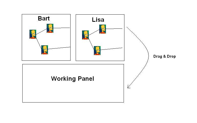
To visualize the pedigree we are going to use a hierachical tree structure where the nodes contain a photo of the corresponding person. First of all only the first person (in our case Bart or Lisa) is to be visualized. If the user wants to go deeper into the family hierarchy then he or she selects one of the childnodes so that an expansion takes places (so that the children of the selected node are going to be visible on the screen). In principle, the visualization works as seen on http://prefuse.org/gallery/treeview/
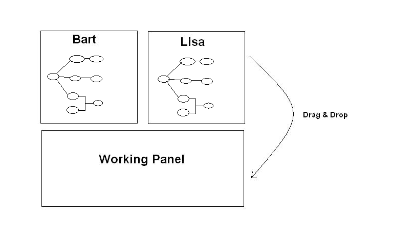
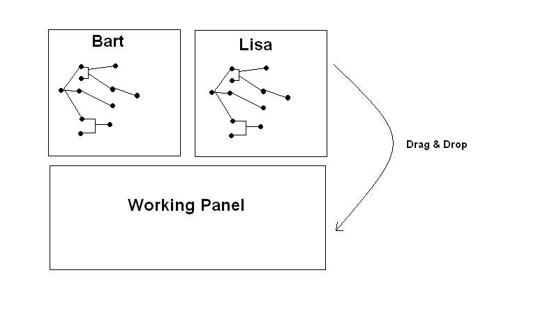
To close such an expansion the user has only to click on the corresponding node. If the screenspace is too small for further expansions the visualization will be converted into perspective wall, focusing only on a certain region. Because of the fact that two pedigrees should be developed (one for Bart and one for Lisa) we have to split the screen into two separate regions where each tree will be displayed. Furthermore a third screen region will be provided. This region works as a working panel at which the user can drop some nodes of the trees into it to make some comparisions. The explanation for this follows in a later section.
Visual Mapping
Next, we explain how the different data dimensions are translated into visual attributes:
Family relationships
These relationships are visualized by the edges between the nodes
Blood relatives or family members by marriage
To make a distinction between blood relatives and family members by marriage we use a different border colour of the photo. For example: if someone is a blood relative then the border of his treenode (which shows a photo from e corresponding person) looks like this:
In addition the colour of the outgoing edges could also be in the colour of the photo border.
Dead
Next if someone is dead, then were are going to visualise the corresponding tree node like the following one so that the user will see immeadiately if someone is still alive or not.
Relation between a couple
To see, if a couple is married, divorced or if there is only a relationship between them, serveral symbols could be used to express this. These symbols will be displayed between the corresponding persons (man and woman in general). Well, the first symbol stands for marriage and the second one for divorce. If they are leading a relationship then no icon will be used (displayed between the two corresponding tree nodes).
Description of the used techniques/applied principles
Opportunities for interaction
Selection/Highlighting
To visualize the children of a certain node, the user has to click on the node, which automatically expands the tree and the immediate childnodes will appear on screen. Clicking on an expanded node closes its subtree and hides further descendants. If the tree visualisation becomes wider than the available screen space, the visualisation is converted into a perspective wall:
- Everytime the user moves forward, the focus moves onto this region. Older generations (to the left) move into the out-of-focus region of the perspective wall.
- If the user moves back without closing the front nodes, these nodes (younger generations, to the right) are moved into the out-of-focus region.
Explore
Another possibility to get an overview of the whole tree is zooming. If the user moves the mouse wheel backwards, it will zoom out. Zoom in works in the other direction. For example, at the last zooming out level, the user sees the whole pedigree (which will look like a connected scatterplott). This overview is also useful if the user wants to mark subsets of data the purpose of comparision.
By zooming in, the focus will move to a certain region, the will become bigger and the photos of the nodes will be visible again.
Abstract/Elaborate
To display detailed information about a specific person on demand, the user has to double click on a node. A pop-up window, which we call infobox, appears containing some information about the person. These informations are arranged in a table.
Comparison between parts of the pedigree
The user should be able to make some comparison in view of the underlying tree data. For this purpose it is necessary to offer the user some interaction mechanism which allows him or her to make such comparisons. Furthermore comparisons among various tree nodes should also be possible. To do so some nodes have to be selected and moved into the working panel. To make various comparisons a button list should be available for the user (e.g.: uottons for each/some person properties). If the user klicks at such a button, a corresponding visualisation will be created.
Temporal plot of the satisfaction (one person)
In this visualisation the satisfication of some family member (because it may change during the course of life) will be plotted. For this purpose a time-series plot will be used, where the scale of the x-axis contains the time and the y-axes the scale of satisfaction (very low - low - medium - high - very high). So the user has insight about which person has changed its corresponding satisfaction over time.
This plot is visible in the detailed infobox of a person which means that the user has to open the normal infobox. Furthermore if the user wants to look at the plot, he or she must click at a button, so that an expansion of the infobox takes place. As a result, the detailed infobox with the corresponding plot appears. Furthermore a comparision between various persons is also possible. For this purpose the user will select some tree node and drop them into the working panel. As a result the infobox for each selected node will be visible in this panel.
Temporal plot of the satisfaction (more than one person)
Its like the plot in the detailed infobox, except that lines for more than one person are going to be drawn. To make a distinction between which persons belong to Lisa's tree and which family members belong to Bart's tree, two different colors for the lines will be used.
Comparison of major events
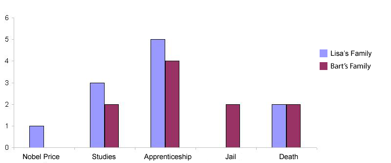
A comparison of the major events in view of the selected persons should be made. For this purpose a simple barplot will be drawn. Each bar stand for an appearing event (X-axes) in view of the tree node selection. The incidences of the events will be mapped on the Y-axes. If the selection contains different nodes (from Bart's and from Lisa's tree) then for each event two bars (with different colors) will be plotted (the one bar says, that this event has occurred in Lisas family and the other one says, the event occurred in Barts family). So the user has an overview of the major events and sees if one event occurred also in the other family. The following figure gives an example for such a barplot (which will be displayed in the working panel of the main window)
Mockup(s)/Fake Screenshots
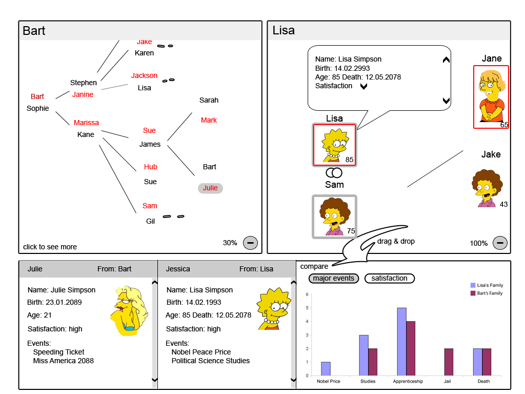
Here is a screenshot of the pedigree visualization program. At the top there are the two pedigrees of Bart and Lisa Simpson. On the left the zoom factor is less big than on the right side. On the bottom you can see the comparison pane and the persons who are compared in detail. To get the person out of the pane it is just necessary to drag it and then drop it outside the pane. All tables and information panes are scrollable.
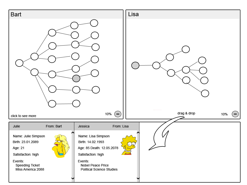
At this screenshot the zoom-factor is very small to see the whole pedigree. The pairs are viewed as one single bubble.
User support in their tasks
The user can decide how detailed the view of the pedigree is and what type of information he wants to view. It is possible to view two pedigrees, e.g. of Lisa and Bart, at the same time. The handling is intuitive and only needs clicking and scrolling. The number of generations can easily be seen by a lower zoom factor. The comparison pane supports the user in detailed comparison of many persons. This is possible by simple drag and drop of the person into the pane.
Specificities
In this pedigree visualization it is possible to view the portrait of the persons. It is also possible to visualize the feeling of a single person in a chart.
Pros and cons of the used technology
The used technologies enables the user to simply navigate throw the pedigree. The navigation techniques are mostly intuitive and easy to learn.
Possible expansions and improvements
A possible improvement would be to think about more mechanism for comparisons between two pedigrees (e.g.: lifetime-plot which shows in a plot birthday, lifetime and eventually the year of death for the selected persons. So the user would gain a temporal overview in view of the family members).
