Teaching:TUW - UE InfoVis WS 2009/10 - Gruppe 09 - Aufgabe 2
Jump to navigation
Jump to search
Aufgabenstellung
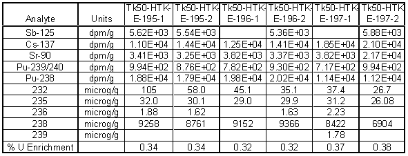
Zu beurteilende Tabelle
Review of the Existing Table
We have reviewed the table above based on Stephen Few's work "Show Me the Numbers: Designing Tables and Graphs to Enlighten" which contains some important rules and advices in view of designing tables.
- A grid is used to delineate columns and rows of the table, which should be avoided as grids break up the data.
- Rules are used to form a boundary around the entire table, which should be avoided if white space permits.
- Numbers in scientific notation are hard to read and not easily comparable to each other.
- Numbers are not aligned properly (numbers that represent quantitative values should always be aligned to the right)
- The headers should be aligned with the associated data. This is international.
- Placing a comma to the left of every three whole-number digits would improve the readability.
- The readability would also be improved if for each value the same number of decimal digits is going to be used, even when they are zeroes.
Enhanced Table
Changes to the Table
- The table has been split into two separate tables, as the numbers of the two blocks are not comparable.
- The grid has been removed, as delineation of columns and rows is its least effective use [Few, 2004]. Only the header areas are separated from the body of the tables using rules.
- Columns and rows are delineated using white space only, which enhances readability [Few, 2004].
- The U-235 enrichment column is delineated from the rest of the body, as it is a calculated value based on the other columns.
- A percent sign was added to each value in the U-235 enrichment column because percentages are used less often than other units of measure, so it’s easy when reading down columns of numbers to forget that you’re looking at percentages [Few, 2004].
- Numbers are aligned to the right.
- The Unit-column has been removed, because they should be part of the headers [Wallace, 2005]. In our case the units are now part of the spanner headers.
- In general, text should always be aligned to the left! Furthermore one exception to the practice of left alignment works well for columns of text: when the entries each consist of the same number of characters and the column header consists of several more characters than the text entries [Few, 2004]. So I think it also works very well in view of numbers.
Referenzen
[Few, 2004] Stephen Few. Show Me the Numbers: Designing Tables and Graphs to Enlighten. Analytics Press, 2004, Chapter 8 – Table Design
[Wallace, 2005] Rosa Wallace. Designing Tables. http://www.ncsu.edu/labwrite/res/gh/gh-tables.html

