Teaching:TUW - UE InfoVis WS 2009/10 - Gruppe 08 - Aufgabe 4
Aufgabenstellung
Zu erstellende Visualisierung
- Stammbaum der Nachkommen von Lisa und Bart Simpson*
...Visualisierung der Nachkommen von Lisa Simpson sowie der Nachkommen von Bart Simpson. Dabei sollen zwei Stammbäume entstehen - einer von Bart und einer von Lisa - die dann miteinander verglichen werden können. Zuerst kommen Lisa und Bart, dann deren Kinder, ihre Enkel, etc. (mind 4 Generationen). Da es noch keine Nachkommen gibt, können diese frei erfunden werden.
Die Visualisierung soll folgende Informationen darstellen:
- Verwandtschaftsverhältnisse (zumindest Eltern-Kinder),
- Unterscheidung zwischen Blutsverwandtschaft und angeheirateten Familienmitgliedern,
- Geburts- und Todestag sowie Lebensdauer von allen Familienmitgliedern,
- wichtige Ereignisse im Leben jedes Familienmitglieds (z.B., Anzeigen, Gefängnisaufenthalte, Schulzeit, Studienzeit, Nobelpreise, Arbeitslosigkeit etc.)
- Zufriedenheit jedes Familienmitglieds (Skala: sehr niedrig - niedrig - mittel - hoch - sehr hoch); kann sich im Laufe des Lebens ändern.
Die Visualisierung soll die interaktive Auseinandersetzung mit den Daten ermöglichen. Verpflichtend: Möglichkeiten zum besseren Vergleich von einzelnen Abschnitten der Stammbäume bzw. Vergleich von Ausschnitten aus Lisas und Barts Stammbäumen. + mind. 2 weitere Interaktionsmöglichkeiten (z.B., Details on Demand, Filteroptionen)
Allgemein:
- Die Daten sollen zur Analyse von Zusammenhängen zwischen Familienverhältnissen, wichtigen Ereignissen und Zufriedenheit visualisiert werden (die Anwendungsgebiets- und Zielgruppenanalyse kann kurz gehalten werden).
- Die bisher erlernten Design-Prinzipien sollen umgesetzt werden z.B.: Optimierung der Data-ink ratio (keine Comics!), visuelle Attribute (Größe, Farbe, Position, etc.) sollen sinnvoll eingesetzt werden (Information darstellen).
- Die Mockups sollten zumindest 1) die beiden Stammbäume im Überblick und 2) eine detaillierte Vergleichsansicht von 2 Teil-Stammbäumen wiedergeben.
- Alle nicht angeführten Daten können frei erfunden werden.
Links
Point A: Description of application area, data, target group and tasks
Application area and data
A family tree is a chart representing family relationships in a conventional tree structure. The tree shows the parents-children connection. The tree should show detail information of a person as well as important events and emotions (happiness). The family tree should visualize hierarchical structures. In our case we will add some additional information as hereditary diseases.
Target group
The target audience of this visualization would be:
- family members of the Simpsons
- characters of the Simpsons-Universe
- cast and crew of 'The Simpsons'-Television-Show
No, seriously:
- just folks who are interested - the family tree data is fictional anyway. Laymen, no prior knowledge needed.
Target group for family trees are usually people, who would like to know more about specified family relationships. It serves as well for next family generations who would like to know more about their family members. The family tree is also very useful for medical matter because hereditary diseases are shown (epilepsy).In our case the target group is each person who would like to know more about The Simpsons characters.
Goals
- The tree should be made very simple so everybody could be able to read the most important information about each person listed on the tree.
- For the visualization of the data we will use miscellaneous visual attributes and high data-per-ink ratio. The goal is to keep the reader focused on the important information and give him maximum information about the persons and their relationships among each other on the tree.
Point B: Concept

Type of Visualization
The family tree is visualized by the use of a hierarchical graph - in our case not to be mistaken for a tree since we have more than one higher-ranking node (= two parents) for each node.
We wanted the root (Lisa and Bart) at the top of the visualisation to highlight that everything else (the offspring) follows unidirectional (-- in reality: time, in our visualisation: vertical axis).
Visual mapping / Visual Attributes
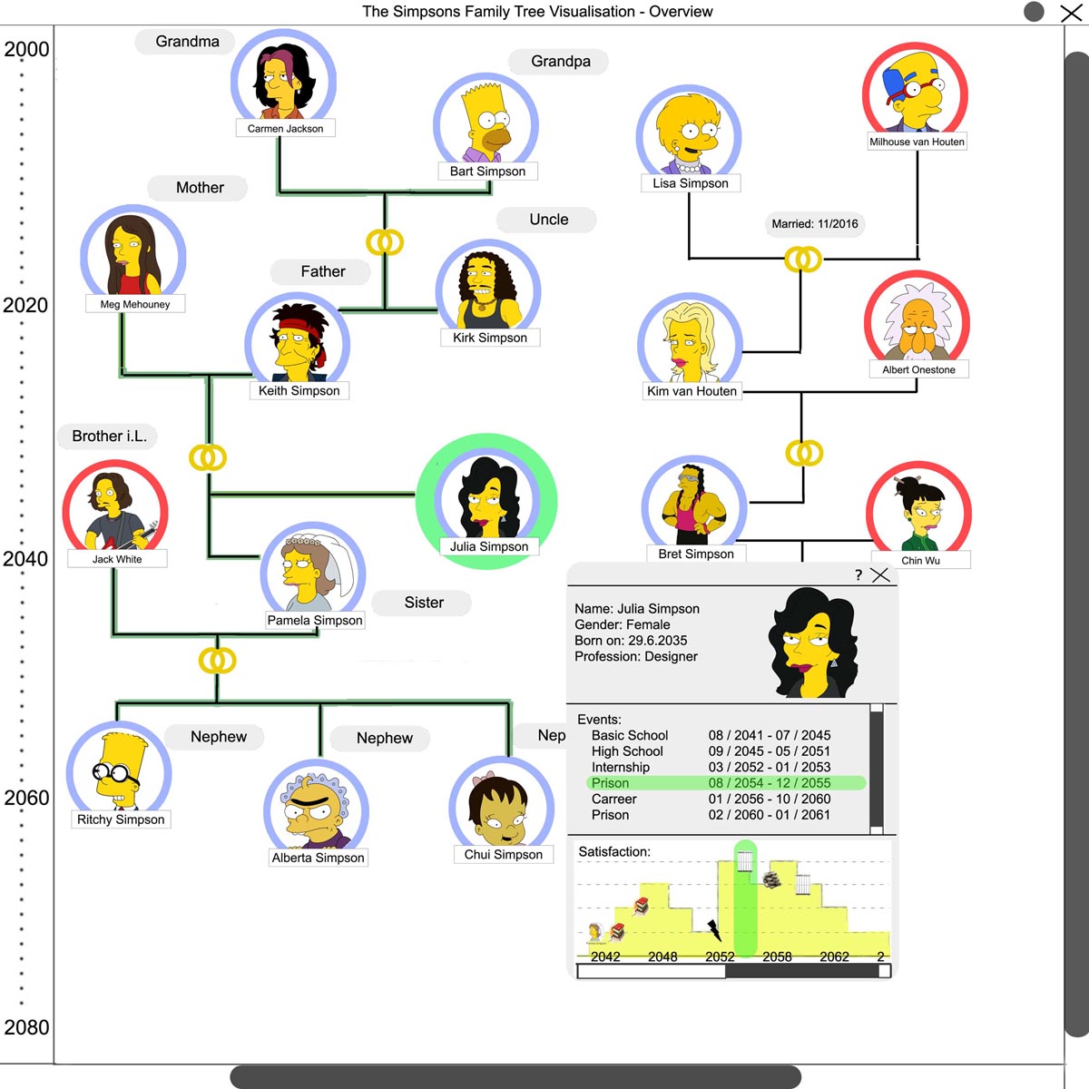
Blood relationship -> Annulus (around portrait)
Blue Annulus = existence of blood relationship
Red Annulus = no existence of blood relationship
Explanatory statement: Since the blood relationship to Lisa and Bart is a key information we decided to choose an Annulus around the portraits. In that manner it is fast to extract this particular information for the viewer.
Marriage -> dual wedding ring symbol (between two parents of a child)
dual wedding ring symbol = the parents are/were married with each other.
Explanatory statement:In many cultures two interlooped wedding rings are a symbol for marriage. [1]
Relationship -> Black persistent lines
Horizontal black persistent lines between persons indicate relationship based on partnership.
Vertical black persistent lines between persons indicate relationship between parents and their child/children.
Relationship -> Black dashed lines
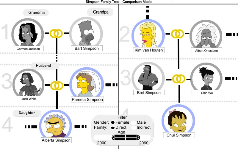
Horizontal black dashed lines in Comparison Mode indicate not shown siblings (due to eg. zoom level).
Vertical black dashed lines in Comparison Mode indicate indirect parent-child-relationship - meaning one or more generations inbetween the dashed lines are left out.
Interaction
Navigation
Navigation takes place via mouse controls. A modifier key on the keyboard is also used ('Control'-key). The program starts in the Overview mode showing the whole family tree.
Mouse-hovering over a person brings up a popup window revealing all kinds of person-related information (name, gender, birth date, profession, events, satisfaction graph). Selecting an event item in this popup-window causes highlighting the corresponding time-section in the satisfaction graph.
Selecting more than one person via 'Control'+Left-Mouse-Button-clicking several persons or drawing a selection frame around several persons (- via holding Left-Mouse-Button and moving the Mouse). Via 'Enter'-key on the keyboard the selected persons are shown in the Comparison Mode - non-selected persons are left out by dashed black lines (- see text on Visual Mapping).
Zooming and Panning
In the Comparison Mode the program allows for each split side (left and right) a separately adjustable zoom level and area by panning. A change of the zoom level is accomplished by the use of holding the 'Control'-key on the keyboard and turning the mouse wheel. Panning is accomplished by holding the left mouse button and moving the mouse in direction of desire.
Split Screen Mode
The Comparison Mode splits the window into two separate sub-windows to allow for separately adjusting (by zooming and panning) the region of interest for each side (= lisa as well as bart) of the family tree.
Note that without any character selected, the family relationships is not shown. In that case, moving with the mouse over a character causes the system to show the relationships relative to this character (e.g. Alberta Simpson is labeled as Pamelas daughter when the user moves the mouse over Pamelas picture, as shown in Figure 2).
Dynamic Queries
There are several search queries the user can choose from - they are accessible in the Comparison Mode.
One filter in the comparison mode allows the user for filtering with the help of regular expressions - this searches for matching strings in all data fields in the family tree and highlights the corresponding persons.
More filters:
- filter by gender
- filter by Blood relationship (- blood related? Yes/ No.)
- filter by time range (- see section 'Range Slider' below)
Range Slider
The user can choose an arbitrary range of time to show the family tree only in the corresponding range.
Details on Demand
On user demand the information of a person in the family tree is shown in a separate popup window. This window is divided into three different parts. One third shows the name, gender, date of birth and profession. The second one shows all mentionable events in the lifetime of the person - the last third of the window visualizes the 'satisfaction-over-time'-graph.
As you can see, the 'satisfaction-over-time'-graph also includes various icone, representing the previous mentioned events. When the user moves the mouse over these icons, additional informations is shown. The system should include a set of predefined icons (e.g., school, career, prison) as well as a symbol for other events (e.g. internship in our graphic). If the user is not familiar with these icons and needs help, it is possible to display a legend via the help-symbol (?).
Focus and Context
Usage of the Dynamic Queries causes the program to focus on the matching search results. The search results are visualized by adding a mask layer on top of the family tree, allowing only for the resulting persons to be shown clearly through the mask layer - the non-matching persons are overlaid by the dark but opaque layer.
How are the users supported in their tasks?
A top priority for the team was to create a great experience for the user by making the controls as intuitive and easy to use as possible. Many of the Navigation Methods (left-clicking / zooming and panning) are commonly known from surfing the internet. Moreover an extensive help documentation is supplied with the family tree software package.
What special features are there?
Dynamic query search with regular expression engine, range slider for time filtering, intuitive easy-to-use-interface, clear design (with priority on data-ink-ratio)
References
-[Ball, 2004]: Robert Ball, Details on Demand vs. High Resolution, 2004.
-[Shneiderman, 1996] Ben Shneiderman, The Eyes Have It: A Task by Data Type Taxonomy for Information Visualizations. In Proceedings of the IEEE Symposium on Visual Languages, pages 336-343, Washington. IEEE Computer Society Press, 1996.
-[Card et al, 1999] Card, S.K., Mackinlay, J.D., and Shneiderman, B. (Eds.) Readings in Information Visualization: Using Vision to Think, pp. 1-34, Morgan Kaufmann Publishers, San Francisco, Califomia, 1999.
