Teaching:TUW - UE InfoVis WS 2009/10 - Gruppe 06 - Aufgabe 4
Aufgabenstellung
Zu erstellende Visualisierung
- Stammbaum der Nachkommen von Lisa und Bart Simpson*
...Visualisierung der Nachkommen von Lisa Simpson sowie der Nachkommen von Bart Simpson. Dabei sollen zwei Stammbäume entstehen - einer von Bart und einer von Lisa - die dann miteinander verglichen werden können. Zuerst kommen Lisa und Bart, dann deren Kinder, ihre Enkel, etc. (mind 4 Generationen). Da es noch keine Nachkommen gibt, können diese frei erfunden werden.
Die Visualisierung soll folgende Informationen darstellen:
- Verwandtschaftsverhältnisse (zumindest Eltern-Kinder),
- Unterscheidung zwischen Blutsverwandtschaft und angeheirateten Familienmitgliedern,
- Geburts- und Todestag sowie Lebensdauer von allen Familienmitgliedern,
- wichtige Ereignisse im Leben jedes Familienmitglieds (z.B., Anzeigen, Gefängnisaufenthalte, Schulzeit, Studienzeit, Nobelpreise, Arbeitslosigkeit etc.)
- Zufriedenheit jedes Familienmitglieds (Skala: sehr niedrig - niedrig - mittel - hoch - sehr hoch); kann sich im Laufe des Lebens ändern.
Die Visualisierung soll die interaktive Auseinandersetzung mit den Daten ermöglichen. Verpflichtend: Möglichkeiten zum besseren Vergleich von einzelnen Abschnitten der Stammbäume bzw. Vergleich von Ausschnitten aus Lisas und Barts Stammbäumen. + mind. 2 weitere Interaktionsmöglichkeiten (z.B., Details on Demand, Filteroptionen)
Allgemein:
- Die Daten sollen zur Analyse von Zusammenhängen zwischen Familienverhältnissen, wichtigen Ereignissen und Zufriedenheit visualisiert werden (die Anwendungsgebiets- und Zielgruppenanalyse kann kurz gehalten werden).
- Die bisher erlernten Design-Prinzipien sollen umgesetzt werden z.B.: Optimierung der Data-ink ratio (keine Comics!), visuelle Attribute (Größe, Farbe, Position, etc.) sollen sinnvoll eingesetzt werden (Information darstellen).
- Die Mockups sollten zumindest 1) die beiden Stammbäume im Überblick und 2) eine detaillierte Vergleichsansicht von 2 Teil-Stammbäumen wiedergeben.
- Alle nicht angeführten Daten können frei erfunden werden.
analysis
application area
This graph is about family-tree visualization, where parents-children connections should be shown. It should not just be about family relations, but also be about individual happenings and feelings. The family tree should visualize hierarchical structures. As already mentioned the tree should not only contain family relations, but also individual content and most important is, that the tree should be interactive:
- show detail information of a person, if demanded
- enable detailed comparisons of a section
dataset
- Sex is a nominal data because it cannot be ordered in a meaningful way. Both genders are equivalent. Additionally, the gender is a binary value (being male or female).
- The date of birth and death are ordinal values, because of the chronological order. In reality continual, we simplified the modelling by leaving out the time of birth. So are only discrete values are possible.
- The contentedness of a person is a discrete value, there are three different values possible (good, neutral, bad). It is 2-dimensional, because the contentedness is dependent on the time (what makes it temporal too) and of the value (good, bad, neutral).
- Important happenings are temporal, because they change by time.
- Text data like first and last name is a nominal value.
- The family tree itself has a hierarchical data, the ancestors are on top and are followed by their children, grand children etc. Relations of the same generation (partners, siblings) are shown on the same level. The hierarchy is shown implicitly, no extra hint is made.
target group
In general, the main target group are descendants, who want to know more about their ancestors and not just who they are / were, but it could be also interesting for everyone, who wants to know more about the specified family. (In this case it would be interesting for all serious Simpsons fans, who want to know everything about their favorite characters). But in general this type of family tree contains some very sensitive data (like criminal records) and shouldn't be viewed by everyone due to privacy reasons.
use of visualization
To show relations a graph is much better than a table. So the primary aim of the visualization is to show relations between the family trees. An interesting aspect in this visualization could be, that there could be some time shift between different generations. For Example: 4.generation child from one parent could be as old as 3.generation from another parent.
questions getting answered by visualization
- Who were my ancestors?
- Who is related with me?
- Were my ancestors lucky with their lives?
- Did some happenings change their contentedness?
- How long did they live or are they still alive?
- What special happenings did they have in their lives?
concept
techniques used
We like to see our family-tree as computer application (maybe just a internet page), because it's very easy to create and very easy to use interactive applications on computer-systems and almost everyone should be familiar with it.
family tree
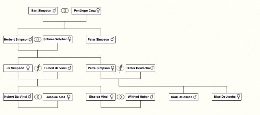
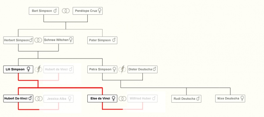
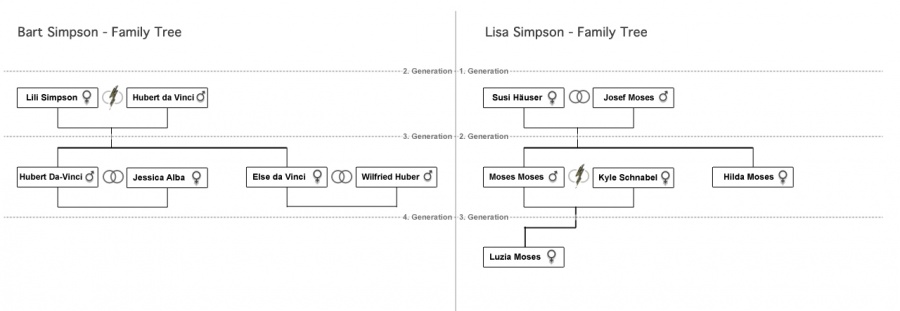
The family relationships are shown in a classical tree view. Generations are shown in one line. To show relationships a conduit is used, for example: Between two persons, who get children a conduit is used, a conduit is also used between those parents and their children and so on.
The family-tree overview contains following data:
- Name of the person
- Conduit and position are showing relations
- Conduit also shows if person is related by marriage
- Sex is shown by color background
timeline
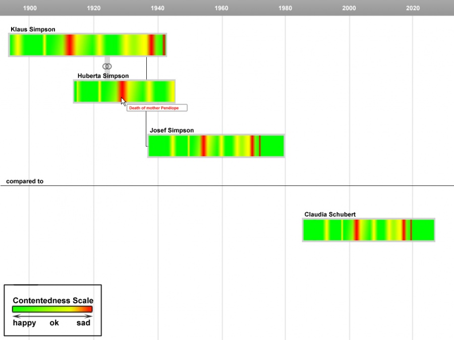
To bring a time dimension into our application, we included the so called "timeline mode". This is a special compare view, to show time differences between different persons. In the timeline mode you can see, when a person, was born, died, which mood he/she had, when he/she was alive, and also relations between married and blood relatet persons are visible.
mouse over effect
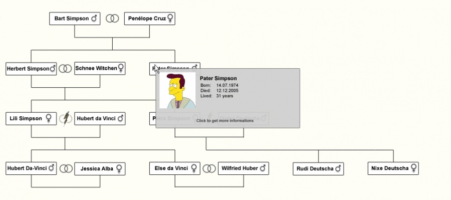
By sliding with the mouse cursor over a member of the family tree a pop up window appears with short informations about the specified family-member. If more information is needed, one can click on the window, to show more detailed information about the person. An advantage of this method (nesting) is, that sensitive data can be preserved with a password. A Disadvantage is, that it could be more inconvenient to use the application. Therefore a login-system would be very helpful.
The hover field contains following data:
- Picture, if available
- Name
- Sex
- Date of birth
- Date of death
detail information
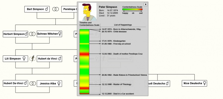
By clicking on the popup-window button in the hover menu an extra pop-up window appears, in which all the registered data of the person shows up. The Contentedness-scale also has a mouse over effect: When sliding with the mouse over a specific time (from left to right) it shows the nearest happening from the happening list.
The detail information contains following data:
- All the data shown in the popup window
- Contentedness-scale
- Important happenings
additional interactivity
To increase the number of possibilities for user interaction a filtering and sorting mode was added to the Mock-Up's. The user can sort and filter name, date, etc.
comparison view
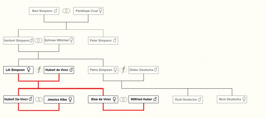
To compare specified family tree details a member of the tree has to be selected at first. This happens by double clicking a specified member. To compare with another family tree just double click a member of the other family tree to get into the comparison view. There the two specified family tree's are going to be compared. Also different generations can be compared.
explanation
We used hierarchical trees to visualize the realtions between the persons, because it is the easiest and most common way to do it. Everybody can relate to it. To visualize gender and marriage/divorce we used symbols. As an additional mode we used the timeline mode to ease the comparisons. For the Contentedness-scale we used the colors green to red, because green is naturally related to good and red to bad/angry. We used the mouse-over effect to show the events so that the user has the feelings and the related event combined and also the time aspect.
