Teaching:TUW - UE InfoVis WS 2009/10 - Gruppe 05 - Aufgabe 3
Aufgabenstellung
Zu verbessernde Grafik
Kritik
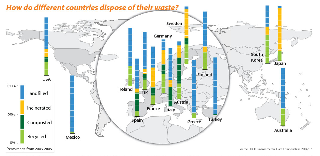
The given graph lacks a few design principles. The first one is the background. It is non-data ink, because the visual information of world map is unnecessary for readers. The important information in this graph, the so called data ink, should be waste management of different countries. The loupe attracts the attention of the reader. The data in this visual cue becomes more important than the outside data, which gives the outside data less visual weight, though the information outside the loupe is as important as the inside information. Cutting of the border around the legend could save unnecessary data ink. The font used for labeling the four possibilities of waste disposal is also used for the data. This case makes the importance of the legend equal to the main data. Another disadvantage in the original graph is the bars. It is hard for the reader to get the raw numbers or even to compare the data.
Redesign
Vorgenommene Verbesserungen
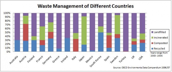
First we reduce the non-data ink, which means that we remove the background and the loupe. Second we estimate the percentages of each waste disposal type for every country. The results are four colored bars, which present the different opportunities of waste management for each country. We sorted the countries by name in a descending order. These bars we drew in a table. At least we modified the title. The new title is short and precise. Our redesign of the given graph is clearly arranged and leads the reader´s eyes to what is important. The comparison of countries is quite simply. In the first table it is easy to estimate the percentages with the help of the horizontal lines and their labels. We created a clear and powerful message with our redesigned graph.

