Teaching:TUW - UE InfoVis WS 2009/10 - Gruppe 05 - Aufgabe 2
Aufgabenstellung
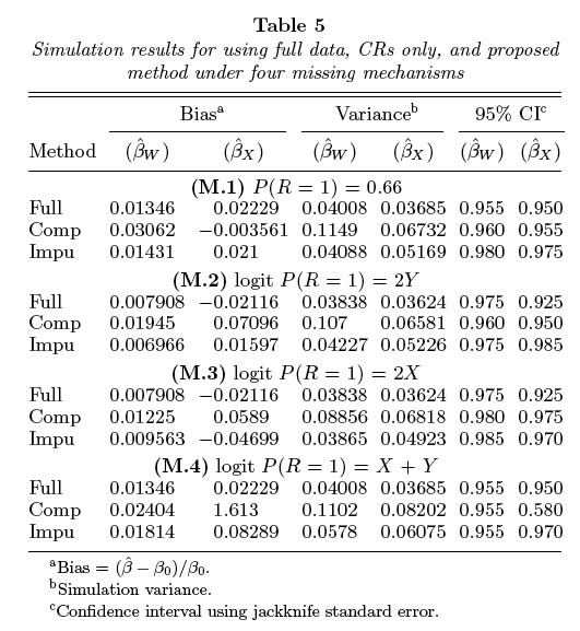
Zu beurteilende Tabelle
Kritik der vorliegenden Tabelle
The given table lacks grouping and white areas for spacing of any kind, making it difficult to sort through the list.The table number is above the title. The table number should always be in the same line as the tiltel.For table notes it´s best practice to use an asterisk (*) for the first note, two (**) for the 2nd, three (***) for the 3rd or a stacked cross. The given table uses letters to refer to table notes. Table notes should start with the initial word Note: under the table. The stubhead Method is to close to the column spanner and column heads, making it hard to see where it belongs. The given table uses too much digits of decimal precision.
Verbesserte Tabelle
Vorgenommene Verbesserungen
To accomplish the task of ease and speed, our table uses new grouping and white areas for spacing between the data in order to break the list apart and make it easy to follow. We switched the stub header + stubs with the column spanner and column heads to get a new table grouping to make it easy on the eyes. We adjusted the tilte and the table number in the understanding of best practice. We rounded the numbers to a maximum of three decimal places.

