Teaching:TUW - UE InfoVis WS 2009/10 - Gruppe 04 - Aufgabe 4
Aufgabenstellung
Zu erstellende Visualisierung
- Stammbaum der Nachkommen von Lisa und Bart Simpson*
...Visualisierung der Nachkommen von Lisa Simpson sowie der Nachkommen von Bart Simpson. Dabei sollen zwei Stammbäume entstehen - einer von Bart und einer von Lisa - die dann miteinander verglichen werden können. Zuerst kommen Lisa und Bart, dann deren Kinder, ihre Enkel, etc. (mind 4 Generationen). Da es noch keine Nachkommen gibt, können diese frei erfunden werden.
Die Visualisierung soll folgende Informationen darstellen:
- Verwandtschaftsverhältnisse (zumindest Eltern-Kinder),
- Unterscheidung zwischen Blutsverwandtschaft und angeheirateten Familienmitgliedern,
- Geburts- und Todestag sowie Lebensdauer von allen Familienmitgliedern,
- wichtige Ereignisse im Leben jedes Familienmitglieds (z.B., Anzeigen, Gefängnisaufenthalte, Schulzeit, Studienzeit, Nobelpreise, Arbeitslosigkeit etc.)
- Zufriedenheit jedes Familienmitglieds (Skala: sehr niedrig - niedrig - mittel - hoch - sehr hoch); kann sich im Laufe des Lebens ändern.
Die Visualisierung soll die interaktive Auseinandersetzung mit den Daten ermöglichen. Verpflichtend: Möglichkeiten zum besseren Vergleich von einzelnen Abschnitten der Stammbäume bzw. Vergleich von Ausschnitten aus Lisas und Barts Stammbäumen. + mind. 2 weitere Interaktionsmöglichkeiten (z.B., Details on Demand, Filteroptionen)
Allgemein:
- Die Daten sollen zur Analyse von Zusammenhängen zwischen Familienverhältnissen, wichtigen Ereignissen und Zufriedenheit visualisiert werden (die Anwendungsgebiets- und Zielgruppenanalyse kann kurz gehalten werden).
- Die bisher erlernten Design-Prinzipien sollen umgesetzt werden z.B.: Optimierung der Data-ink ratio (keine Comics!), visuelle Attribute (Größe, Farbe, Position, etc.) sollen sinnvoll eingesetzt werden (Information darstellen).
- Die Mockups sollten zumindest 1) die beiden Stammbäume im Überblick und 2) eine detaillierte Vergleichsansicht von 2 Teil-Stammbäumen wiedergeben.
- Alle nicht angeführten Daten können frei erfunden werden.
Links
part a
1. used application area and datas
application analysis
- The used family tree analysis helps to visualise Bart and Lisa Simpsons´ pedigree until the fourth generation including detailed information like the date of birth, relations inbetween each others, etc. according to each certain person. Supportingly color represents the satisfaction of each family member. The final tree should allow to compare single sections with each others.
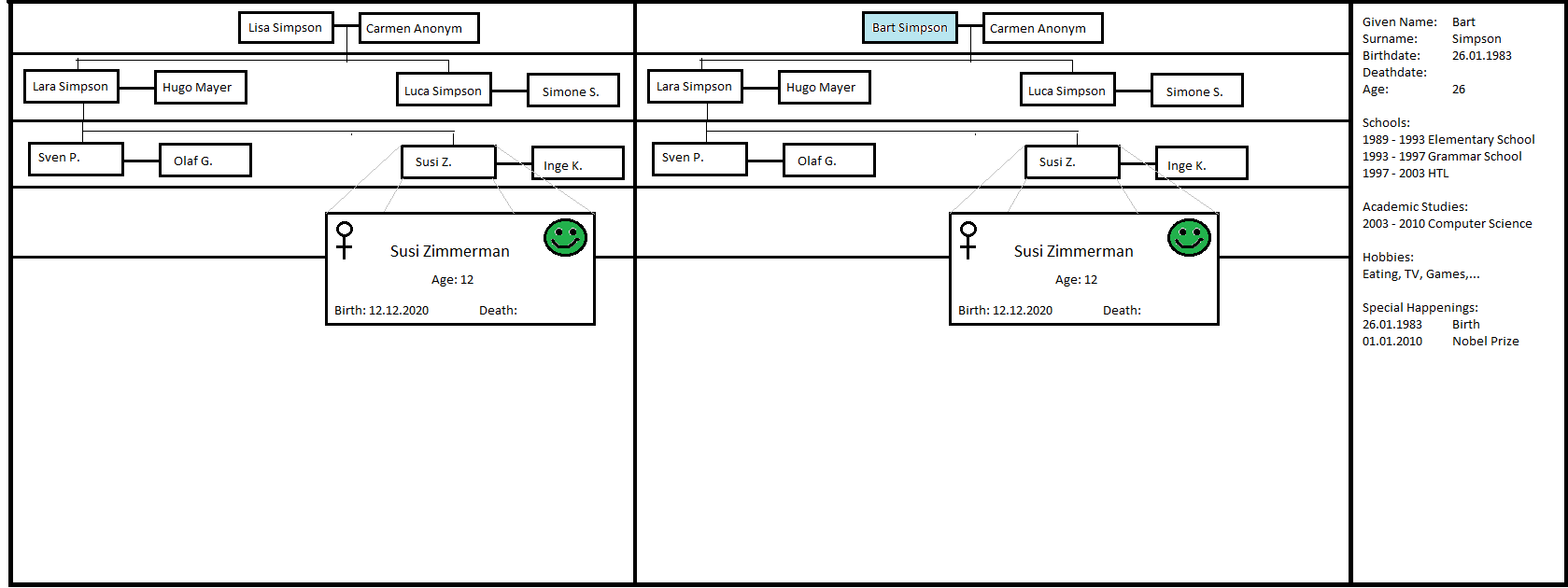
- On the first sight you get a general overview of the family tree. Selecting one name you see the name colored and get all available information of the selected person on the right of the table.
- Bold lines --> seperate different generation
- Thin lines --> connect directly related family members. Horiuontally it represents a relation of two, vertically a parent-child relationship by blood.
Moving over a name you get closer information in a separated box such as bmood, sex, birthdate and age.
- Gender --> Sex is displayed on the top left corner by the international symbols for men and women
- Mood --> in the top right corner. There are 5 different moods available
Besides single clicks you get more information by a double click on the double click on the empty stace, a timeline to kind of sort the happenings,etc. (Coser ininformation below in part b)
data analysis
- Data types:
- Family tree itself --> hierarchical structure
- Names --> nominal values
- Gender --> nominal
- Date of birth --> ordinal vaues
- Date of death --> ordinal values
- Important events --> temporal value
- Mood --> discrete ordinal datas
2. analysis of the target group
- In general this type of visualization of the family tree mainly adresses future family members of psychoterapists.
- The information you gain concerns information in general that is very superficial and unpersonal, whereas the color underlined envelopment of satisfaction gives a very personal view of the family member. For this reason it will just be related persons or professions with an interest of the psychical side of a person and their past.
- Different ways of visualization:
- The most current and best known way of the visualization of relations between families is the form of a directed graph (gerichteter Graph), whereby generations are ranked by the age from down to up with the eldest family member on the bottom of the graph.
- The pedigree (Stammtafel) puts a person on the top of it to form the basis for the following members. The information is limited to the surnames and their marriage partners. The pedigree becomes confusing and unclear in the moment the family grows.
- Another display format of a listed pedigree (Stammliste/ Nachfahrenliste) which includes just family members with the same surname.
3. aim of visualization
- The aim of visualization is the creation of a clear, fast reproducible graphic to recognize relations between family members easy and clear. The additional information you get out of the visualization depends on the type of graph you chose.
- Unclear relations between family members may be recognized fast. i.e. adpoted children or stepparents.
- Different relationships that are possible between the members of a family should be shown in a graphic.
Concept
Our program has multiple views which can be used to present the data needed for a certain purpose, because not all data available is needed all the time.
Our first view is a classical hierarchical presentation of the family tree.
This view is used to get a brief overview of the family tree, how big it is, who is related by blood and who is not.
On the right side of the screen is an information area which presents all available information for the current selected person. The data displayed can be configured. The current selected person is colored, e.g. in light blue.
The screen is devided by horizontal lines, each section is presenting a new generation.
Connected horizontal names represent a relationship of the two. Conntected vertical names represent the parent - child relationship, which also represents a relation by blood.
When moving over a name with the mouse a new, small, window is displayed, which contains some detailed informations of the specific person. Details like mood, sex, birthdate, deathdate and age are displayed.
Sex is displayed in the top left corner. The international symbols for man and woman are used.
The mood is displayed in the top right corner.
There are 5 different moods available.
- Very high - displayed with a happy smiley and the color green
- High - displayed with a happy smiley and the color light green
- Medium - displayed with a neutral smiley and the color yellow
- Low - displayed with a sad smiley and the color orange
- Very low - displayed with a sad smiley and the color red
In this view its possible to arrange 2 or more persons with their family trees. It is, for example, possible to arrange the family trees of Bard and Lisa side by side to compare the two family trees.
For more detailed comparisons its possible to compare different Persons or a whole generation whith just a single click.
To get to the next screenshot simply double click on an empty space in the first generation of the family tree.
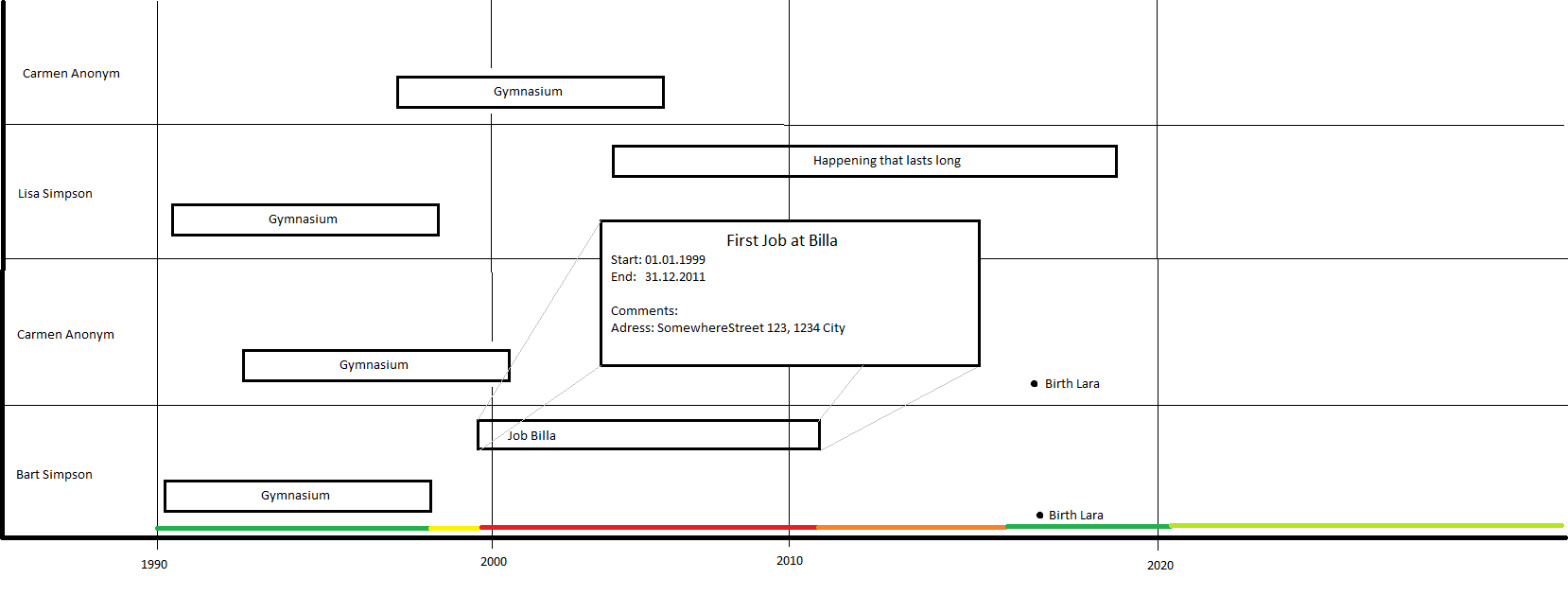
In the detailed comparison of a generation, e.g. the first generation of the family tree, we have a kind of timeline. From left to right is a timeline, which is used to "sort" the happenings according to their appearance. From top to bottom are all family members from the first generation.
In the comparison we have a "container" which contains a short information of the happening, e.g. Grammar School.
The start and the end of the timeline depends on the data available. If the data is available its also possible to compare the whole life of the selected generation / persons. The start of each container represents the date when it happened and the length represents the duration of the happening. Happenings that have a too short duration to have a container get a dot.
The timeline can be scalled to be more detailed or to just get an overview over a whole life. According to the granularity of the timeline, the containers are adjusted automatically to fit the actual timeline.
To get detailed information of a specific happening you just have to move the mouse over the container and a new window with detailed informations is displayed. To get all informations available for a specific happening, you can just double click on a container and a new window is opened with all informations, background informations, links (if possible),...
To represent the mood in the timeline, there is a special colored line which represents the mood at a specific point in time.

