Teaching:TUW - UE InfoVis WS 2009/10 - Gruppe 04 - Aufgabe 3
Jump to navigation
Jump to search
Aufgabenstellung
Zu verbessernde Grafik
Ausarbeitung
Criticism
Steven Few, Show me the numbers:
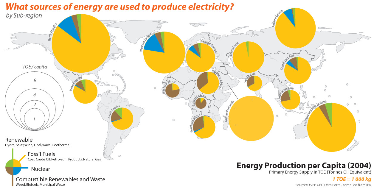
- Some of the circles cover the map behind which are supposed to convey important information. Thus decreasing or putting next to the map with a line connected to the country it is concerned to.
- The shape of a circle covers way too much information. The usage of a bar would give the same information without blocking that much.
- The real message/data is not supported in the Graph, which is against the task of visualizing quantitative information.
- It is not clear, which data has priority. TOE/capita? The sources of energy?
- There is no direction for order in which data should be read.
- The information-scale on the left can´t be taken as a referenc, because it is too far away from the circles.To decode the size of the circles it takes several steps: first compare the size with the scale, which is hard to tell, when the circles have no extreme. Secondly you have to look for an explanation for the shortcut "TOE". It is put somewhere under a title insted of underneath or put in parenthesis next to the TOE.
- The many colors are not necessary. It is better to work with forms and sizes.
- We are more sensitive to the vertical and horizontal alignment than we might imagine. Therefor we should use it to give more weight to the real content of the graphic.
- The unstrucstured ordering of the circled makes it difficult to separately scan the major content.
Steven Few, Elegance Through Simplicity:
- There is too much unnecessary ink used for the graphic, because the important values need less place in contrary to the borders around them. The greater the ratio of the ink that you use to communicate the data to the total amount of ink in the table or graph, the better you´ve highlighted the data.
Corrections
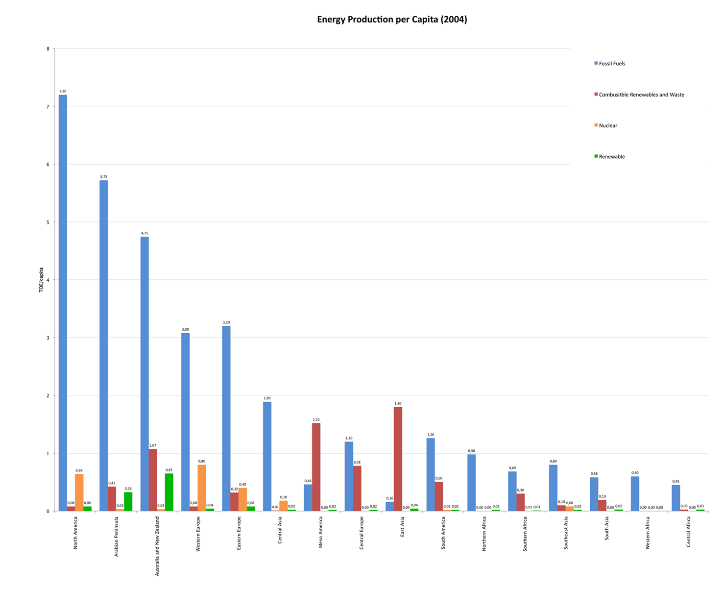
- The graph is reorganized by dividing the graph in three parts:
- TOE/capita plot in bars
- Types of energy by colors. Besides is the color scale - not round.
- Some explaning lines are added.
- The essential message of the graph and additional information is clarified.
- Main message: Most of the sources of energy is based on Fossil Fuel.
- Additional Message: Does the size of the country has a bigger effect on the used energy or does it more depend on the richness there or the mental relation to energy.
- The TOE/capita scale on the left side of the bars helps to read the scale. It does not go until infinity, but until the highest information we have. There is no need for an y-axis.
- Additionally the bars are ordered by their size. That way it is easier to compare and to read the content.
- Objects positioned on the right are less seen that objects positioned on the top. Therefor we put the titles underneath each other to introduce the graph.
New Table
References
- Stephen Few, Show Me the Numbers: Designing Tables and Graphs to Enlighten, Analytics Press, 2004, Chapter 7 - General Design for Communication.
- Stephen Few, Elegance Through Simplicity, intelligent enterprise, Oct 16, 2004.

