Teaching:TUW - UE InfoVis WS 2009/10 - Gruppe 02 - Aufgabe 2
Jump to navigation
Jump to search
Aufgabenstellung
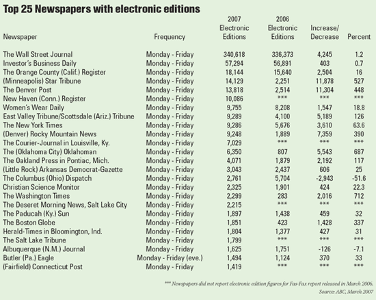
Zu beurteilende Tabelle
Critics concerning the table
The analysis (critics) and the synthesis (changes) are based on the guidelines for table design by Few [Few,2004].
- The background colour is useless and disturbing.
- The title of the table should describe the content in a more appropriate way (e.g. years or geographic restrictions).
- 'Frequency' is almost always the same, doesn't need to be an own column.
- Columns '2007' and '2006' should be switched in order to be increasing.
- The representation/description of the numbers with alignment-middle makes the readability difficult as well as the direct compareabilty.
- 'Percent' should include the percentage. The number of right-of-comma positions is not alike.
- The columns don't seem to belong to each other -> lines should be marked as groups via colour or space.
- The meaning/calculation of the column 'Increase/Decrease' is not so easy to be realised.
- Increases should be marked with “+”.
- "***" is inconvenient for missing data.
- Because the column represents a ranking, this should be realised.
- In the name/title of the Newspaper partly the region is shown. However this takes place in different ways. If this information is of essential importance this should be separated.
General remarks on the data:
- The time indicated in the source “ABC, March 2007” is not the same as the mentioned period of 2007, since it must be assumed generally that the data include the entire year 2007.
- The values for 'Increase/Decrease Percent' contain partly calculation errors (e.g. Denver post office in table 448%, correct 449.6%).
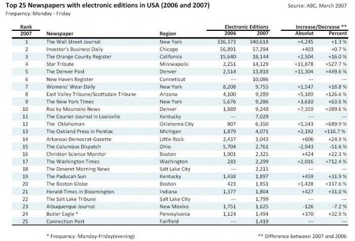
Corrected table
- The background colour was removed.
- The title of the table was supplemented that it concerns with Newspapers in the USA and the data originate from 2006 and 2007. The New title is "Top 25 Newspapers with electronics edition in the USA (2006 and 2007)".
- The column 'Frequency' was removed, and the standard stock of "Monday - Friday" is indicated as a subtitle. The only exception was marked by means of a footnote.
- Because the column represents a ranking, a separate column was added. So it becomes clear, according to what reference the ranking is applied (here 2007). Likewise an easier navigating is possible over the lines. So e.g. the Top 10 can be recognized easily.
- Because it can be assumed, that the information about the region of the appearance is important, a columne 'Region' was added. When the information was missing, it was search in the Internet and added.
- The columns '2007' and '2006' were exchanged, in order to get a chronological order.
- The values for '2006' and '2007' each represent Electronic Edition. A spannerheader was introduced.
- Because the column 'Percent' also indicate the parameter "Increase/Decrease", also a spannheader was included.
- The representation of the numbers were implemented a right alignment.
- With 'Percent' the percentage sign was added. The number of right-of-comma positions was adapted - uniformly a right-of-comma position.
- In order for a better readability of the numbers, the sign of the number(plus-sign)was also added with positive numbers.
- For a better structure the actual area for the values were seperated by rules.
- In order for a better directing with the horizontal scanning every second one was coloured in a quiet way.
- In the area of the footer the foot-notes were added.
- Not available values were marked with "---".
- For the clarification of the terms 'Increase/Decrease' a foot-note was added. Thus it shall become obvious, that the "Difference between 2007 and 2006” serves as a benchmark.
Remarks on the data:
- Since (with this exercise) the Design of the table is in the foreground, the sources were left without further comment.
- The values for 'Increase/Decrease-Percent' were corrected in the table.
References
[Few,2004]: Stephen Few, Show Me the Numbers: Designing Tables and Graühs to Enligthen, Analytics Press, 2004, Chapter 8 - Table Design

