Teaching:TUW - UE InfoVis WS 2008/09 - Gruppe 10 - Aufgabe 4
Aufgabenstellung
Gegebene Daten
Homer Simpson's Trinkverhalten in Abhängigkeit von seinen Lebensumständen
...Visualisierung von Homer's Lebensabschnitten bzw. Ereignissen mit Einfluss auf sein
Trinkverhalten (zB.: Kindheit, Pubertät, Arbeitslosigkeit, Beziehungen, Hochzeit, Geburt
der Kinder, Liebeskummer, Alltag, etc.) von seiner Geburt bis Jetzt + mögliche
Zukunftsszenarien (mind. 3).
- Die Menge folgender Getränke soll für die jeweiligen Lebensumstände ablesbar sein
(ml oder Liter - je nachdem - pro Tag, Monat, Jahr (z.B.: Fokus+Kontext Methoden):
 a) Wasser

 b) Milch

 c) Fruchtsaft

 d) Cola

 e) Kaffee (Würfelzucker?)

 f) Bier
(vereinfacht angenommen, Homer trinkt ausschließlich diese Getränke)
- Die folgenden Werte sollen abhängig von den konsumierten Getränken ablesbar sein:
 1) g oder kg konsumierter Zucker (aus Getränken) + empfohlene Maximaldosis pro Tag, Monat, Jahr
   (empfohlene Maximaldosis/Tag: 50g; enthaltener Zucker: 10g/100 ml Cola; 10g/100 ml Fruchtsaft; 3g/Würfelzucker).

 2) mg konsumiertes Coffein + empfohlene Maximaldosis pro Tag, Monat, Jahr
   (empfohlene Maximaldosis/Tag: 600mg; enthaltenes Coffein: 10 mg/100 ml Cola; 80 mg/100 ml Kaffee).

 3) g konsumierter Alkohol + empfohlene Maximaldosis pro Tag, Monat, Jahr
   (empfohlene Maximaldosis/Tag: 20g; enthaltener Alkohol: 3,6 g/100ml Bier)
- Die Daten sollen zur medizinischen/psychologischen Analyse visualisiert werden.
- Die bisher erlernten Design-Prinzipien sollen umgesetzt werden (z.B.: Optimierung der Data-ink ratio).
- Die Mockups sollten zumindest 1) Homer's Leben im Überblick 2) und eine Detailansicht wiedergeben.
- Alle nicht angeführten Daten können frei erfunden werden.
Links
Description of area of use, data, users, tasks and goals
Analysis of the Area of Use
The visualization is to be used in medical/psychological analysis of the patient Homer Jay Simpson. In this case the test person is an imaginary figure. That is why, the visualized data may seem impossible for a human being, since the data is fictional. What is more, such a tool should preferably show only the amount of sugar, alcohol and caffeine taken by the patient, since they are of interest for the treating doctor and not the actual liquids. However, we are speaking of Homer Simpson and his life and drinking behavior is pretty interesting, so it is of great importance to follow the patterns of his drinking behavior.
Analysis of the Dataset
There are 2 dimensions for the data used. Please note that the visualizing concept has more than 2 dimensions but all others are derived from the initial two and all their data values can be easily calculated. These 2 are described as follows:
- time
Time is a continuing unit. In this case it is divided in several parts, which mark the different periods in Homer J. Simpson's life. The units used in the graph are years, but there is data for every day in his life for the corresponding periods.
- volume
Volume is a discrete unit. In this case there are values for every day of Homers life, for every different liquid he consumes. The volume is measured in deciliters.
Having the values of these two dimensions and the table with the constant amount of alcohol, caffeine and sugar in each beverage, one can easily calculate the amount of alcohol, sugar and caffeine consumed.
Description of the Data Structures in the Dataset
The volume is divided in six different categories for the six beverages that are inspected. A possible data structure is a 2 dimensional array. For every cell of the array (day) there is another array with six cells, which hold the values for the volume of the six different beverages. The problem can also be solved with Lists within Lists, etc.
Analysis of the the Targetted User Group
The users of the tools will most likely be staff trained in medicine or psychology and will know what the dataset with which the visualization concerns itself. Furthermore, it can be taken for granted, that most users will have a better than basic understanding of statistics. A detailed domain knowledge can be taken for granted.
No intimate knowledge of the subject (Homer Jay Simpson) should be taken for granted (unless Dr. Nick is the one to use the tool ;) ), a time-axis should be used to put the different circumstances in context.
Goals of the Visualization
The visualization should bring to light, the change in drinking habits of the named types of fluids (water, milk, fruit juice, coke, coffee and beer) and the amount of certain ingredients (sugar, caffeine, alcohol) ingested per time unit (depending on displayed detail-level) over time and the influence of certain events during the life of the subject. It is very easy to see the relation between the different amounts of liquids consumed, which can be of interest and great importance.
A Solution
From numbers to graphs. A Start
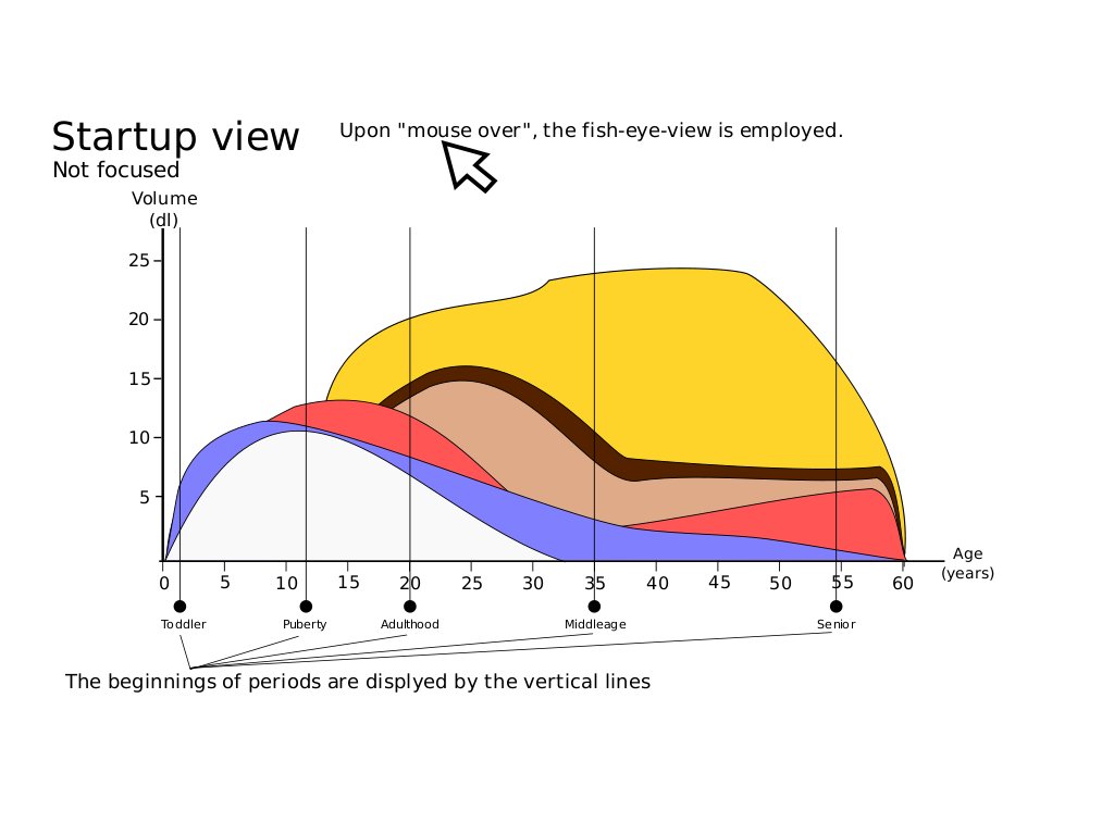
A possible solution to the problem can be seen in the graphs above. When started the tool displays the first graph. It is a 2D coordinate system, which presents the amount of liquids ingested by Homer Jay Simpson in relation to his life periods, such as "puberty", "adulthood", etc. The time periods are marked by vertical lines and have labels.
Every parallel to the ordinate represents the total amount of liquid consumed per day. The liquids are always ordered in the following way: water, milk, fruit juice, coke, coffee and beer, and have unique colors.
What is more, every layer begins at the end of the previous for every single point of Homers life. So for every day of his life the total amount of consumed beverages equals the corresponding value of the top layer. In order to compare the amount he ingests over the years, one should just spare a look at the area of the corresponding beverages and its size.
Static vs. Interactive
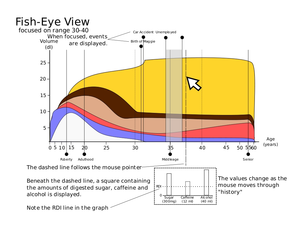
The graph remains static until the user moves the mouse over it. When this event occurs the tool enters an interactive mode, where the following happens:
Mouse Motion
A dashed line follows the cursor (Highlighting) and allows the user to inspect the patients life in detail, since a square box folds out at the bottom end of the line. This box holds out important information (Dynamic Querying), such as sugar, caffeine and alcohol ingested for that particular day and the recommended dosage.
Fish Eye
Because of the great deal of data it will not always be easy to remain still on the exact spot with the cursor. Furthermore, one could want to inspect a specific day of the patients life. That is why, the user can click anywhere in the graph near the period he/she desires to inspect. The tool switches to fisheye view (Zooming) and the period around the cursor gains focus. While moving the cursor over the area, the graph zooms in. Everything else can still be observed, but it stays in background because it zooms out when the cursor leaves.
What is more, the focused period displays more vertical lines. Each of them represents a special event in the patients life. This can be very useful, in order to follow the turnovers in Homers drinking behavior throughout given existence periods.
Pros and Cons
There are a lot of advantages, because of the simplicity of the tool. However, it should be enhanced in order to cope with some disadvantages. Please note, that the pictures above are pure sketches and do not represent a complete piece of software.
Advantages
- very easy to interact
- no buttons, only mouse motion and a single click.
- only the important information is shown
- detailed information is hidden
- a common visualization, so it is easy to understand
Disadvantages
- because of the great amount of data, one cannot easily observe a specific day, without entering the fisheye view.
- one cannot easily compare two or more days, which are far from each other.
Enhancements
- may be one can click on more than one spot and observe more than one period in detail concurrently.

