Teaching:TUW - UE InfoVis WS 2008/09 - Gruppe 10 - Aufgabe 3
Aufgabenstellung
Zu beurteilende Grafik

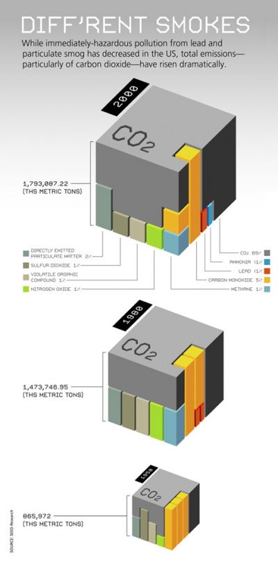
Emissions in the US - Diff'rent smokes
Evaluation
As it is written at the top of the graph the primary aim is to show that:
- pollution grows (through the size of the cube)
- immediately-hazardous pollution decreases (through the bars in the cube)
- CO2 emission increases (not recognizable at first sight)
Expressed in percentages this statement is correct. Measured in overall pollution it is incorrect, because the total emission increases. But whether this statement is true or not, our goal is to emphasize the author's message by improving his expression.
The data shall be highlighted to give them a voice that comes through loudly and clearly, without distraction. [Few, 2004a] This can be achieved by subtracting anything, that is not required to support the message and by emphasizing what's important. This leads us to the term of elegance. Elegant comes from the Latin term eligere and means to choose carefully. [Few, 2004a] In the following we want to evaluate the current graph by using a concept called data-ink ratio introduced by Edward R. Tufte in [Tufte, 1983].
Data-Ink Ratio
Explained in a few words, the data-ink ratio is the proportion of ink which is used to present the actual data, compared to the total amount of ink which is used in the entire graph. [Few, 2004b] The graph uses a lot of unnecessary ink - in this case pixels - and therefore has a low data-ink ratio.
Reduce non-data ink
Every unnecessary non-data ink should be reduced to a minimum. The gray shading at the top can even be removed completely without loss of any data. Having a better representation of data, the written text at the top would become redundant. It could be removed or at least replaced with a few words to introduce the reader to the topic. The engraved text at the top of the cube, the year-digits at the top/left side of the cube and so on can be reduced or even removed.
Enhance the data ink
To emphasize the primary aim of showing us how emission of CO2 increases, the part of the cube which represents CO2 could be highlighted. In the current graph carbon monoxide seems to be very important and acts as an eye catcher - this was not intended by the author.
Refactored Design
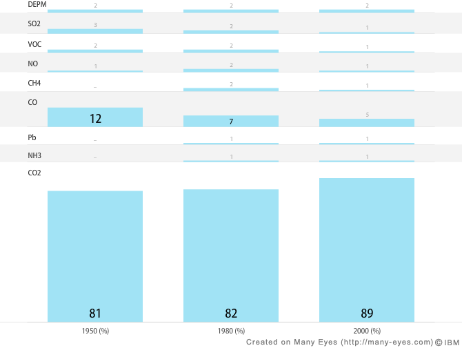
- DEPM - Directly Emited Particulate Matter
- SO2 - Sulfur Dioxide
- VOC - Volatile Organic Compound
- NO - Nitrogen Oxide
- CH4 - Methane
- CO - Carbon Monoxide
- Pb - Lead
- NH3 - Ammonia
- CO2 - Carbon Dioxide
Applied Changes
Cube
cube graph
First of all, we want to comment on the cube concept. Generally, we like this concept. However, this type of visualization does not optimally convey the message of the author. It is a relatively complex technique for this kind of data, which can be presented in a much easier fashion.
matrix chart
To solve this problem we used another type of graph. The matrix (bar)chart.
Bar charts are widely used and easy to understand. In addition it is easier to see the (percentual) distribution of the data easier in the bar-chart than in the cube.
Bars
cube graph
The data-ink ratio decreases through the three dimensional graphs, since there is much ink used that does not code any new data.
matrix chart
Due to their data-ink ratio, 2D bars are in this case better. It is much greater than that of the cube. What is more, there is no information loss. The reader can guess the relative amount of gas very fast by comparing the size of the bars or just look at the specific amount indicated by the numbers in or above the bars for a concrete comparison.
Labels
cube graph
There are no labels for the data for the years 1950 and 1980.
Since there are labels only in the first cube you have to guess the ratio of the different gases and scroll all over the graph in order to see the representation of each bar.
matrix chart
To solve this problem we added either an abbreviation or a chemical formula as a label in the matrix chart; we expect that readers of this kind of graph will be familiar with this terminology. Nevertheless, we added a legend in the wiki, so that the reader can easily see what the abbreviations mean.
Color
cube graph
The color palette used is not appropriate. The colors are very bright and the reader concentrates mostly on the yellow bars. Because of the gray color of CO2 the reader assumes that this part of the cube is not important. This, as we know, is not the case.
matrix chart
To solve this problem we used a softer earth color for all the data, since we can say everything that we want with the size of the bars. Different colors are not needed in this case.
Links
Bibliography
[Few, 2004a] Stephen Few, Show Me the Numbers: Designing Tables and Graphs to Enlighten. Analytics Press, 2004, Chapter 7 - General Design for Communication.
[Few, 2004b] Stephen Few, Elegance Through Simplicity, United Business Media LLC. Created at: October 16, 2004. Retrieved at: December 7, 2008. http://www.intelligententerprise.com/showArticle.jhtml?articleID=49400920
[Tufte, 1983] Edward Tufte, The Visual Display of Quantitative Information. Graphics Press, 1983
