Teaching:TUW - UE InfoVis WS 2008/09 - Gruppe 09 - Aufgabe 4
Aufgabenstellung
Gegebene Daten
Homer Simpson's Trinkverhalten in Abhängigkeit von seinen Lebensumständen
...Visualisierung von Homer's Lebensabschnitten bzw. Ereignissen mit Einfluss auf sein
Trinkverhalten (zB.: Kindheit, Pubertät, Arbeitslosigkeit, Beziehungen, Hochzeit, Geburt
der Kinder, Liebeskummer, Alltag, etc.) von seiner Geburt bis Jetzt + mögliche
Zukunftsszenarien (mind. 3).
- Die Menge folgender Getränke soll für die jeweiligen Lebensumstände ablesbar sein
(ml oder Liter - je nachdem - pro Tag, Monat, Jahr (z.B.: Fokus+Kontext Methoden):
 a) Wasser

 b) Milch

 c) Fruchtsaft

 d) Cola

 e) Kaffee (Würfelzucker?)

 f) Bier
(vereinfacht angenommen, Homer trinkt ausschließlich diese Getränke)
- Die folgenden Werte sollen abhängig von den konsumierten Getränken ablesbar sein:
 1) g oder kg konsumierter Zucker (aus Getränken) + empfohlene Maximaldosis pro Tag, Monat, Jahr
   (empfohlene Maximaldosis/Tag: 50g; enthaltener Zucker: 10g/100 ml Cola; 10g/100 ml Fruchtsaft; 3g/Würfelzucker).

 2) mg konsumiertes Coffein + empfohlene Maximaldosis pro Tag, Monat, Jahr
   (empfohlene Maximaldosis/Tag: 600mg; enthaltenes Coffein: 10 mg/100 ml Cola; 80 mg/100 ml Kaffee).

 3) g konsumierter Alkohol + empfohlene Maximaldosis pro Tag, Monat, Jahr
   (empfohlene Maximaldosis/Tag: 20g; enthaltener Alkohol: 3,6 g/100ml Bier)
- Die Daten sollen zur medizinischen/psychologischen Analyse visualisiert werden.
- Die bisher erlernten Design-Prinzipien sollen umgesetzt werden (z.B.: Optimierung der Data-ink ratio).
- Die Mockups sollten zumindest 1) Homer's Leben im Überblick 2) und eine Detailansicht wiedergeben.
- Alle nicht angeführten Daten können frei erfunden werden.
Analysis
Field of application and data set
- Field of application
The given data provides values over the consumption of different beverages (water, milk, fruit juice, cola, coffee and beer) of the test person Homer Simpson. Because the amount of consumed drinks is known, also the consumption of the different ingredients sugar, caffeine and alcohol can be measured. This data shall now be visualized for medical/psychological purposes. The audience might look at the visualization of data from a professional point of view. So the data has to be presented in a way which satisfies the demands of such a viewership. Medical oriented viewers might have another interest in the data than psychologists. This should also be beared in mind.
- Types and dimensions of data
Discrete values in a nominal comparison:
The comparison of the different types of drinks (such as water, milk, fuit juice, cola, coffee and beer) measured in liters is a nominal comparison. The amount of every single beverage is shown in comparison to the others. Also to be shown is the comparison of the recommended dose of ingredients (sugar, coffeine, alcohol) compared to the actually consumed amount.The visualization should show the percentage of consumed ingredients in comparison to the recommended dose.
The comparison itself is a deviation. The data type of all values for measuring the volume of consumption (i.e. for example the amount of drinks in ml) is continous and the values of the ingredients are derived from the values of drinks and sugarcubes.
Time-Series and time as a dimension:
For the visualization of the drinking habits during the lifetime of Homer a Time-Series is used. The amount of drunken beverages is shown for every different time-step. Time is used in a nominal type of data here.
Target audience
- The target audience will mainly consist of scientists and doctors working and researching in medicine, health and/or psychology. Because also some patients could view the visualization would be nice to have an easy understandable visualiziation.
- The doctors and scientists investigate the connection between the living condition and and drinking habits of people (in this case Homer Simpson) over a longer period of their lifetime. Furthermore the researchers in medicine may rather be looking for an impact of the drinking habits to health, whereas psychologists may have an bigger interest in the connection of drinking habits a mental condition. For both of them the data has to be presented in an appropiate way.
- Since the people who use the visualization are not necessarily professionals in using interactive visualizations it has to intuitive and learnable quick and easy
Purpose of the visualization
- The visualization of the dataset should make it easier to explore the data for the researchers.
- Possible connections between arbitrary stages of life and drinking habits should be recognizable clear and quickly. To increase the benefit of the application it has to be possible to browse the whole dataset in a timely manner.
- Particularly major connections between drinking habits and living condition shall be shown in the visualization in an appropriate manner, i.e. be recognised fast and clearly.
- During the design of the visualization the different types of users (medicine/psychology) have to be beared in mind.
Concept
Visualization
2. Use Graphs when the document you produce will be used to reveal relationships among multiple values.
Following the principles of Stephen Few, the main graphic of the visualization is a graph. In order to get an overview of Homer Simpsons drinking habits this visualization method seems superior to any other. Since becoming an overview is this visualizations main task, no detailed information is needed. This, and the fact the there are simply too many values to compare, makes the graph superior to a table. The graph also allows to browse Homer Simpsons life quite easily for any special events. To make this browsing more effecive several interactive technologies where applied. (see "Interaction").
When it comes to analysing detailed information we need an other method. [Few, 2004a] recommends using Tables when "The document you produce will be used to look up individual values." For a doctor who wants to set up a therapy or medication, a graph wont be sufficient. He will want detailed and exact data. Therefore, the visualization should also hold a detailed table view (in addition to the overview graph).
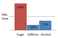
Finally, to look up if a maximum dose was exceeded, a part-to-whole bar chart is also contained in the visualization. This visualization method "Measures [..] individual categorical subdivisions as ratios to the whole." [Few, 2004a] Since the task is to compare given values to a maximum values and display theri ratios, this methods seems appropriate.


The visualization now holds:
- Flow graph
- Detail table
- Substance part-to-whole bar chart
Visual Mapping
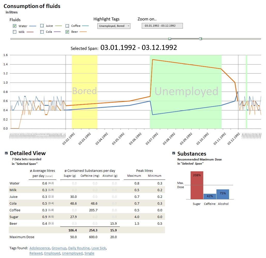
- Flow graph [Figure 1]
In the Flow graph the consumed amount of Fluids (in litres) is mapped to the y-axis while Homer Simpsons age/life-period is mapped to the x-axis. The key events in his life (described by "Tags") are mapped as an area to both axes.
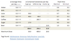
- Detail table [Figure 2]
In the detailed view table things are relatively simple: all values are directly mapped into a table values.
The table holds the average consumpted litres, the average thereby consumpted substances and the peak values for a given period of time. It also contains a list of all tags which where found in this period of time (e.g. "Unemployed"). In order to grant interpretation of this data, the table also holds the maximum doses for substances.
For the task of checking wheter a maximum dose was exceeded or not, one can also take look at the..
- Substance part-to-whole bar chart [Figure 3]
Like mentioned above, this chart holds the values of all consumpted substances and their maximum value. To make the comparison more easy, the values are displayed as a bar and compared against a line which describes the maximum doses.
Technologies Used
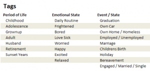
- Tags

Tags are used to represent Homer Simpsons life. There is a list of given tags used in our prototype application. This list can be expanded whenever a new tag is needed. With the help of those tags a professional user (like a psychologist) can browse through the recorded data and search for specific events. In the flow chart the user can search for periods of time and for tags alike.
- Fisheye
The fisheye is a "spatial / distortion-oriented method of a Focus+context technique" [InfoVis, 2008]. It helps representing relevant data while suppressing irrelevant data. Hence the user can browse for specific data, and he wont get lost in the big data junk.
- Mouse Actions
Basic mouse actions like clicking, double clicking, scrolling and 'mouse over' are also applied.
- Reduce/Expand View
The Detail table and the Substance part-to-whole bar chart can be expanded or minimized. When a user is not intereset in medical data and just want to browse through Homer Simpsons life, he can minimized the two data displays. According to [Few, 2004b] any data which is not needed should be removed. The reduce/expand function allows the user to set what he wants to see himself.
- Time-Series
The technique Time-Series [Few, 2004a] shows different types of data of the same measure on a timeline. It is used in the flow graph.
- Multifunctional flow graph
Normally the flow graph holds the data of fluids consumed by Homer Simpson. But as described in the next Chapter ('Interaction - Draw Substances into Flow graph') it can also hold data of substances contained in those fluids. With this technique we avoid drawing two flow charts, when only one is needed. The data-ink-ratio [Few, 2004b] is reduced.
- Distribution
Distribution [Few, 2004a] shows the distribution of different values on either vertical or horizontal bars. This technique is used for the Substance part-to-whole bar chart.
Interaction
- Zoom Bar
![]()
Above the Flow graph there is a small bar with two sliders on it. This is the "Zoom Bar". If you grab one of the two sliders and move him closer to, or farther away from the other slider, you thereby set the zoom factor in the flow graph. If you, for example, move the a slider directly next to the other, the flow graph is totally zoomed in - meaning only one day is displayed. The bigger the distance between the two sliders, the smaller the zoom factor in the graph (and hence the bigger the zoomed period of time).
If you grab the line between the two sliders, you can move toe zoomed area in the flow graph left and right.
- Grab and move Flow graph

Another way to move the zoomed area in the flow graph left and right (besides moving the Zoom Bar) is done by simply grabbing a point in the zoomed area of the flow graph and then move around.
- Mouse over

Almost all displayed data also has a MouseOver menu. Hovering the mouse above a line in the flow graph for example, makes a popup field appear, which describes the actual amount of the fluid, the date and all tags for this date. Another example is are the tags listed in the Detail table. Moving the mouse cursor over one of those will show the periods of time in which they are set.
- Mouse over: Substances


A special case for a MouseOver action is found in the substance part-to-whole bar chart. By moving the mouse over a bar, all other bars turn grey and the composition of the current bar is displayed. That way, one can dive deeper into the data with just a simple interaction.
- Zoom on ..
With the "Zoom on.." field above the flow graph, the user can set the zoomed area for the graph. Usually the user will enter a date or a period of time into it. Doing so will set the zoomed area according to the input. The zoomed area can then be moved / changed through the Zoom Bar. Via the "Zoom on.." field, the user can also zoom the specific Tags. For example, by entering "Unemployed" into the field, the flow graph will zoom to all periods of time in which Homer Simpson was not exmployed. If there where several periods in which he was unemployed, the flow graph would zoom onto several periods of time.
- Select fluids
By clicking the Checkboxes above the flow graph the user can add/remove the lines for the specific fluids in the flow graph.
- Highlight tags
All Tags typed into the "Highlight Tags" field will be highlighted in the flow graph by coloring the background of the periods in which a tag was found.
- Click tags
By clicking a tag in the Detail table the specified tag is sent to the "Zoom on.." field. So, if a user is interested in relations between different tags, e.g. if Homer Simpson is always 'Relaxed' when he has 'Holidays', one can easily switch between the different tags in order to get an overview when and where they are found.
- Draw Substances into Flow graph
By clicking a (substance) bar in the Substance part-to-whole bar chart, all data is removed from the Flow graph and the selected substance data is filled into it. This means that the Flow graph can display not only data on fuilds, but also data on substances.
Fake Screenshot
Discussion
Advantages
- With the fisheye focusing method one can easily change the granularity of the shown data. If one wants to get an overview he can zoom out, and for more detailed information he can zoom in.
- The user can choose how many deatils he wants to see. Again, if he wanto to get just an overview he can minimize the details displays, and if he needs more acurate data he can expand them. While the graphics should be quite easy to understand for a 'normal' user, a professional (e.g. psychologist) can also retrieve exact and sophisticated data from the graphics.
- Since the user can browse Homer Simpsons life for either time periods or tags, it is easy to retrieve desired data. Important events can also be highlighted to make them more eye-catching.
Disadvantages
- There is no way to visually compare two different periods of time. One could for example want to compare the two periods in which Homer was unemployed.
Improvements
The Detail table could hold more data. For example, all days with data in the selected period of time could be shown. Since the Detail table can be minimized it wouldnt be a problem, if it was quite spacious.
References
- [Few, 2004a]:Stephen Few, Show Me the Numbers: Designing Tables and Graphs to Enlighten, Analytics Press, 2004, Appendix A - Table and Graph Design at a Glance.
- [Few, 2004b]:Stephen Few, Show Me the Numbers: Designing Tables and Graphs to Enlighten, Analytics Press, 2004, Chapter 7 - General Design for Communication.
- [InfoVis, 2008]:Silvia Miksch, Folien zur LVA Informationsvisualisierung, WS 08/09, Part 5, Focus+Context Techniques - Fisheye.
