Teaching:TUW - UE InfoVis WS 2008/09 - Gruppe 08 - Aufgabe 3
Aufgabenstellung
Zu beurteilende Grafik

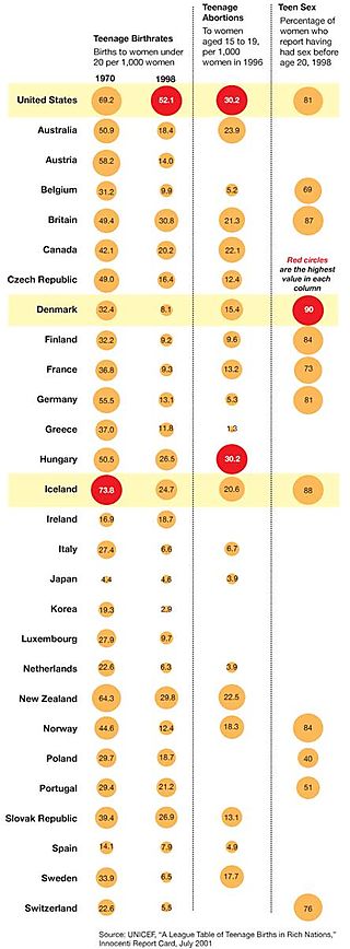
Teenage births in rich nations
Criticism
- Organize the Data
First nation mentioned in the graphic are the United States, before alphabetically ordered list of nations is presented. This could be useful if the most viewers of the graphic come from the US. But since this is only an assumption it might be better to put the data for the United States also to their appropriate position in the alphabetic listing.
- The Role of Text
The legend describing the meaning of read circles stands inside the table. Since this might be considered the explanation for the most important data in the graph it might be better to put this legend on top of the graph such that the viewer immediately sees it. Moreover the Graph has not title at all to explain to the viewer what the graph will be about.
- Subtract unnecessary data ink
Filled circles increase data ink, use unfilled circles instead
- Subtract unnecessary non-data ink
The Shaded rows holding the highest value for each column are not necessary. The red color of the circles focus the viewers attention already to them.
- De-emphasize and regularize the remaining non-data ink
The lines used to split the columns are to strong, use neutral colors as for example a light gray.
Optimized graphic
Short Description
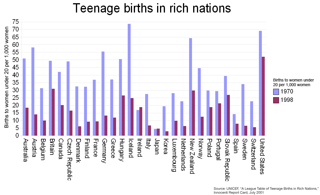
This graph shows the number of women becoming mother, before reaching their 20. Birth year among different nations.
Short Description
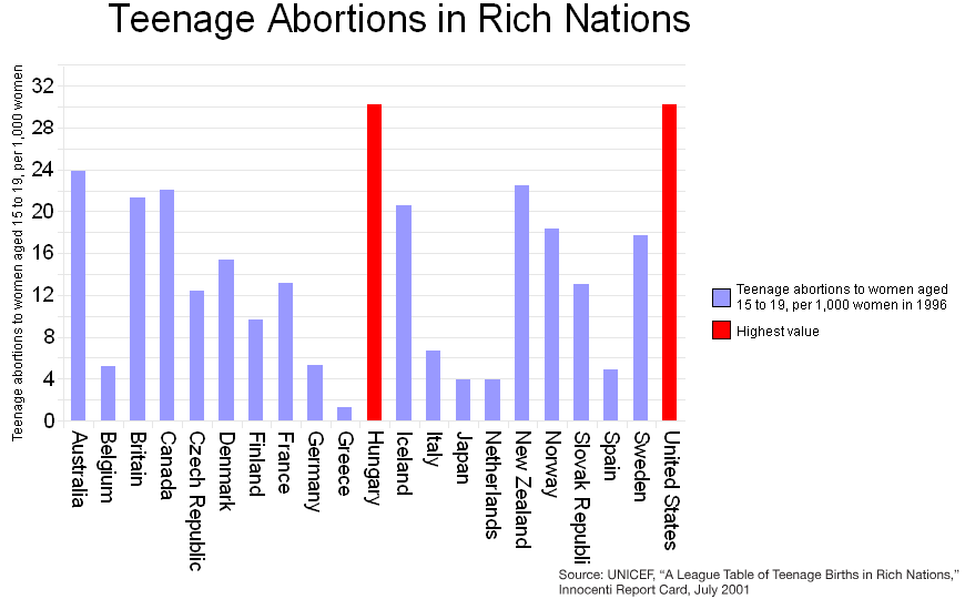
The amount of women in rich nations between 15 and 19 years who had an abortion in 1996.
Short Description
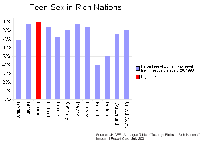
The amount of women in rich nations reported having sex before they reached an age of 20.
Improvements
- Split the graph into the three new graphs because the data represents different years and can not immediately be compared. One representing the information about the Teenage birthrates in rich nations in the years 1970 and 1998. Another graph for the Teenage Abortions and a last one for Teen Sex in 1998.
- Change the circles to bars. Put the bars for the different years close together to get a better view on changing values over time. Increase the maximum length of the different bars such that it becomes easier for the user to see the difference between small and large numbers.
- Add a meaningful title for every graph to show the viewer what the graphs are about.
- Put the countries on the X axis and the number of abortions and the other data on the Y axis.
- Add horizontal lines into the graphs such that the values can be compared in an easier way.
- Use less saturated color for the lines splitting the columns (put non-data ink into the background).
- Remove the shading of the rows holding the highest values to reduce the non-data ink.
- Put the United States an the according position in the list such that the countries are ordered alphabetically. Helpful for the viewer of the graph if he is looking for a specific nation because the data is ordered now.
- Create a Legend explaining the meaning of the red bars and the years on the sub-graph.
References
- [Few 1, 2004] Stephen Few, Show Me the Numbers: Designing Tables and Graphs to Enlighten. Analytics Press, 2004, Chapter 7 - General Design for Communication.
- [Few 2, 2004] Stephen Few, Elegance Through Simplicity. United Business Media LLC, October 16. 2004, http://www.intelligententerprise.com
- [Stanford, 1999] Yoko Mizuno, Josh Sheldon, and Mun-See Tham, Tufte Design Principles. Stanford University, January 26. 1999, http://ldt.stanford.edu


