Teaching:TUW - UE InfoVis WS 2008/09 - Gruppe 07 - Aufgabe 3
Original Graphic
Critics
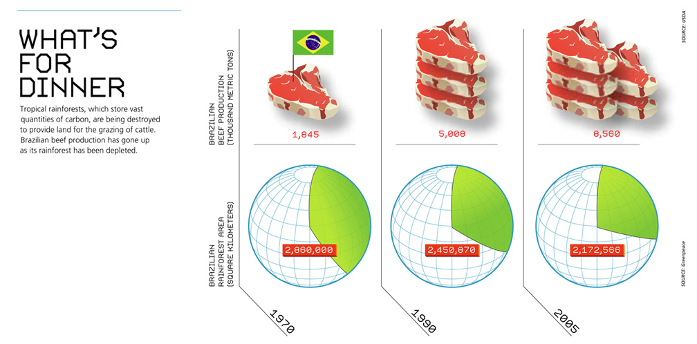
A first look at the graphic "What's for dinner" does not reveal a lot about the information presented in the graphic. The title, which should summarize the graphic in short has nothing to do with the message of the image. To get the meaning you first have to read the small printing underneath the title, explaining about the connection between the destruction of the rainforest to provide more land for the grazing of cattle. Even now, knowing what is supposed to be shown, one could start thinking about the advantages of food production, having in mind that a high percentage of the worlds population is starving and in the need of food. This feeling is reinforced looking at the delicious steaks being shown in the graphic.
On the other side the destruction of a vast amount of rainforest does not evoke any compassion at all. It is displayed by a sphere, which is at first filled with about 1/3rd and getting a bit less filled in the other representations, but only coming close to 1/4th, which does not seam like a noticeable loss of rainforest. Also it is not obvious what the sphere stands for. A blue sphere is more likely to be recognized as Earth in general than a specific country. Overall the message that is supposed to be sent with this graphic is confusing.
The graphic contains mostly non-data-ink, there are a lot of images, lines and text which are not necessary to present the data in question. It is very confusing to have a change in scale, regarding the time periods between the data. The fact that the first time segment spans 20 years and the second time segment only spans 15 years makes it hard to take the graphic seriously.
To really get the information, one has to tilt his or her head in order to find out which scales the data is measured in, which is in fact in two different scales, metric tons on the one hand, square kilometres one the other. The labelling of the two different kinds of data is not only written vertically, but it also does not stick out as important.
Each group of data has a different type of labelling, giving information about the amount of data shown in each picture. The labelling of the steaks easily gets lost in the big picture. This is mainly because it is written in the same colour as the steaks, but is much smaller as they are. The labelling of the rainforest is more obvious than the labelling of the steaks. This is due to the fact, that the numbers are directly on the spheres and the color is a bright red which easily sticks out.
The used image representation is, as discussed before poorly chosen. The units of steaks shown in the images stand in no connection with the data they are supposed to represent. There is a flag sticking in one of the steaks for no obvious reason, which is useless non-data-ink. And the drastic change of existing rainforest is not obvious using a pie diagram, because this form of representation does not make it easy to notice the change over time.
Changed Graphic ver 2

Brazilian rainforest areas replaced by cattle farmland
Correction ver 2
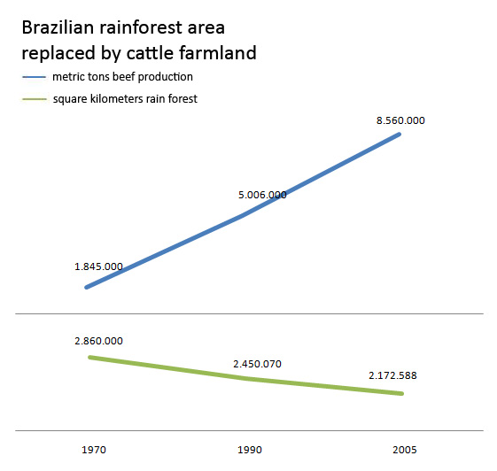
In the above changed graphic the destruction of the rainforest has been emphasized, using two line charts. The horizontal part is the tie (1970-2005) and at the vertical part there are 2 plots which show the growth of the beef production and the decrease of the rainforest.
We changed the units to square kilometers and metric tons for easier comparison. Furthermore with the use of line charts the message of the chart is very easy to get -> more beef means less rainforest.
We removed all unnecessary pie charts to reduce the non data ink and added a title which explains the graphic more than the old title.
Changed Graphic

Brazilian rainforest areas replaced by cattle farmland
Correction
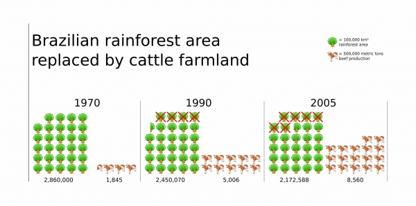
In the above changed graphic the destruction of the rainforest has been emphasized, using pictograms instead of a pie chart. Though this might stand in conflict with the "use-less-non-data" philosophy in order to make the graphic simple and easy to understand, it is easier to get the message of the graphic at first glance without having to look at the caption. To focus on the destroyed areas, the lost trees have been marked with red crosses rather than leaving them out. This way the message greenpeace might have intended for the graphic should be delivered in a more obvious and direct way. The lines in the changed graphic were used to make the differentiation of the different years more obvious. The text of the graphic was unified and adapted to the importance of its information.
The lack of data could not be fixed, but with using the year dates as titles instead of a timeline the difference between them should be less bothering. The number of trees as well as the number of cows stand for precise units: one tree represents 100.000 square kilometres and one cow represents 500.000 metric tons. Using parts of the respective pictograms should approximate the exact values as good as possible.
Over all, it was tried to keep close to the style of the original graphic, which looks like it had the purpose to be used for public relations reasons, but changed to optimize the visual information using the data at hand.
Resources
- [Few, 2004a]:Stephen Few, Show Me the Numbers: Designing Tables and Graphs to Enlighten, Analytics Press, 2004, Chapter 7 - General Design for Communication.
- [Few, 2004]:Stephen Few, Elegance Through Simplicity, intelligent enterprise, October 16, 2004, http://www.intelligententerprise.com/showArticle.jhtml;jsessionid=N2ATDQWY5VYKSQSNDBGCKHSCJUMEKJVN?articleID=49400920.
- [Tufte, 1999]:Edward R. Tufte, The Visual Display of Quantitative Information, January 26, 1999, http://ldt.stanford.edu/ldt1999/Students/mizuno/Portfolio/Work/reports/tufte/ed229c-tufte-outline.html
