Teaching:TUW - UE InfoVis WS 2008/09 - Gruppe 06 - Aufgabe 3
Jump to navigation
Jump to search
Aufgabenstellung
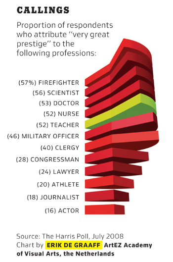
Zu beurteilende Grafik

Proportion of respondents who attribute 'very great' prestige to professionals
Critical Review
Based on the design principles recorded by Few [2004], we discovered the following problems in the graphic shown above:
- Data objects with 3-D depth are used. These objects are hard to read. Furthermore, the graphical components added for 3-D depth do not convey any extra information (bad data ink ratio) [p. 171].
- Through the use of pie charts, quantitative information is encoded by area. These types of graphs communicate poorly, because the human visual perception cannot accurately estimate the area of a 2-D shapes. In 3-D this is even harder [p. 60].
- The numeric values are printed next to the categorical labels. This decreases the data-ink ratio. If we take into account the two points mentioned above, we can argue that the pie charts are non-data ink and only categorical labels and values are data ink.
- Except for "teachers" all pies are drawn in an intense color (highly saturated red). This draws a lot of attention to these pies, especially because red signals danger in most western cultures [p. 171]. However, we think that the graphic's purpose is to highlight the proportion for "teachers". In that case the pie for "teachers" should be more intense [p. 187].
- We noticed that the pies are drawn in (at least) two subtly different variations of red. The pies for "firefighter", "clergy", "athlete", and "actor" appear to be brighter. We found this disturbing, as we could not find out if this difference encodes any information.
- The categorical labels are printed in capitals. In this form text is less legible.
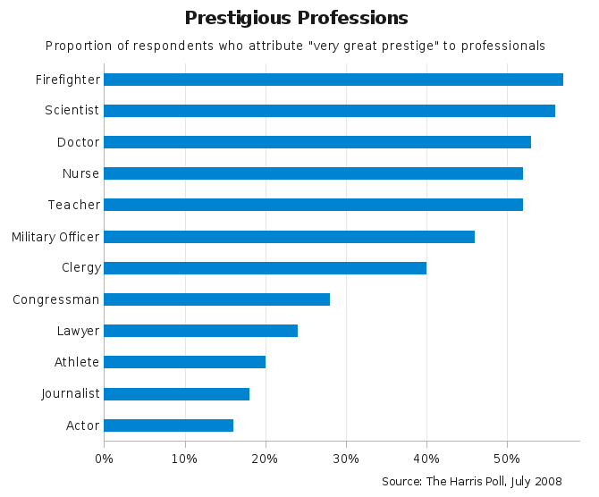
Improved Graphic
Improvements
- We decided to use horizontal bars, because they are well suited for displaying ranking relationships [Few, 2004, p. 73, 182].
- We used blue color for the bars, removed the bar borders, and set a 1-to-1.5 ratio of bar to intervening white space.
- We didn't highlight the bars for "firefighter", "clergy", "athlete", and "actor", because we were not sure, if the difference in the original graphic encode any information.
- We also colored the bar for "teachers" blue, because there is no obvious reason for highlighting "teachers".
- On the categorical axis we switched off tick marks, because they are not needed. On the quantitative axis we put tick marks every 10%.
- To ease comparison and look-up of values, we used thin grid lines.
- We didn't include the values in numbers, because we believe the purpose of this graphic is to communicate ranking and relation between values, but not exact values.
- Categorical labels were written in mixed case to improve legibility.
- We changed the title from "Callings" to "Prestigious Professions", which is more meaningful.
- We reduced the font size of the reference to the data source.
Links
References
- [Few, 2004] Stephen Few. Show Me the Numbers - Designing Tables and Graphs to Enlighten. Analytics Press, Oakland, CA, 2004.
