Teaching:TUW - UE InfoVis WS 2008/09 - Gruppe 06 - Aufgabe 1 - Small Multiples


Principles[edit]
Small multiples, a representation principle introduced by Edward R. Tufte [1990, 2001], make it easy to compare different products, different parameters, or how parameters change over time. A constant visual structure allows the human reader to focus on changes in the data without being disturbed by changes in the scales, axes, etc. The small size makes it possible to put many representation within eyespan. Spreading small multiples across several pages would eliminate these effects.
Small multiples use a constant visual structure to show different parts of the data. In contrast, representations based on Multiple Views use different visual structures to show the same data in all views.
Examples[edit]
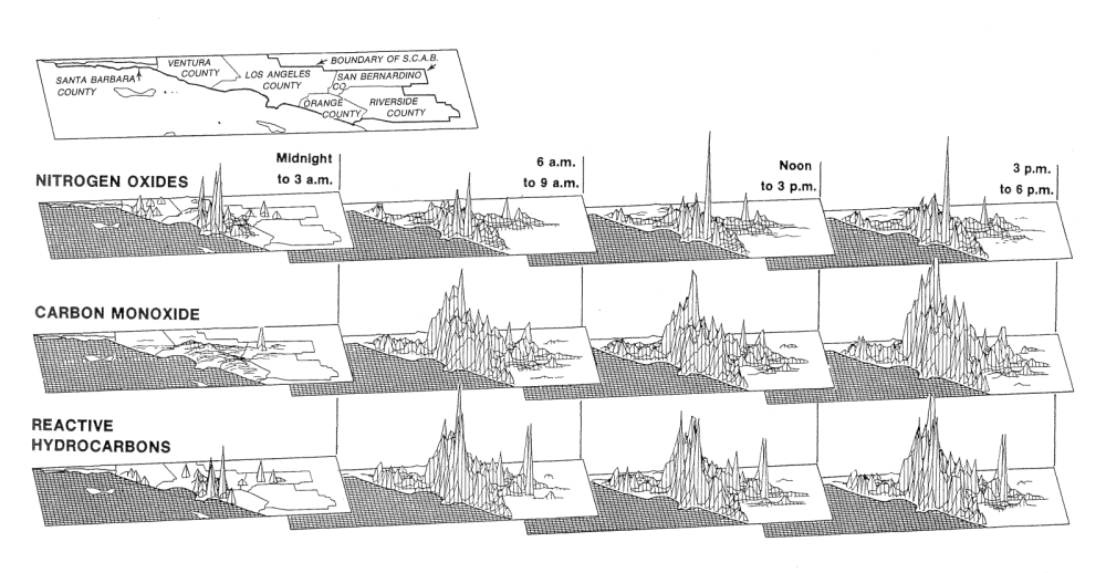
The position of a small multiples in the two dimensional representation space can be mapped to data dimension. Consequently, small multiples are well suited for representing multivariate data. For example, in the pollution visualization (top right) the individual images are indexed by time and pollutant. Within each graphic pollution levels are shown on a two dimensional spatial grid. Thus, a total of 28,800 data values are shown, except for those hidden by peaks [Tufte, 2001].
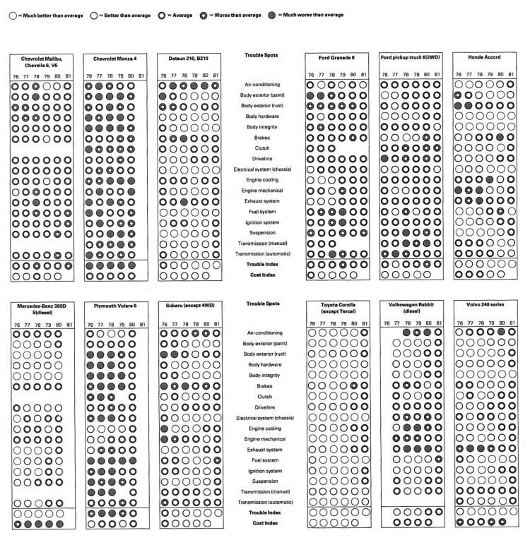
The second example (middle right) shows the frequency-of-repair records for cars built from 1976 to 1981. Edward Tufte [2001] describes it as "a particularly ingenious mix of table and graphic, portraying a complex set of comparisons".
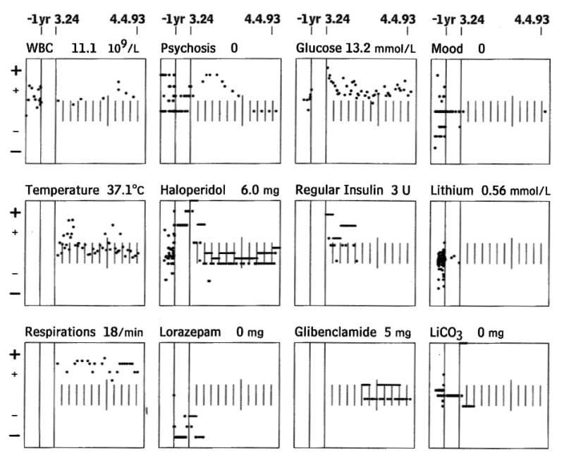
The third example is the visualization of a patient's medical record. It consists of small scatterplots to show medical status and drug dosages over time. These values are normalised to allow for easy comparison. Furthermore related parameters are grouped: e.g, Insulin is located directly below Glucose [Pownser and Tufte, 1994].
References[edit]
- [Pownser and Tufte, 1994] Seth M. Powsner and Edward R. Tufte. Graphical Summary of Patient Status. The Lancet, 344(8919):386-389, August 1994.
- [Tufte, 2001] Edward R. Tufte. The Visual Display of Quantitative Information, Second Edition. Graphics Press, Cheshire, CT, 2001.
- [Tufte, 1990] Edward R. Tufte. Envisioning Information. Graphics Press, Cheshire, CT, 1990.