Teaching:TUW - UE InfoVis WS 2008/09 - Gruppe 05 - Aufgabe 4
Aufgabenstellung
Gegebene Daten
Homer Simpson's Trinkverhalten in Abhängigkeit von seinen Lebensumständen
...Visualisierung von Homer's Lebensabschnitten bzw. Ereignissen mit Einfluss auf sein
Trinkverhalten (zB.: Kindheit, Pubertät, Arbeitslosigkeit, Beziehungen, Hochzeit, Geburt
der Kinder, Liebeskummer, Alltag, etc.) von seiner Geburt bis Jetzt + mögliche
Zukunftsszenarien (mind. 3).
- Die Menge folgender Getränke soll für die jeweiligen Lebensumstände ablesbar sein
(ml oder Liter - je nachdem - pro Tag, Monat, Jahr (z.B.: Fokus+Kontext Methoden):
 a) Wasser

 b) Milch

 c) Fruchtsaft

 d) Cola

 e) Kaffee (Würfelzucker?)

 f) Bier
(vereinfacht angenommen, Homer trinkt ausschließlich diese Getränke)
- Die folgenden Werte sollen abhängig von den konsumierten Getränken ablesbar sein:
 1) g oder kg konsumierter Zucker (aus Getränken) + empfohlene Maximaldosis pro Tag, Monat, Jahr
   (empfohlene Maximaldosis/Tag: 50g; enthaltener Zucker: 10g/100 ml Cola; 10g/100 ml Fruchtsaft; 3g/Würfelzucker).

 2) mg konsumiertes Coffein + empfohlene Maximaldosis pro Tag, Monat, Jahr
   (empfohlene Maximaldosis/Tag: 600mg; enthaltenes Coffein: 10 mg/100 ml Cola; 80 mg/100 ml Kaffee).

 3) g konsumierter Alkohol + empfohlene Maximaldosis pro Tag, Monat, Jahr
   (empfohlene Maximaldosis/Tag: 20g; enthaltener Alkohol: 3,6 g/100ml Bier)
- Die Daten sollen zur medizinischen/psychologischen Analyse visualisiert werden.
- Die bisher erlernten Design-Prinzipien sollen umgesetzt werden (z.B.: Optimierung der Data-ink ratio).
- Die Mockups sollten zumindest 1) Homer's Leben im Überblick 2) und eine Detailansicht wiedergeben.
- Alle nicht angeführten Daten können frei erfunden werden.
Description of the application field and the given dataset
The given data should show the connection between the different periods of homer's life and his drinking behavior. We want to figure out which periods of life affected the drinking behavior in a good/bad way. The data is useful for a few different fields of application: Medical analysis, psychologically analisis and for nutritional advice. For the application we are dealing with two different tables. We need both of them in order to get meaningful results.
The nutrition panel
The nutrition panel contains a list of all the ingredients of a certain beverage. The data is multidimensional and metrical. Here we are dealing with a ratio scale. The unit for all ingredients (except for the sugar in the coffee where it is measured by piece) is 100 ml. There are beverages like milk and water which have no entry in the table. This is because in this case we are only interested in the amount of sugar, alcohol and coffein. If we would like to take also fat or protein into account, milk would play a different roll. We can look at this table in two different ways. If we only look at a column (for example "Zucker") we can compare how much sugar each beverage contains. If we take a look at a horizontal entry (e.g. "Cola") we can determine which ingredients this entry contains. An additional value for each ingredient tells us about the maximal dosis per day.
The list of amount
This table contains the amount of every beverage homer drank on a certain day. For the application we need the table of amount for each day. Such a daily table contains the amount of beverages and the amount of the different ingredients of the beverages based on the information stored in the nutritional panel. As the nutritional panel the amount table is multidimensional and metrical. The structure of the data is also equal to the structure in the nutritional panel.
Target group
The target group for this application could be both medical staff (psychologists, doctors, nutritionists, ...) and the patient. The visualization is very simple so everybody is able to deal with the application but also contains all the sufficient data to make medical analysis possible. The ideal case would be if the doctor and his patient would evaluate the data with each other. The doctor or nutritionist gets a general idea of the drinking behavior of the patient and is so able to determine whether his behavior is healthy or not. In a second step a psychologist is able to see in what kind of situation the patient is at a risk of drinking too much sugared beverages or too much alcohol. The final step would be to elaborate a diet plan by taking into account the data and the psychological cognitions.
Goal of the visualization
The main goals for this visualization are:
- Demonstration of the consumption of beverages and the resulting consumption of nutrients for different periods of time.
- Comparisons (increase/decrease) of the consumption of beverages and nutrients over different longer periods of time.
- Comparisons of the consumption of nutrients at different non-connected periods of time (e.g. different periods of life).
Concept
To allow both professionals (doctors, psychologists ...) and patients to easily access information, our visualization concept provides 3 views, each one presenting some specific information. The 3 view are presented in a smalll toolbox, allowing the user to easily switch between the views and personalize the visualization.
The toolbox provides three button for choosing the three views, and below the desired view is visualized.
The Gesamt view
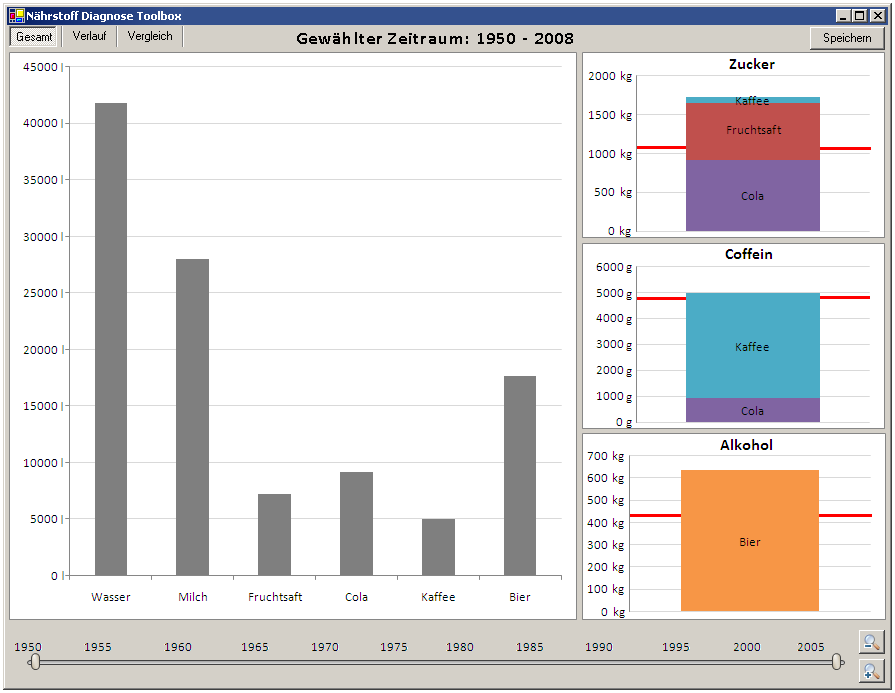
This view shows the total amount of each drink for a certain amount of time.
There is a timeline located on the bottom of the window. The user can select the exact period of time he wants to visualize. On startup, the maximum time span is Homer's whole life (1950 - 2008), but the user can zoom in using the zoom buttons on the right border for an accurate time span selection. This time span selection allows the user to control which exact period of the patient's life to be visualized. The currently selected period of time is always displayed above the diagrams.
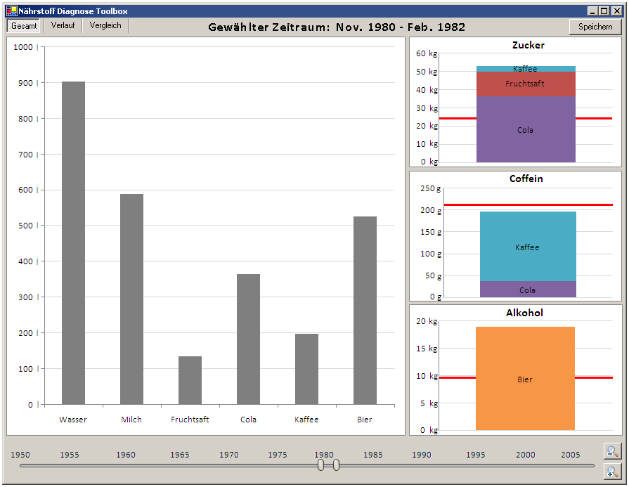
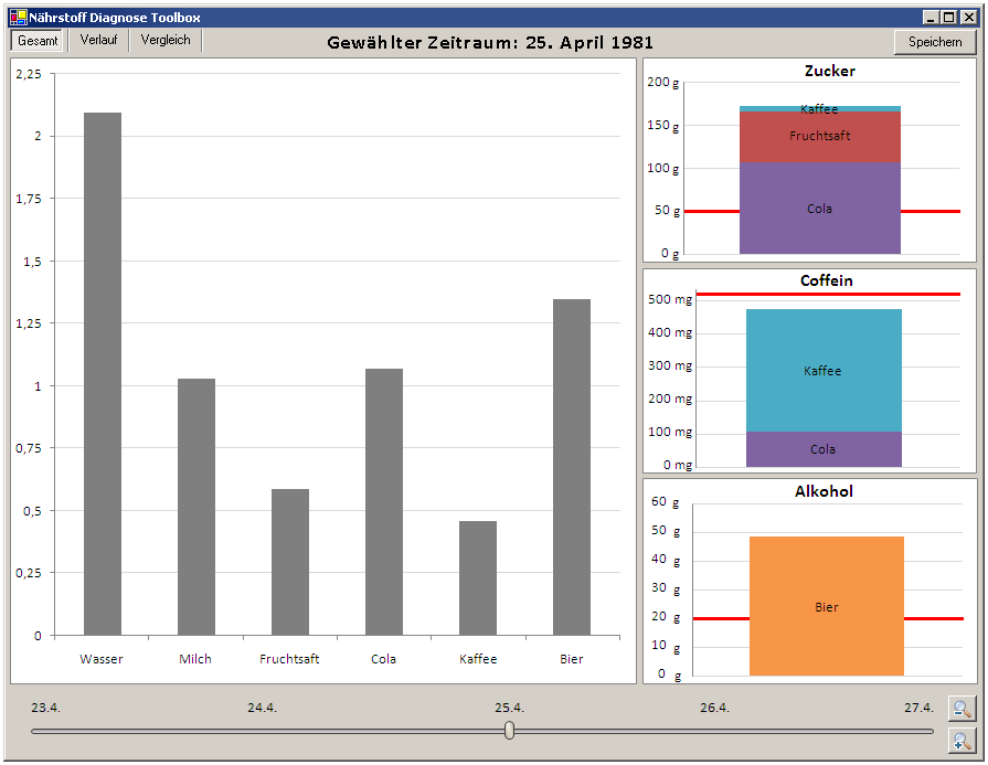
The selected period of time is then visualized in the main window. This area is divided into two blocks: The large diagram on the left side shows the total amount of consumed drinks, summed up over the whole time span that is currently selected. The three diagrams on the right side show the amount of consumed sugar, coffein and alcohol during the selected period of time, including both the total amount as well as a break down to the drinks containing sugar, coffein and alcohol. The recommended maximum dose is dynamically calculated for the current time span and displayed as horizontal red line.
The Speichern button on the upper right border of the window allows the user to add a specific visualization the the Vergleich view, which will be presented later.
The following three images show the Gesamt view for Homers whole life, a time span of a few months and one single day respectively:
The Verlauf view
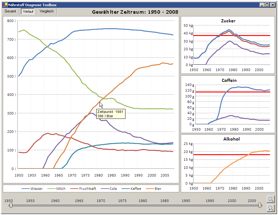
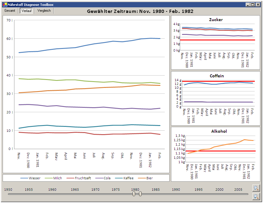
This view shows the alteration of the amount of consumed drinks as well as sugar, coffein and alcohol over a certain period of time. Similar to the Gesamt view, the user can select a time span using the time line. The left diagram shows the amount of consumed drinks for each day, month or year (depending on the currently selected period of time). The three small diagrams show the same for sugar, coffein and alcohol, but summing up all drinks that contain sugar, coffein or alcohol. Again, the recommended maximum dose for the current unit (day, month or year) is shown as a horizontal red line. When moving the cursor over the diagrams, detailed infomation is shown in a tool-tip box.
The following two images show the Verlauf view for Homers whole life and for a time span of a few months:
The Vergleich view
This view is structured diffently, allowing the user to personalize the visualization and compare analyses from different points of time.
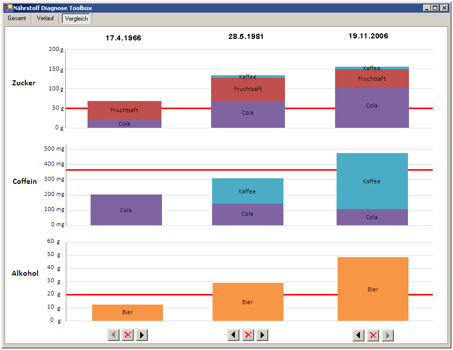
In the Gesamt view, the Speichern buttons adds the currently shown sugar, coffein and alcohol visualization to the Vergleich view. Here all sugar, coffein and alcohol diagrams are normalized and shown next to each other, allowing comparisons between the consumption at different points of time in the patient's life.
The diagrams can be sorted by clicking the arrow-buttons at the bottom of the window, and diagrams can be removed from the Vergleich view using the small delete buttons.
The following image shows the comparison of three days in Homer's life using the Vergleich view:


