Teaching:TUW - UE InfoVis WS 2008/09 - Gruppe 05 - Aufgabe 3
Jump to navigation
Jump to search
Aufgabenstellung
Zu beurteilende Grafik

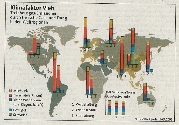
Treibhausgas-Emissionen durch tierische Gase und Dung in den Weltregionen
Critical comments
Interpreting the Data
- In order to interpret the graphic we first wanted to know what kind of information should be compared to each other. We found out that the main statement of the graphic is not perceptible out of the design. There could be two different ways of interpreting the data:
- A comparison of the amount of emission of greenhouse gas between the different kinds of keeping inside a country
- A comparison of the amount of emission of greenhouse gas per keeping between all countries
- Because there are no scales it is hard to estimate how much tons of gas there are emitted there's only mentioned the totaling amount of 150 million tons.
- It is hard to determine which countries are combinded in a region especially in Asia.
- There is no explanation in the legend that tells us what an empty entry in a table means. It could mean that there is no emission because of the absence of the kind of keeping or it could mean that there is no data for this kind of keeping.
- A comparison of the emission of greenhouse gas between the animals is difficult when there are many different animals in a region.
- It is very disturbing for interpreting the data that the bars are placed at a different height.
Data-Ink Ratio
According to E. Tufte the data-ink ratio can be computed as follows: (data-ink) / (all-ink used to print the graphic) = data-ink-ratio. This means that you should only display significant data in a graphic.
- In our opinion it is a decorative idea to use a map of the world for displaying the data but not a good one. This kind of style is disturbing the because it prescinds from the relevant information.
Visual Clutter
Color
- The colors used for the world map are very hard to distinguish and that's why it's hard to determine which countries are related to which table.
- It's difficult to identify the different kinds of animals when there is much data in a table especially when dark blue, blue and green are close together.
Legend
- The legend is scattered all over the graphic which disturbes reading it.
- The largest font size is used to display the headline that draws off the attention.
Adapted graphic
Adaptions
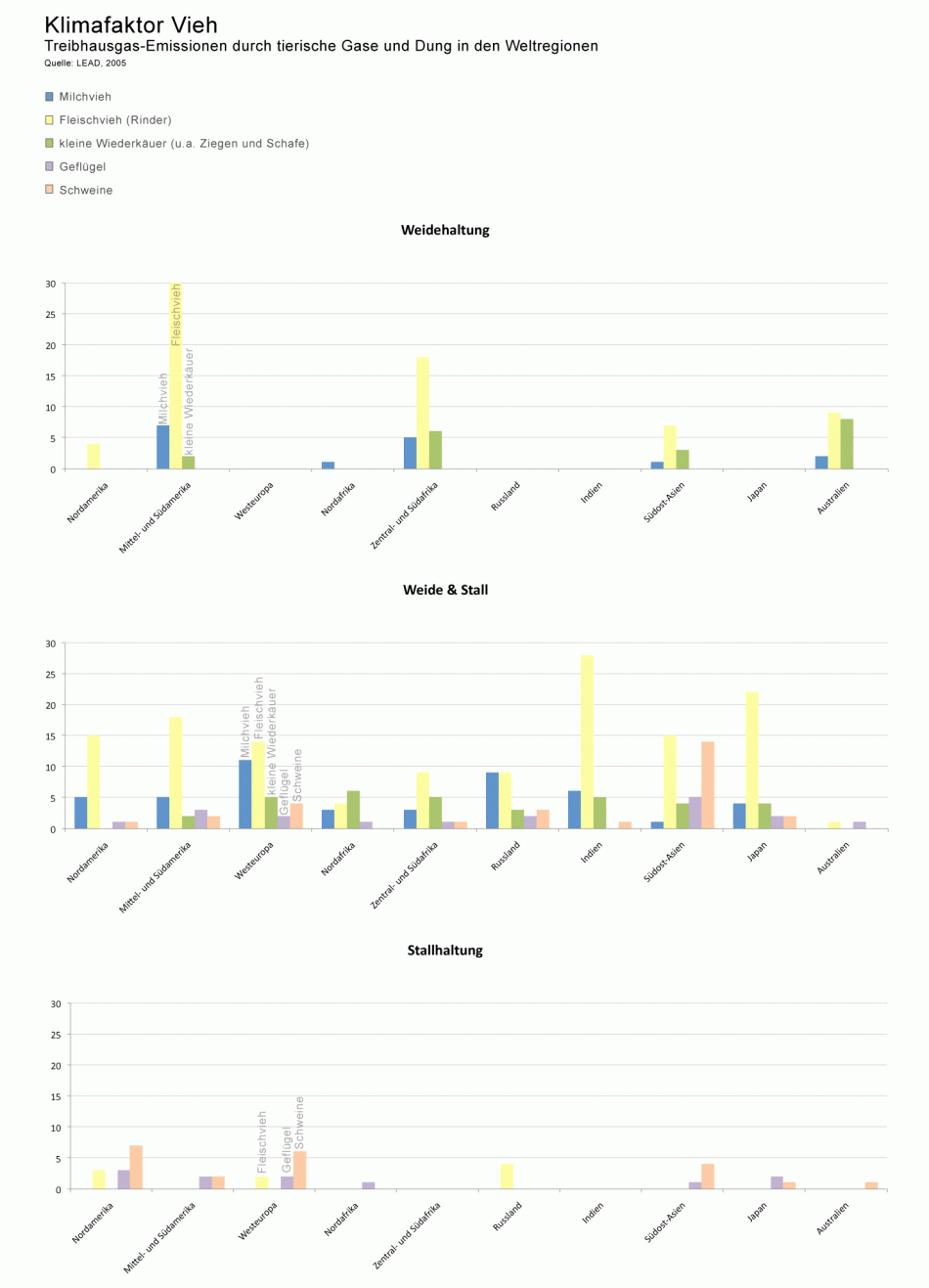
- With the improvement, we delivered an other kind of graphic presentation of the data. The overview has been improved, and the comparison beetween the different regions is now much easier. The new solution is a Bar chart divided into three main categories: Weidehaltung / Weide u. Stall / Stallhaltung.
- All non-data ink was removed. The Map has been removed due to the inconsistent amount of detail. The user is now not distracted by the graphic and can concentrate on the comparison of the data.
- Due to the new improved presentation of data, it is easier for the viewer to compare the amount of emission of greenhouse gas. Now all Data is lined up in one row, and is therefor easier to evaluate.
- Because of the low-detail graphic, the Data has been transfered in regions.
- The regions, where there is no data available have been made transparent to indicate, that there is no data availible, but that the region is still there to compare. If these parties have been removed, the user would lose the overview over all regions.
- The bars are vertically oriented in order to allow easier comparison of data.
- The vertical scale is the same in all three charts in order to enhance the relation between the groups and regions
The overall change of the presentation style is a better solution for the comparison of this kind of data.
Correction:
- The Diagramm has been changed in order to make it more clear and legible. The Bars are bigger and now every respresentation of a branch has a Legend printed on the bar in order for the viewer to recognize this easier.
- The Y-Axis has been labeled.
- Red color has been removed and replaced by a gentle yellow.
- The Graphic now has a clear Label and description. The source has also been added.
- ’It is very disturbing for interpreting the data that the tables are placed at a different height.’ > The Problem with the old Graphic was, that the bars have been places in different positions in the graphic. Therefor the comparison was not given. The viewer can't compare two bars if their origin is not at the same hight.
- The wrong labeling of bars, tables, etc. has been corrected.
Links
References
- [Tufte et al., 1999] E. Tufte Design Principle Project: The Visual Display of Quantitative Information, Retrieved at: December 08, 2008. http://ldt.stanford.edu/ldt1999/Students/mizuno/Portfolio/Work/reports/tufte/ed229c-tufte-outline.html
- [Few, 2004a] Show Me the Numbers: Designing Tables and Graphs to Enlighten, Analytics Press, 2004, Chapter 7 - General Design for Communication.
- [Few, 2004b] Elegance Through Simplicity Article about redesigning graphs . Retrieved at: December 08, 2008. http://www.intelligententerprise.com/showArticle.jhtml;jsessionid=N2ATDQWY5VYKSQSNDBGCKHSCJUMEKJVN?articleID=49400920
