Teaching:TUW - UE InfoVis WS 2008/09 - Gruppe 03 - Aufgabe 3
Aufgabenstellung
Zu beurteilende Grafik

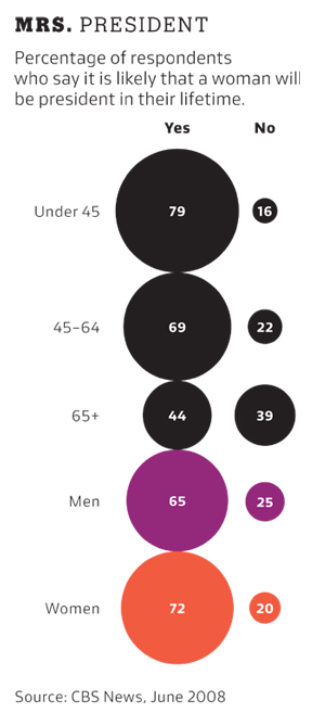
Percentage of respondents who say it is likely that a woman will be president in their lifetime
Interpreting the Data
The graphic contains data based on a poll asking if the respondents think that it is likely that a woman will be president in their lifetime. The results were grouped into age and sex of respondents. The main statement of the graphic is that the answers are significantly different depending on the age of the respondents. With increasing age people tend to believe that it is less likely that a woman will be president in their lifetime.
Critics & Changes
Chart Style
The bubble chart visualization allows someone to see the important statement of the data but the comparability between some parts of the data is affected due to the arrangement of the increasing spots. E.q. for human perception the size of the spot describing the percentage of people aged older than 65 who answered "Yes" is influenced by the spot above and underneath it, and seems therefore smaller than it would look without it's neighbor. Furthermore it uses to much data ink to show the difference of the percentages.
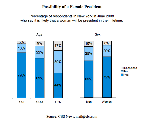
- The chart style was changed to a bar chart, which uses less data ink and optimizes the possibility of comparing the data.
Title & Information
The title "Mrs. President" isn't very meaningful. Furthermore there are some important informations missing, like in which state and at which time the survey has been made. Besides it would be helpful for the reader to have a contact address of the survey makers, to be able to contact them in case of questions.
- The title was changed to "Possibility of a Female President" to fastly give a impression what's the graphic about. Furthermore the missing informations about state and time of the survey have been added to the subtitle and a contact e-mail address has been added in the footer.
Organization of Data
Age and sex are different categories and interpretations of the data. Therefore they should be separated more clearly from each other.
- This separation has been realized through splitting the data into two graphs. One for representing the age and the other for the sex. They have been arranged beside each other, to let the viewer read all important data easily from left to the right.
Color
The color used in the graph highlights the data concerning the sex and let it appear more important than the rest.
- The special colors for women and men have been removed. Color is now used to differentiate the answers of the respondents and to highlight the different percentages of the answers between different groups of age or sex.
Percentages
The sum of the percentages for each group of age or sex does not equal 100. So there might be a percentage of people who didn't answer or had no opinion.
- The missing percentages were categorized with "Undecided" to get a sum of 100 percent, consistent for each group of age or sex.
Improved Graphic
References
- [Few, 2004]: Stephen Few, Show Me the Numbers: Designing Tables and Graphs to Enlighten, Analytics Press, 2004, Chapter 7 - General Design for Communication.
