Teaching:TUW - UE InfoVis WS 2008/09 - Gruppe 02 - Aufgabe 4
Aufgabenstellung
Gegebene Daten
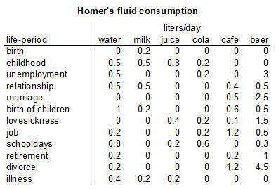
Homer Simpson's Trinkverhalten in Abhängigkeit von seinen Lebensumständen
...Visualisierung von Homer's Lebensabschnitten bzw. Ereignissen mit Einfluss auf sein
Trinkverhalten (zB.: Kindheit, Pubertät, Arbeitslosigkeit, Beziehungen, Hochzeit, Geburt
der Kinder, Liebeskummer, Alltag, etc.) von seiner Geburt bis Jetzt + mögliche
Zukunftsszenarien (mind. 3).
- Die Menge folgender Getränke soll für die jeweiligen Lebensumstände ablesbar sein
(ml oder Liter - je nachdem - pro Tag, Monat, Jahr (z.B.: Fokus+Kontext Methoden):
 a) Wasser

 b) Milch

 c) Fruchtsaft

 d) Cola

 e) Kaffee (Würfelzucker?)

 f) Bier
(vereinfacht angenommen, Homer trinkt ausschließlich diese Getränke)
- Die folgenden Werte sollen abhängig von den konsumierten Getränken ablesbar sein:
 1) g oder kg konsumierter Zucker (aus Getränken) + empfohlene Maximaldosis pro Tag, Monat, Jahr
   (empfohlene Maximaldosis/Tag: 50g; enthaltener Zucker: 10g/100 ml Cola; 10g/100 ml Fruchtsaft; 3g/Würfelzucker).

 2) mg konsumiertes Coffein + empfohlene Maximaldosis pro Tag, Monat, Jahr
   (empfohlene Maximaldosis/Tag: 600mg; enthaltenes Coffein: 10 mg/100 ml Cola; 80 mg/100 ml Kaffee).

 3) g konsumierter Alkohol + empfohlene Maximaldosis pro Tag, Monat, Jahr
   (empfohlene Maximaldosis/Tag: 20g; enthaltener Alkohol: 3,6 g/100ml Bier)
- Die Daten sollen zur medizinischen/psychologischen Analyse visualisiert werden.
- Die bisher erlernten Design-Prinzipien sollen umgesetzt werden (z.B.: Optimierung der Data-ink ratio).
- Die Mockups sollten zumindest 1) Homer's Leben im Überblick 2) und eine Detailansicht wiedergeben.
- Alle nicht angeführten Daten können frei erfunden werden.
Description
- Application area analysis & dataset analysis
The predefined dataset describes Homer Simpson's lifetime beverage consumption.
We distinguish between beverages (water, milk, juice, cola, coffee, and beer), contained substances (sugar, alcohol, caffeine), and their according recommended daily allowance (RDA). As actual data, we store ingested liters of fluids and the time of consumption with the information of life-period, like child ship, puberty, unemployment, marriage, birth of children, retirement, divorce, illness,..).
For measurement of consumed drinks, we use the ordinal data type Liter and for substances kilogram or gram, the life period is considered as nominal type and can also directly be linked to a specific quantitative time span. This results in a quantitative dataset composed of multiple instances of several measures taken periodically, which is best visualised as a line chart [Few, 2004].

- Target group analysis
The visualization is tended for medical and psychological stakeholders an their patients; to discuss easily the problems of their drinking habits and their solution. The medical view expresses the consumption of substances like sugar, alcohol and caffeine whereas the psychological view details the intake of fluids. With Homer Simpson’s dataset it is also possible to demonstrate the overall intake of amounts of sugar and similar harmful substances to children. Nevertheless the interface for the visualization should be easily comprehended and user friendly to be able to be operated by different target groups.
- Goal
The goal of the visualization is to get a quick and detailed overview on Homer Simpson’s drinking behavior depending his current life period and circumstances. It should be possible to identify the accumulated quantities of substances in relation to the recommended maximum dose. The interactive visualization should also offer an option to select considered fluids.
Concept
- Visualization
We should use graphs, when the message is contained in the shape of the values and the document you produce will be used to reveal relationship among multiple values [Few, 2004]. In our task about Homer Simpson's drink consumption are too much different values that have to be shown, that a table all alone won't show the information clearly enough.
- Visual Mapping
We separate the two different views for medical and psychologic interests:
On the psychologic or "drink"-view of our data, the drinks to be shown are selected:
The time series is mapped onto the x-axis [Few, 2004] and the consumed amount (in liters) onto the y-axis.
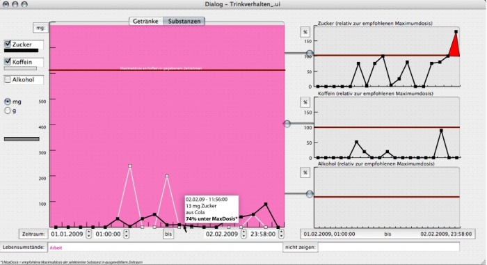
On the medical or "substance"-view, the sugar-, caffeine- and alcohol-rates can be examined:
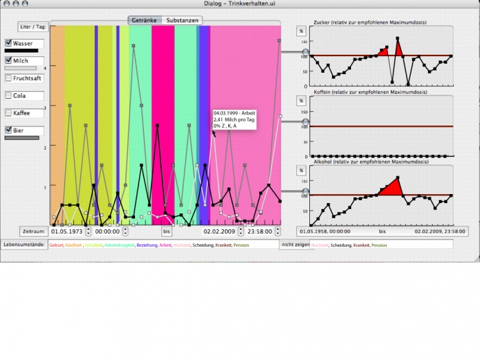
Again, the time is shown on the x-axis. For the selected time periode, the amounts of consumed substances sugar, caffeine and alcohol are mapped onto the y-axis. We can put a horizontal line where y equals one recommended maximum dose of the selected time periode (by a sliding button). That way, it is easy recognizable which substance consumption exceeds one RMA. But to show the substances according to the RMA clearlier, each substance is arranged in one diagram, with the relation to the recommended maximum dose on the y-axis an the same selected time periode on the x-axis, on the right side of the analysis panel at both (drinks- and substances-) views (Figure 1, 2).
The life periode is always shown in the main window on the left by coloured bars (transparently) in the background of the line panel. It is able to hide or show different life periodes by copying or droping the issued life-periode-words in the text-line (under the main analysis panel) to the right one.
- Description of the technologies
The time periode would be shown in a line chart, because quantitative dataset composed of multiple instances of several measures taken periodically, is best visualised as a line chart [Few, 2004].
We use a bar diagram for the life periode to show our nominal dataset, because a simple comparison of the categorical subdivision of one or more measures in no particular order can be shown very easy by this visualization[Few, 2004].
On the "substance"-view,in the main panel the amount of the substances are shown in optionally mg or g on the y-axis.
We decided to show the differences to the maximal dosis by mapping each substance on an RMA scale, where the maximum dose is clearly shown by the horizontal line at 100 percent [Few, 2004]. The line plot then visualize in the whether Homer Simpson's drinking behavior was adequate for each period by sliding the pannel on the left of each "RMA-substances"-diagram to the left/main diagram, and if not, by how much one RMA was exceeded.
- Interaction
The user can choose between the drinks-view and the substances-view by selecting the according tab on the top of the currently displayed diagram (panel "Anzeige"). Under this main diagram he can select the time area by writing the start- and end-time and -date in the boxes.
In the panel "Getränke", one can select up to three drinks for simultanous comparison.
In the "drinks"-view, the color under the drinking-name define the line color for a drink in the diagram. When a single point on the line is selected, a floating panel emerges showing the exact date, life periode(s), consumption and RMA for each substance of the according drink. In the three "RMA-substances"-diagram all contained substances are listed with their exact value and unit.
In the substances-view, also the color under the substance-name define the line color for a substance in the diagram. If a single point on a line is selected, the emergin panel reveals the exact date and time, the amount, the taken drink(s) and RMA of the according substance consumed in that point.
- MockUp
Figure 1 shows three different drinks in the (selected) all life periods, so it is mainly made for the physiological interest on the relation between the drinking habits and the time of his life. Additionally the physiological patient can be shown (on the right side of Figure 1) which substances he/she had taken too much in relation to the selected time periode.

Figure 2 shows the amount of the different substances on (optional) one day in (optional) milligram. The moved slider on the left side of the "caffeine-relation-window" show the maximum dosis of caffeine (red line) in the main window.

References
- [Few, 2004]:Stephen Few, Show Me the Numbers: Designing Tables and Graphs to Enlighten, Analytics Press, 2004, Appendix A - Table and Graph Design at a Glance.