Teaching:TUW - UE InfoVis WS 2008/09 - Gruppe 01 - Aufgabe 1 - Cartogram
Cartogram[edit]
Definition[edit]
More about Cartograms[edit]
A Cartogram is a small diagram, on the face of a map, showing quantitative information or an abstracted and simplified map the base of which is not true to scale. Simply we can say cartograms are unique representations of geographical space. They use cartographic outlines to represent data which depends on the source of the chosen country('s). [Bortins & Demers, 2002].
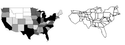
For example on the left side of Figure 1. you can see a traditional map of the United States and on the right side a Cartogram of USA depending on the population density. To see some statistical data like the population it can be enough to color a map or to use different grayscales, like in Figure 1 on the left. If you want to show something like the size of a state it might be better to use the same value (the size) to show the difference between the values.
The size of a cartogram is depending on the value of the part shown in the picture. For example in Figure 1 the state California is bigger than in the original map because of its high population. On the other side Ohio is drawn smaller on the right cartogram because it has a low population in relation to its area size.
Types of Cartograms[edit]
- Non-Continuous Cartograms
In non-continuous cartograms the regions on the map don't have to be connected to their neighbors. In this type of cartogram it is important to see the shape of the original map. User will recognize the map just because of their borders. The regions in the map are displaying the content with their own size. For an example a region with a smaller population will be smaller than a sector with a higher population, Figure 2 [Kocmoud, 1997].
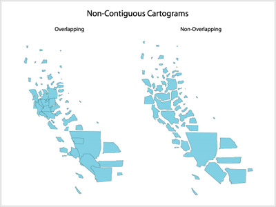
a) overlapping b) non-overlapping
- Continuous Cartograms
Different to the non-continuous cartograms, the important point is that the regions in the map are connected to each other. Accordingly the shape of each region is changing their size [Bortis and Demers, 2002]. Therefore the outline of the hole map changes. For example as we can see in the Figure 3, France is very distorted but still connected to his neighbors. With changing the shape of this country, the outlines of the whole map has changed [Wikipedia, 2009].
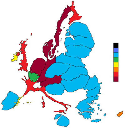
Cartogram of europe net budget expenditure in euros for the whole period 2007-2013 per capita using continuos cartograms
- Perimeter-Preserving Cartograms
A perimeter-preserving cartogram is one in which the map outline is left unaltered while the map interior is transformed. Algorithms of this type have the capability of “pinning down” vertices, thereby rendering them immovable. A map of the counties in Britain is shown in Figure 4.a. The transformation of this map into a perimeter-preserved cartogram can result in an identifiable country with distorted, unrecognizable regions, as shown in Figure 4.b. However, each county is still connected to its adjacent neighbors, upholding continuity despite the drastic changes in shape. More common are nonperimeter-preserving cartogram algorithms that do not have the capability to fix vertices. The perimeter is not preserved in Figure 4.c, resulting in a cartogram where the viewer may recognize the individual counties, but fail to identify the country [Kocmoud, 1997].
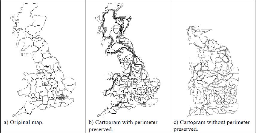
a) Original map b) Cartogram with perimeter preserved c) Cartogram without perimeter preserved
- Dorling Cartograms
This type of cartogram was named after its inventor, Danny Dorling of the University of Leeds. A Dorling cartogram maintains neither shape, topology nor object centroids, though it has proven to be a very effective cartogram method. To create a Dorling cartogram, instead of enlarging or shrinking the objects themselves, the cartographer will replace the objects with a uniform shape, usually a circle, of the appropriate size. Professor Dorling suggests that the shapes shouldn't overlap but rather be moved so that the full area of each shape can be seen. Another Dorling-like cartogram is the Demers Cartogram, which is different in two ways. It uses squares rather than circles; this leaves fewer gaps between the shapes. Secondly, the Dorling Cartogram attempts to move the figures the shortest distance away from their true locations; the Demers cartogram often sacrifices distance to maintain contiguity between figures, and it will also sacrifice distance to maintain certain visual cues. See Figure 5 [Bortins & Demers, 2002]. The positive effect of this is, that there are no free spaces between the shapes [Florisson et al., 2005]. The other map that is shown in the figure 5 is Graduated Symbol map, which uses symbols of varying size, rather than color, placed within a region to denote the value ascribed to it [McManus, 2005].
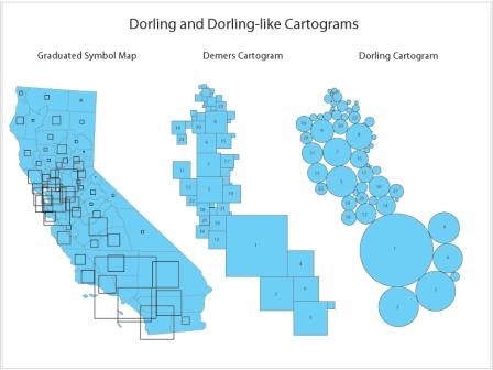
a) Graduated Symbol Map b) Demers cartogram
c) Dorling cartogram
Further reading[edit]
- Campbell, John. Map Use and Analysis. New York: McGraw-Hill, 2001.
- Gillard, Quentin. "Places in the News: The Use of Cartograms in Introductory Geography Courses." Journal of Geography. 78 (1979): 114-115.
- Tobler, Waldo. "Thirty-Five Years of Computer Cartograms." Annals of the Association of American Geographers. 94 (2004): 58-73.
- Vescovo, Victor. "The Atlas of World Statistics." Dallas: Caladan Press, 2005.
References[edit]
- [Bortins & Demers, 2002] Ian Bortins and Steve Demers under the direction of Dr.Keith Clarke ,NCGIA,Cartogram Types. Last edited at: July 31, 2002. http://www.ncgia.ucsb.edu/projects/Cartogram_Central/types.html
- [Kocmoud, 1997] Christopher James Kocmoud, Constructing Continuous Cartograms: A Constraint-Based Approach. Created at: December, 1997. http://www-viz.tamu.edu/faculty/house/cartograms/Thesis.html .
- [Florisson et al., 2005] Sander Florisson, Marc van Kreveld, and Bettina Speckmann. Rectangular Cartograms : Construction & Animation. 'Annual Symposium on Computational Geometry'.372–373, 2005.
- [Wikipedia, 2009] Wikipedia, Retrieved at Nov 2, 2009. http://en.wikipedia.org/wiki/Cartogram .
- [McManus, 2005] Brian MaManus, Thematic Maping, GIS Resource Document 05-70, Created at: April, 2005. http://www.pop.psu.edu/gia-core/pdfs/gis_rd_05-70.pdf