Teaching:TUW - UE InfoVis WS 2007/08 - Gruppe 09 - Aufgabe 4
Aufgabenstellung
Aufgabe ist das Design einer interaktiven Visualisierungsapplikation zur Darstellung und Exploration
(des zeitlichen Verlaufs) von Laborwerten einer Blutuntersuchung. BenutzerInnen, Einsatzzweck, Tasks, etc.
sollen von Euch selbst festgelegt und beschrieben werden.
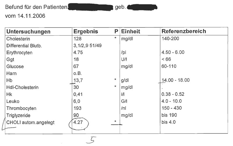
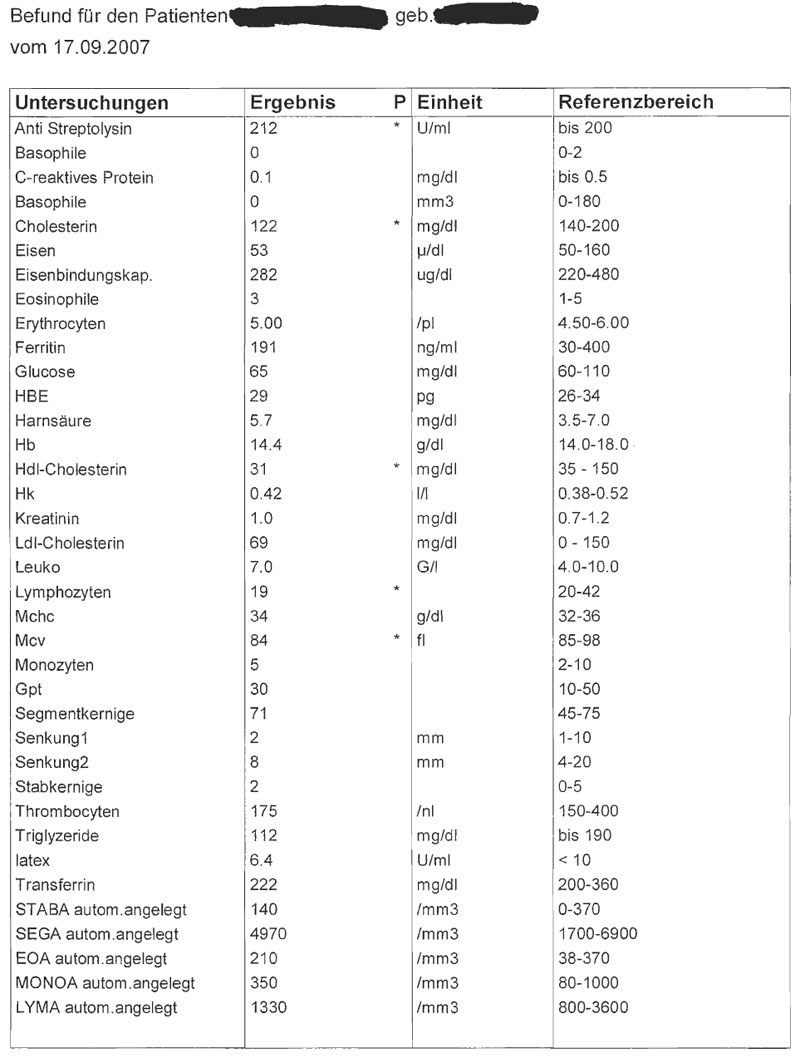
Beispiele für derartige Datensätze
ABGABE
Analysis of the application area
Application Area Analysis
Laboratory Values of blood tests should be visualized, in order to make an exploration, for a point in time as well in a chronological sequence, possible. This Application Area is highly sensible with high expectance towards accuracy. Furthermore the development of blood test results over time is of special interest. For the interpretation of the values and a diagnosis based on these values, the available reference values are of central relevance.
One special characteristic is that the results are within known ranges. The scale can therefore be adjusted towards these ranges.
Dataset Analysis
Theoretically the values of the blood tests are continuous. From a practical point of view the values will not undercut or exceed some certain borders. Therefore the data can be considered as steady and finite. The borders will be set obviously ample to be able to visualize the most unlikely values as well.
The data is two dimensional. One dimension is the value, the second dimension shows the point in time (the date of the blood test) for which this value is valid. It has to be analyzed whether certain test results could be gathered together from a thematic point of view, in order to create structures and groups.
Target Group Analysis
The doctor needs a fast overview of the test results to be able to create a diagnosis. First and foremost the visualization should therefore help doctors to get an overview of the test results. The second target group should be patients. It should be possible to explain them in an easy way the test results.
Target Group Specifics
Doctors often lack time and are under performance pressure. To avoid misinterpretations and to support the doctor in creating a diagnosis, the doctors’ attention should be drawn to the values outside the reference range. Furthermore an overview should show whether the results are ok or not. Patients should be able to understand easily the visualized values. It is of high importance that the patient gets support in reaching clarity in this sensible topic.
Well known Visualization Techniques for this area
Icon-based techniques would be a possible approach for visualizing this kind of data. There are some tools like the VIE-VISU-system [Horn et al., 1998] for example that use glyphs to visualize medical data. The drawback of most icon-based techniques is that they cannot visualize data that changes its values continuously over time. In most cases only specific points in time are visualized separately by one glyph. The VIE-VISU-system for example uses 24 glyphs to represent one 24-hour-cycle of measurements. Purpose of the Visualization
The visualization should provide an overview over the blood test results both for a concrete test and in variation in time. An outstanding task is the elevated focus on values which exceed or undercut the predefined borders. Not only these values need special attention, but as well the values near these borders should be focused in some way. The visualization should answer questions like whether the blood values are in the normal range, whether some tendencies exist and whether one or more values should be drawn more attention to.
Concept
As mentioned above, the tool is mainly intended for doctors, therefore one should be able to use it intuitively. The information to emphasize would be :
- the change of a specific blood feature over time
- when the value of a blood feature goes outside of its reference interval
We also want to keep the table format, because of its convenience when looking up specific values [Few, 2006]. Also, our values have more than one unit of measure, which makes it useless to compare them amongst each other [Few, 2006]. A graph is used for visualizing the values of a specific blood feature over time.
Design
The design is was intentionally kept simple, not to distract the user from the main task. It only offers the most important information.
Header
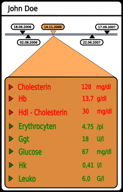
All screens have a common header with the name of the patient and a time line. The time line shows the dates when blood tests were taken. The user may click on each date and the corresponding data will be shown. It is also possible to drag the time line in order to shift the view port if there are too many dates to fit on the screen.
Outline Screen
The initial screen shows the data in tabular form. Values which are outside the reference interval are shown on top of the list, colored red and in alphabetical order.This makes it easy for the doctor to immediately spot dangerous values. Other values are colored green, also in alphabetical order. Upon clicking on the triangle next to a blood feature we get to the detailed screen.
Detailed Screen
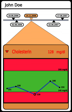
This screen has a graph showing the various measurements of the selected feature over time. The area of the reference interval is colored green, everything outside of it is red. The selected value has a enlarged dot and is centered on the screen. It is also possible to use the time line to select a different date.
Discussion
One of the main goals of the design was to keep it simple, so that the user does not have to go through a manual to figure out how things work (doctors are usually not technical people). The sorted table supports the user in locating irregularities in the blood sample as fast as possible. The detailed view gives an insight about the history of selected blood feature and therewith assists in discovering recidivism. A possible improvement would be to use different shades of green/red to indicate how close a value is to the border of the reference interval. Whether or not this information would really be useful has to be discussed with a doctor.
References
- [Horn et al., 1998] Werner Horn, Christian Popow, and Lukas Unterasinger. Metaphor Graphics to Visualize ICU Data over Time, In Proceedings of Intelligent Data Analysis in Medicine and Pharmacology (IDAMAP-98), Workshop Notes of the ECAI-98 Workshop, 1998.
- [Few, 2006] Stephen Few, Show Me the Numbers: Designing Tables and Graphs to Enlighten, Analytics Press, 2004, Appendix A - Table and Graph Design at a Glance.


