Teaching:TUW - UE InfoVis WS 2007/08 - Gruppe 09 - Aufgabe 3
Poor Graphic
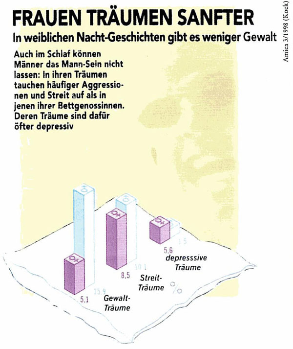
Frauen träumen sanfter
Critics
Data-Ink Ratio
Following this principle unnecessary non-data ink will be removed. Therefore the background picture and the unnecessary graphics will be removed. Furthermore unnecessary data ink will be removed or replaced.
In the next step the most important data should be emphasized. Since the attention of the reader should be drawn on the information that men more often dream about violence and conflicts, whereas women lead in having depressive dreams, this information should be emphasized with some special markup. For example, the bars, which having the dreams of the men ahead, could be colored with a more saturated color.
Bei der geringen Anzahl an Balken ist ein Hervorheben Einzelner meiner Meinung nach
nicht notwendig und würde eher zur Verwirrung beitragen.
Visual Means to Highlight Data
As mentioned above we want to draw the reader’s attention to the difference between women and men’s dreams. As the most important data in the graphic is that men dream more about violence, this part should be emphasized. Therefore the men’s violence bars could be drawn with a darker color.
vgl. meinen Kommentar weiter oben
Background
Following this rule, all the background pictures should be erased, and replaced with some background that does not draw much attention, but serves the purpose of a background.
Emphasize the most important data ink
Hue, Enclosure, Size, Line width and more are attributes which can be used to emphasize the most important data ink. The most important data in our graphic is the relationship between men and women´s dreams. So this part of the graphic should be emphasized.
- Group the data (i.e., segment the data into meaningful subsets)
- Prioritize the data (i.e., rank the data by importance)
- Sequence the data (i.e., give direction for the order in which the data
Since we want to draw the attention to the data which shows the violence data, the order of the data could be changed. That the reader begins at the left, subsequently follows the graph to the right and that his look at the graphic ends with a ‘wow’ effect.
Prioritize the Data
As mentioned already we want to draw the reader’s attention to the violence dreams. But the data shows as well the interesting point that depressive dreams are underrepresented, at least concerning this survey, in dreams. There are some ways to prioritize the data. For this example we think it is useful to concentrate on the hue or a lesser saturation of the depressive bar color.
Sequence the Data
The contents of a graphic should be clearly divided into columns, since readers will first scan the left-most column from top-to-bottom, then move to the top of the next column [Few, 2004]. Therefore the 3-dimensional view of the bar chart in the given grapic is unnecessary and even obstructive for the viewer. It should be replaced by a normal 2-dimensional bar chartwith proper labeling.
Text
Most of the text in the given graphic satisfies the rules of [Few, 2007]. The labeling of the bars is ok accept that the "%"-sign should be put directly next to the values of each bar. Furthermore the color of the "male"-bar hasn't been chosen very well since it has not enough contrast to the background. The title of the graphic could be improved also. It doesnt give very much information about the contains of the grapic. "Häufigkeit von Träumen nach Geschlecht" would be a more informative title for example.
Sonstiges:
- Es wird vorausgesetzt, dass alle Leser mit den männlich - weiblich Symbolen vertraut sind.
- Es gibt keine Legende (Zeichenschlüssel).
- Das Prozentzeichen befindet sich weder bei den Werten, noch sind entsprechende Angaben im Titel gemacht.
- Der Titel suggeriert, dass Frauen besser schlafen, was auch bei depressiven Träumen wohl nicht der Fall ist.
- Zudem ist nicht klar, was mit den restlichen Arten von Träumen (die Anteile die auf 100% fehlen?) ist.
Worauf beziehen sich die Prozentwerte? Auf die männl. / weibl. Wohnbevölkerung? Auf einen bestimmten Zeitraum?
Für welchen Zeitraum? Wie viele Probanden wurden herangezogen? usw.
Revised Graphic
Improvements
The following changes were made to fix the issues criticized in previous sections:
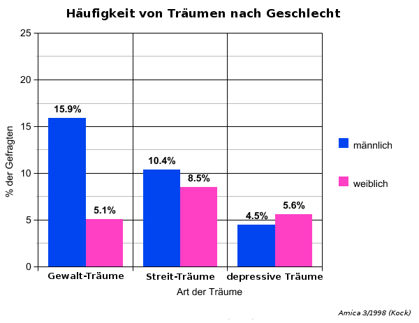
- The title was changed. It now gives a more accurate description of the graphic.
- Unessential and partially disturbing background graphics was removed. The overall image is now much clearer and more readable.
- The labeling was improved. Unit of the values is now immediately clear.
- Switched the model from 3D to 2D. Now the graphic can be read off more accurately.
- Changed the coloring to be distinguishable and still easily readable.
- Added grid and axis for better orientation.
Das Grid ist hier sehr dominant. Die vertikalen Linien in der Datenregion sind eher störend.
Etwas dünnere, hellgraue horizontale Linien würden auch den Zweck erfüllen.
Sonstiges:
- vertikale Beschriftung eher vermeiden, wenn möglich
References
[Few Article, 2004] Stephen Few, Elegance Through Simplicity, Article about redesigning graphs, http://www.intelligententerprise.com/showArticle.jhtml;jsessionid=N2ATDQWY5VYKSQSNDBGCKHSCJUMEKJVN?articleID=49400920, accessed 29.11.2007.
[Few, 2004] Stephen Few, Show Me the Numbers: Designing Tables and Graphs to Enlighten, Analytics Press, 2004, Chapter 7 - General Design for Communication.

