Teaching:TUW - UE InfoVis WS 2007/08 - Gruppe 09 - Aufgabe 2
Aufgabenstellung
Zu beurteilende Tabelle
Critics
Structural Components of Tables
- Label
- Introduce
- Explain
- Reinforce
- Highlight
- Sequence
- Recommend
- Inquire
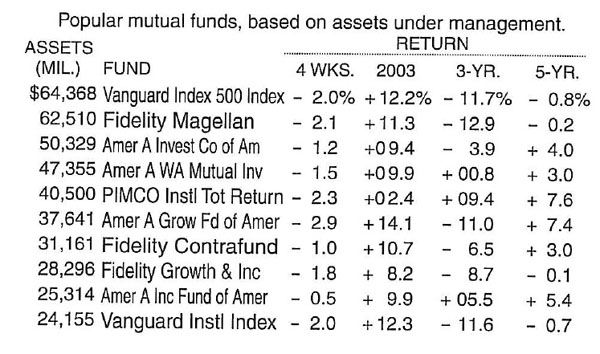
The table tries to explain its data with some text.
The title of the table should be clearly seperated from the table and maybe regrouped in a title and a sub title.
It states labels for the ASSETS and the FUND columns. These column headers label the information below them and should be separated from the data with a horizontal line.
The return values are clearly grouped with the spanner header RETURN. Maybe it should be stated that this is the return on investment. Below the RETURN spanner header we find column headers which state the period for which the data is valid. These should be separated from the data with a horizontal line. Furthermore it is not absolutely clear what there meaning is, and the mixing of so different periods makes it more difficult to understand the table. For example it would be interesting which 3 year period the 3-YR column covers.
The dollar and percent signs should not be introduced at the first data line. Data definitions should be part of the column headers.
The table does not try to focus my interest to a special area, because no area is specially highlighted.
Delineating columns and rows
- White space
- Rules and grids
- Fill color
White space
It is not possible to read the rows without difficulty because the vertical white space between them is pretty small. Therefore it is recommended that the vertical white space between the rows is increased.
As well the horizontal white space between the columns should be increased to ease the reading of the columns. From my point of view, the comparison of the funds is the most interesting information in this table. To lead the reader to scan down the columns, it is advisable to pronounce the white space between the columns more than the one between the rows.
To make a clear distinction between row headers and data, the horizontal white space should be increased between these two parts. As well the horizontal white space between the ASSETS and FUND column should be increased a bit to make a clear distinction.
Rules and grids
In order to make the table more readable it is advisable to draw a line between the column headers and the data.
If the table is in its original context surrounded with some objects where there should be a clear distinction, thin lines could be drawn on each side. Remember to keep the lines as thin and light as possible.
A combination of horizontal and vertical rules could be used if there is an area of special interest.
Fill color
Following this quotation the rows of the table could be separated with fill shades. It would also be possible to delineate the headers in the table as separate groups of information in using fill colors.
Arranging data
Columns or rows
Concerning the ranking relationships the table shows an easy to understand top-down ranking of funds regarding their assets in million dollars.
The time is illustrated from left to right, but the relations between the columns are not clear at all.
Groups and breaks
Since the changing time scale of the table is confusing, I would suggest to group the data for a given time scale.
For example make a table for the year 2003 till 2007. Or make a table showing the quarters in the year 2003. Everything is possible, but it should be consistent.
Columns sequence
Following this principle the table puts the values near together which should be easily comparable.
The table shows the returns in percentage and the reader can easily compare the percentages.
Data sequence
The funds are listed descending concerning their assets. Since the asset of a fund is one of the most important characteristics and the assets are listed in numbers, it is useful to list the funds in their quantitative order.
Formatting text
Orientation
The orientation of all text in the given table is optimal.
Alignment
In most cases convetions are used to determine the alignment of text. Few explains three of them as follows:
- Numbers that represent quantitative values, as opposed to those that are merely identifiers (e.g., customer numbers), should always be aligned to the right.
- Dates are best aligned to the left, using a format that keeps the number of characters in each portion of the date (i.e., month, day, and year) constant.
- Text that expresses neither numbers nor dates works best when aligned to the left.
The given table satisfies the first rule. All numbers that represent quantitive values are aligned to the right, namely the columns 'ASSETS' and 'RETURN'. Also the thrid rule is satisfied since the text in the 'FUND' column is aligned to the left.
Number and date format
- Numbers include no unnecessary information (e.g., excessive levels of precision)
- They express the data using the format that is most familiar to its readers.
The number format of the given table is very good. There is a comma to the left of the first three whole-number digits in the 'ASSETS' column. Also in the 'RETURN' column alls positive and negative values are tagged by a + or a - sign. But there is a small shortcoming: The % and $ sign is only shown once in every column. This should be placed immediately next to every dollar or percentage value.
Number and date precision
The level of precision in the 'ASSETS' column is a little bit too high. The first two digits do not communicate very important information. When talking about 20- to 70-thousand dollars, fifty dollars more less don't make a noteworthy difference.
Fonts
- The font should be as legible as possible
- The same font should be used throughout.
For the given table the second rule isnt true for the whole graphic. In the 'FUND' column there fontsize seems to differ between the different rows.
Emphasis
Emphasis such as bolding or italicizing is missing completely in this table.
Summarizing values
This table currently does not contain any summarizing values.
Column summary values
For each column under the 'RETURN' spanner header it could be useful to provide the median of gain/loss values. It is unclear though, whether this information is desirable at all (due to lack of domain knowledge).
Row summary values
The detailed values in columns beneath the 'RETURN' spanner header seem to be cumulative across a row (Assumption based on the cryptic column titles). That is why there doesn't seem to be much sense in providing a separate summary values for each row (i.e for each fund).
Group summary values
Given only the information provided in the table, there is no plausible grouping possible. The only possible grouping, using only the provided data, would be one by intervals of assets (in Millions of Dollars) or gain/loss percentage intervals. However (possibly due to our lack of domain knowledge) these groupings don't seem reasonable.
Header versus footers
In our case the summary values denote complementary information, therefore their position in the footer seems appropriate.
Page information
Our table is not split into multiple pages, therefore this aspect is not applicable here.
Repeated column headers
The proper way of handling tables spreading across multiple pages would be to copy the table headers on top of each page. However, in our case this is not necessary.
Repeated row headers
This principle is applicable when multiple rows, which spread across multiple pages, are grouped together and have one title column where the title printed only for the first row of the group. The correct way of designing such a table would be to re-print the title on the first row on each page. Again, this is of no concern to our table here.
Improved Table
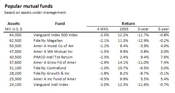
The appearance of the table as a whole has been improved. White space between the columns has been added to improve the tables readability. Furthermore the labels have been separated from the data by using horzontal lines. Also the format of all text (fontsize) and the format of the numbers have been set to a consistant value. The only remaining problem is the labeling of the four 'RETURN' columns. Since we didnt have access to any meta information it wasnt possible to determine the exact meaning of these four labels and so we could not improve this deficiency of this table.
References
[Few, 2004] Stephen Few, Show Me the Numbers: Designing Tables and Graphs to Enlighten, Analytics Press, 2004, Chapter 8 - Table Design.

