Teaching:TUW - UE InfoVis WS 2007/08 - Gruppe 07 - Aufgabe 4
Assignment description
Description of the fourth task
Assigned data / model
Description of the application field
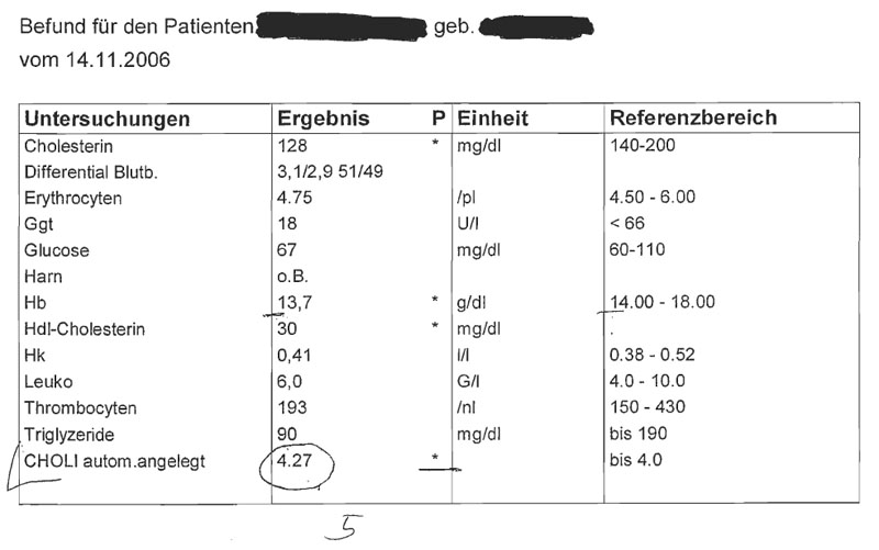
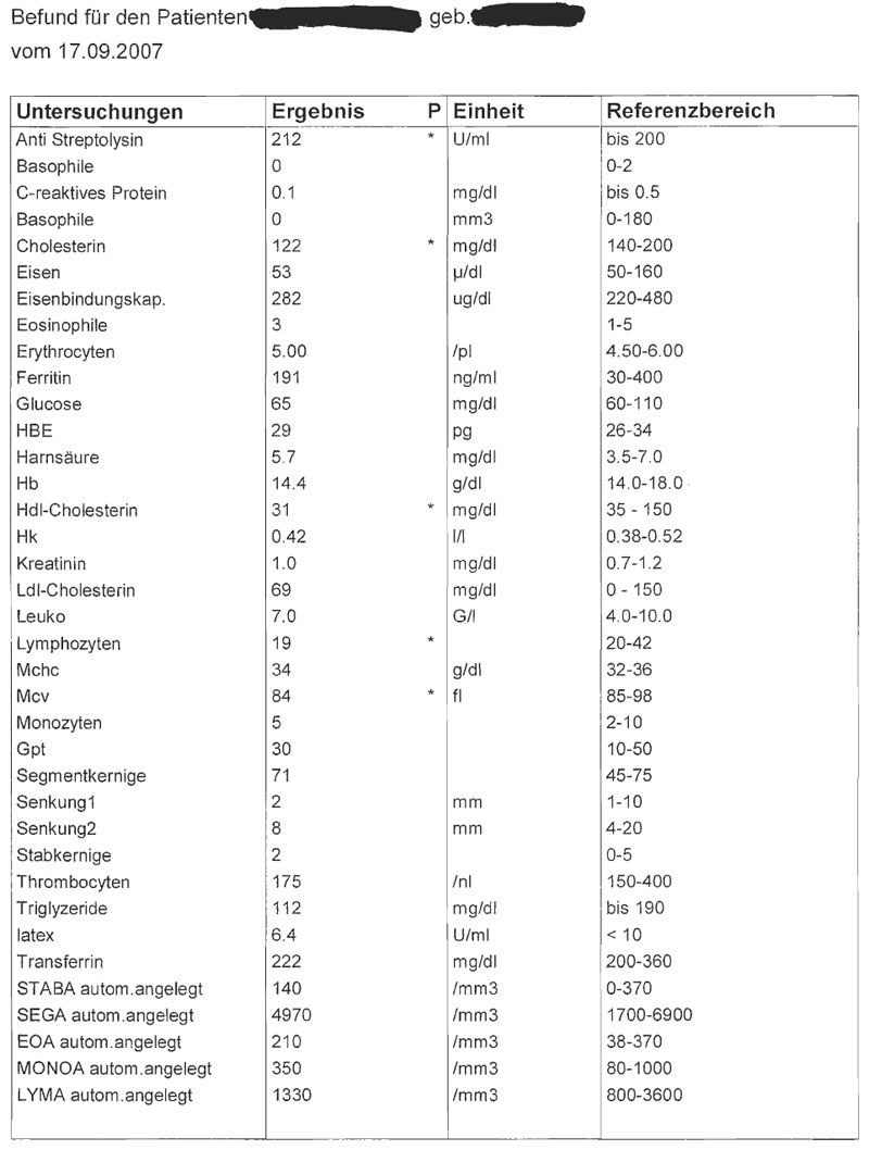
The two tables above show medical data, which are two diagnostic findings of a patient recorded at different dates. In each table row, one examination, it's result, the unit of the result and the interval of "optimal" values are shown. The examination results descripe the amount of chemical compounds or substances in the patient's body. Diagnostic findings play an important role for medical diagnosis.
The first table consists of more rows than the second. Perhaps less substances in body were examined or the tableview shows only a short section of the results.
Each table has four columns. The names of the examinations and the name of the substances the patient has been tested on, respectively, are written in the first column. The result values - numerical values - for each examination are denoted in the second column. Some values are floating point numbers, others are integers. The reason of using floating numbers is, that small variances of the values may cause high differences in diagnosis. One examination has more than one result ("Differential Blutb."), but we don't know the meaning of this results. Some of the cells in this column are marked with "*". This indicates that a value does not reside in an interval (specified in the fourth column). In the third column, the units of the results are shown. The fourth column lists the intervals of reference values - the "optimal" values - for each examination. If a value resides within an interval, the result is "good" - which means that the patient has no lack and no overrun of a specific element.
Multiple forms of intervals are being used, e.g:
- bis 200
- 220-480
- <66
The data is sorted ascending using the first column (the name of the test). None of the values can be classified as nominal or ordinal. We are only dealing with floating point numbers (continuous) and integers (discrete). There is also no hierarchy in this data. It's actually a list of key value pairs where the value-part can contain one or multiple values and an information about the units used and reference.
But the use of diagnostic findings in practice is slightly different. They are not being used as standalone tables with some test results. The values are being examined how they change in time. This fact changes the dimensionality of all data (test key-value-pairs) from 1-dimensional to 2-dimensional because they usually change over time. This is the main issue why we would suggest a different presentation of this data in a more clearer, simpler and legible way.
Target group
The target group (the data has been produced for) is definitely hospital/medical staff. We think that people who do not have any medical knowledge, are not able to make a diagnosis based on the data. They can basically determine which test results do not reside within the reference intervals. The data is very private and should only be seen from people authorized people - like medical stuff. Of course the application can also be used to give the patient an overview of his diagnosis data. For that purpose it is important that the attending physician is at present and can present the visualised data with several views and funded knowledge. For that reason we try to display the given data as intuitive as possible to ease the handling of the appication for the medical stuff aswell as patients that are assisted by a physican should be able to understand basic coherences and can therefore gain a better understanding for ongoing inquiries.
Concept & Mockup for: The DIAMONT application
We named our application DIAMONT which stands for DIAgnosis MONitoring Tool. This tool has been designed for medical staff, i.e. doctors and nurses. It shall provide a more easier legible and better organized view on the data from the test sets. The application is made as a desktop application or as a PDA (handheld-gadget) application. The idea is, to share the data with all hospitals and medical institutions. Therefore, the software has to be installed in each medical institution and the data itself is located on a remote server.
In the following, we will provide a detailed description of DIAMONT's interface. The red colored numbers mark the parts of the interface we want to describe in detail.
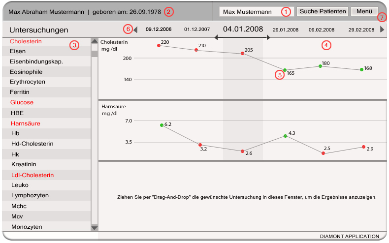
Figure 1
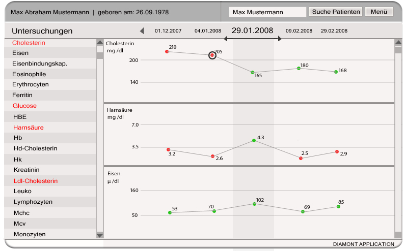
Figure 2: point marked with black circle can be edited in the medical notes sheet (see Figure 3)
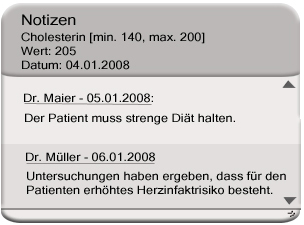
Figure 3
ad 1: Patient Search
The patient search section allows to search for specific patients. By simply typing in a name (or other inforamtion which can be used to identify a patient) and pressing the "Suche Patienten"-Button, the application displays a list of records in the main window. By single-clicking a row, more detailed information about the selected patient is shown in the main window, which is for this purpose an "Patient view" window. Data of the patient can be: name, date of birth, dates of hospitals stays etc. Double-clicking a row will load the patients test values to the list of available tests (see 3).
ad 2: Patient information
This section displays the patient's name and birth-date. More detailed information about the patient is given (in the main-window) when the name of the patient is clicked with the mouse. The information is shown then in the main window and "Patiens view", respectively. There, the patient's data can be modified.
ad 3: List of available tests
The list of available tests shows the names of the tests/examinations that are represented in the dataset. By dragging a test into the main window (see 4), the examination information is visualised in the main window. Values that reside below or above the optimum range - at the chosen date - (see 6) are highlighted red. Values that are within the reference range are black. This feature allows the user to quickly scan the tests for outstanding values, that might be interesting for further research.
ad 4: Main Window
The user can drag and drop one or more tests (the amount is not limited) from the list (see 3) into the main window and the sub-windows, respectively. Empty sub-windows (where no examinations are dropped)show a message that says, that an examination can be dragged and dropped into this window. Each sub-window, which contains an examination, displays detailed information of the tests/examinations over time. The values obtained over time are visualised with a graph (line chart). The sub-windows are divided by horizontal lines into three parts. Examination values that reside above the reference interval are drawn at the top. The part in the middle shows values that reside within the interval. The bottom part shows test results that reside below the reference interval. Additionally, the values are marked with colored circles: red, if the value is too low or too high; green, if the value resides within the optimal interval. The light grey marked region marks the results that refer to the "main" date, which can be selected by simple clicking on a date in the timeline above (see 6).By clicking with the mouse into a sub-window, a window opens and the information is shown larger scaled. In this window, the user can modify the size/scalefactor of the value axis and also the time axis.
ad 5: Medical Notes
Each circle in the main window, which refers to a single result of an examination, can be selected by mouseclick. A texteditor opens, and the user can write some important notes for a specific examination result (see Figure 2 + 3). By clicking on the name of the doctor in the notices window, some informations about the doctor, as hospital, department etc. are shown in the same window.
ad 6: Timeline
As stated before, the main window displays examination results over time. On the timeline, the user can select a specific date by simply clicking on it with the mouse. The selected date is the date of interest. The font of the selected date appears a bit larger than the fonts of the dates beside. Values that were obtained at this date, are shown in the grey marked area of the main window. The user is also able to scroll through the time by using a scroll bar (the arrows positioned on the left and right of the timeline). By scrolling, results of the examinations in the main window get adjusted - according to the time interval that is currently shown int the timeline. Below the timeline are two arrows, that point to the left and right. The user can scale the shown timeline interval by pulling the arrows to the left or to the right (with the mouse). In this manner, the user can see and compare more values obtained at distinct dates (see Figure 2).
ad 7: Menu
By pressing the "Menu"-Button, a pop-up window opens and some options are listed.
The options:
- Print shown diagnostic results: The shown image the main window and a table which contains informations for each examination can be printed.
- Print whole diagnostic report: The whole set of diagnostic findings of the picked date (which is displayed in the main window)can be printed in form of a table. In each row, one examination, it's result, the unit of the result and the range of optimal result values is put column by column. The user has also the possibility to choose another date for printing the related diagnostic findings.
- Send Message/Data: The user can share notes or views with stuff of the same or other hospitals.
- Options: The user can customize specific functions of the program (e.g. personal layout etc.).
- Help: The user can read the documentation of the software and instructions of software usage.
Links
References
- [Few, 2004a] Elegance Through Simplicity. Retrieved at: December 09, 2007. http://www.intelligententerprise.com/showArticle.jhtml
- [Few, 2004b] Show Me the Numbers: Designing Tables and Graphs to Enlighten, Analytics Press, 2004, Chapter 7 - General Design for Communication.
- [Tufte et al., 1999] Tufte Design Principle, Retrieved at: December 09, 2007. http://ldt.stanford.edu/ldt1999/Students/mizuno/Portfolio/Work/reports/tufte/ed229c-tufte-outline.html
