Teaching:TUW - UE InfoVis WS 2007/08 - Gruppe 06 - Aufgabe 2
Jump to navigation
Jump to search
Aufgabenstellung
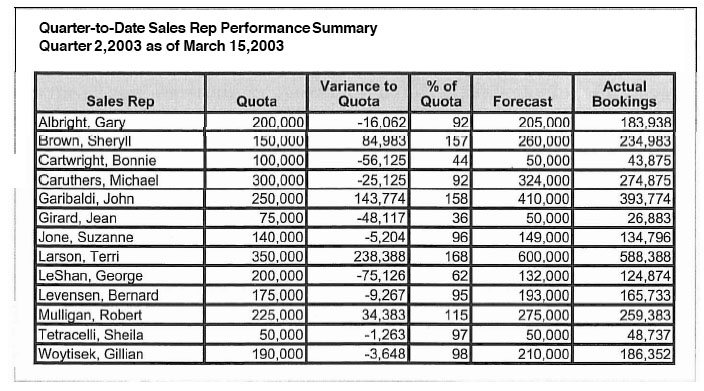
Zu beurteilende Tabelle
Critics
- White space should be used instead of girds to delineate rows and columns. Grids break up the data, while white space makes it easier scanning across a single row or column. Optionally subtle horizontal fill shades could be used to delineate the rows from each other.
- In the given table the (at least for us) most important information, the actual bookings, are placed in the last columns.
- The order of the given table is wrong. Quantitative values which should be compared should be placed close to each other and quantitative values which are derived form other values should be placed just to the right of the column from which they are derived.
The order of the columns should be rearranged to:
Sales Rep Quota Actual Bookings Variance to Quota % of Quota Forecast
- Choosing ‘Sales Rep’ for the row header is a good decision, because it has the most subdivisions and arranging them across the columns would exceed the page width. Additionally the reader has all relevant information about one sales rep. in a single row. Because this is a performance table, it would be wise to choose a sorted 'Actual Bookings' column to find a sales rep easily.
- The column header ‘Sales Rep’ should be aligned to the left, as this alignment works best with text. The rest of the column headers should be aligned to the right, as right alignment works best with numbers. This will help to improve scanning the columns.
- The column headers fill shade is a good method to delineate the table header from the rest of the table, although it could be slightly more subtle. Also a ruler could be used instead of a fill shade.
- Each percentage values in the column ‘% of Quota’ should have a percentage sign to the right.
- The table has no summarizing values, only the sum of each column seems reasonable. The column summaries should be delineated from the rest of the table the same way as the column headers.
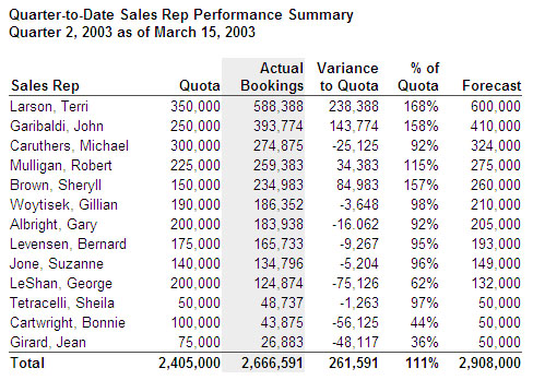
Improved Table
Declaration of improvements
- White space instead of grids makes it a lot easier for the reader to track across the rows.
- The (for us) most important information of the actual bookings were placed as second column, so the reader doesn’t need to scan the whole row. In addition the column was highlighted with a subtle shade to get the readers attention and the sorted values show the sales reps with the best performance.
- With the changed order the reader can easily compare the quota with the actual bookings. The columns ‘Variance to Quota’ and ‘% of Quota’ are also next to the column ‘Actual Bookings”, from which they are derived, which makes it easier to analyze them.
- With the changed alignment of the column headers, it’s easer for the reader to scan the columns.
- The percentage sign was added to each value in the ’% of Quota’ column.
- Instead of fill shades rulers were used to separate headers and footers.
- Total column sums were added to provide the reader with further information.

