Teaching:TUW - UE InfoVis WS 2007/08 - Gruppe 05 - Aufgabe 4
Aufgabenstellung
Aufgabe ist das Design einer interaktiven Visualisierungsapplikation zur Darstellung und Exploration
(des zeitlichen Verlaufs) von Laborwerten einer Blutuntersuchung. BenutzerInnen, Einsatzzweck, Tasks, etc.
sollen von Euch selbst festgelegt und beschrieben werden.
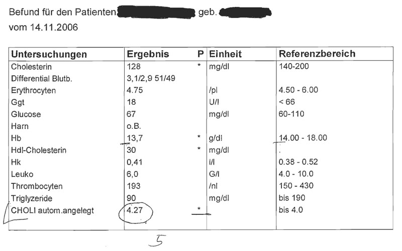
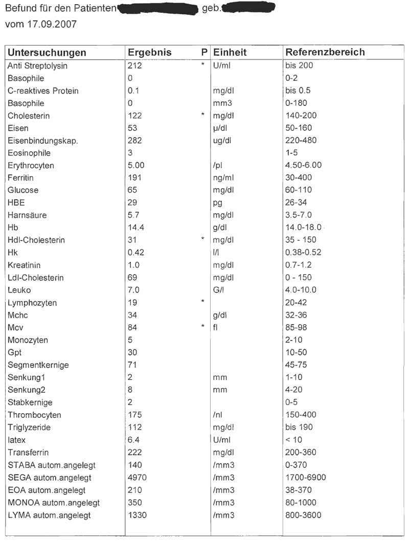
Beispiele für derartige Datensätze
Target exploration
Target and dataset description
field of appliation
This visualization is used in a medical environment to show the different results of blood examinations over time. It's important to highlight values, which are not in the "normal" range, so that you can recognize those values at a glance. It's possible to measure different values at every blood test. Thereby the structure of the datasets can be different for every blood test. The datasets are usually very big and are very complex to analyze.
Datasetanalysis
- The measured values (Cholesterin, Glucose,...) are ordinal and continuous. Those values are numbers. The reference values "date of birth" and "date of examination" are ordinal as well, but discrete. The reference value "patient's name" is nominal and discrete (because you can only choose from 26 letters).
- The dataset is multidimensional. There are many different datasets over time, thus the datasets are temporal as well. There is no hierarchy within the datasets, all measured values in one dataset are independent of each other (but the measured values are dependent over time!).
target group analysis
The target group of our visualisation are doctors, who need the results of blood tests for their daily work. So the visualisation should be very intuitive and easy to understand and you should get the most important information at a glance. The medical knowledge about the visualised data is very high and the users (doctors) are familiar with these kind of data. It's not necassary to explain the different values in detail, because they know all of them. But they have to interprete these datasets to draw the right conclusion. Visualization techniques, which are commonly used in this field are stardinates and parallel coordinates (e.g. MediChart: http://www.symposion.com/MediChart/k03a.htm). These visualization techniques are used because they can display multidimensional datasets in a very effective way.
goals of visualization
With our visualization abnormal blood values should be detected at a glance within the context of all blood examination results over time. It's also possible to highlight one dataset (from one specific date) and detect the detect the tendency of values. The changes over time can also be visualized. You can specify the ranges for the normal values and all values, which are not in this range are highlighted! The data in our visualization should be clearly arranged and so it is easier to predict values and the future state of health. With our visualization it's easier than to predict something from tables.
Concept
kind of visualization
We use the parallel coordinates technique for our visualization.
visual mapping
All data dimensions are mapped as points. The higher the value, the higher the points. Only the "reference values" (name, DOB, date of examination) are NOT mapped as points (this wouldn't make sense ;-).
description of parallel coordinates
interaction
- highlight single data sets (e.g. specific date)
- zoom in (to specific axis), to show the differences between the values
- specify the time range, from which the datesets should be used
- data values: if you select a data set, the corresponding values are shown
- change the range of "normal" values for every axis
- add/remove displayed axis
Fake Screenshots
We made the assumption that the arrangement of the axis make sense from a medical point of view (e.g. Eisen, latex, Glucose and Harnsäure belongs together for a certain health state).
-
standard view for one patient (abnormal values highlighted)
-
values from one specific blood examination are highlighted and detailed information are shown
-
zoom in to specific axis (name of patient should be shown)
support for doctors
It's very intuitiv and the tool must not be learned. You get an overview over the health state of one patient over time. It also allows you to predict future health states and allows you to go against bad consequnces.
pros and cons
+ high dimensional overview
+ intuitive
- temporal history could be better shown in other visualization techniques (e.g. time axis)
- distinction between lines may be hard (improvement is possible)


