Teaching:TUW - UE InfoVis WS 2007/08 - Gruppe 05 - Aufgabe 2
Jump to navigation
Jump to search
Aufgabenstellung
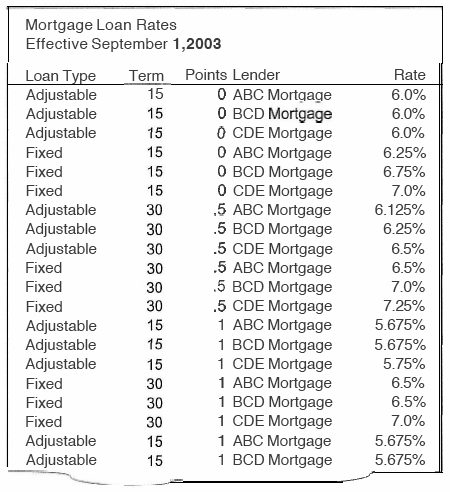
Zu beurteilende Tabelle
Links
Lösung der Aufgabe
Animadversion on the given table
- Absolutley no fill color
- No subdivisions i.e. loan type (there are only 2 types) or term (also 2 types). The information adjustable/fixed or 15/30 is used too often.
- The table is sorted by points. Maybe it would be better, if it´s sort by rate or term
- The word ‘mortgage’ is used to often in the column ‘lender’, it´s not necessary to repeat it so often
- In the column ‘points’ the numbers should have the same amount of digits before and after the decimal point
- The numbers in the column ‘rate’ should all have 3 digits after the decimal point
- The title “effective September 1, 2003” isn´t clear. Is this a date or something else? (because only 1,2003 is bold, why is september not bold?)
- Due to the use of white spaces the reader scans the table column by column but it would make more sense, if there is less white space between the columns but more white space between the rows. This would make it easier to read the table row by row.
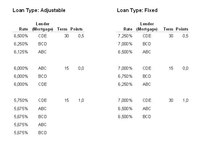
The improved table
This table is the right one, if the value "points" is very important (for more details please go to "The improved table v2" below).
| Loan Type: Adjustable |
Loan Type: Fixed |
|||||
| Points | Rate | Lender(Mortgage) | Term | Rate | Lender(Mortage) | Term |
| 0.0 | 6.000% | ABC | 15 | 7.000% | CDE | 15 |
| 6.000% | BCD | 15 | 6.750% | BCD | 15 | |
| 6.000% | CDE | 15 | 6.250% | ABC | 15 | |
| 0.5 | 6.500% | CDE | 30 | 7.250% | CDE | 30 |
| 6.250% | BCD | 30 | 7.000% | BCD | 30 | |
| 6.125% | ABC | 30 | 6.500% | ABC | 30 | |
| 1.0 | 5.750% | CDE | 15 | 7.000% | CDE | 30 |
| 5.675% | ABC | 15 | 6.500% | ABC | 30 | |
| 5.675% | BCD | 15 | 6.500% | BCD | 30 | |
| 5.675% | ABC | 15 | ||||
| 5.675% | BCD | 15 | ||||
Why is this table better than the original one?
- It's primary sorted by points.
- It's easier to follow one row, because of smart use of whitespace.
- All numbers are aligned to the left
- Now every Number of Rate has 3 digits on the right side of the decimal point
- "Mortgage" is not in every row but once in the header.
- We broke up the table in 2 parts: the "fixed" one and the "adjustable" one. This gives you a faster overview of your possibilites if you're going to lend money.
The improved table v2
We were not sure, what the value "points" is. In the first version (above) we sorted the table by points, because it's also sorted by points in the original one. But afterwards we thought, that the value "points" is not so important, maybe it's just the commission. If it is so, it doesn't make sense to sort the table by commission. So we created a new version of the table (this version is better, if "points" is not important).

Why is this table better than the original one?
- It's sorted by Rate, which is the most important value if you're going to lend money.
- It's easier to follow one row, because of smart use of whitespace.
- The values are grouped together by points and terms, so you don't need to fill in the same values for points and terms in every row.
- The Rate and all numbers are aligned to the right -> you can compare it easier.
- "Mortgage" is not in every row but once in the header.
- We broke up the table in 2 parts: the "fixed" one and the "adjustable" one. This gives you a faster overview of your possibilites if you're going to lend money.
- The "lender" value is centered, because every lender is represented by exactly 3 characters - it's easier to follow.
- We used an unobtrusive grey rule to delineate the header from the body.
