Teaching:TUW - UE InfoVis WS 2007/08 - Gruppe 02 - Aufgabe 4
Aufgabenstellung
Aufgabe ist das Design einer interaktiven Visualisierungsapplikation zur Darstellung und Exploration
(des zeitlichen Verlaufs) von Laborwerten einer Blutuntersuchung. BenutzerInnen, Einsatzzweck, Tasks, etc.
sollen von Euch selbst festgelegt und beschrieben werden.
Beispiele für derartige Datensätze
Abgabe
Area of Application
The applications goal is to visualize data gained from blood examination. Because of the complexity of the human blood, which shows in the many different values received from a blood analysis, a well arranged visualization of the data, on one hand assists medical staff to quickly overview examination results, and on the other hand, helps patients with no medical background to get en overview about their blood values. Since each of the values received from a blood sample describe an integal part, of the blood, we only have to deal with with discrete data. For each value there is an unit e.g. mg/dl for Cholesterin we also have to deal with a two-dimensional data, the first dimension is the actual value, the second the unit. Because all the values describe components of the blood we only have to deal with positive values, hence you can't have less than zero of an integral part in you blood. For each blood component there is a range of values which are called normal values, that indicate everything is ok for that value.
Evaluation of the target group
When thinking about blood values, the first group of people one comes in mind are physicians, the second group obviously are patient's´ who are interested in the results of their blood examination. Because of the fact, that most of non-medical people are not too familiar with the different blood values, we decided to mainly target patient's with our visualization. Due to the fact that for each value there is an norm area we decided to use a common type of visualization for such a taks, we provide a scale with the range of possible values, and highlight the interval in which the value is ok.
Purpose of the visualization
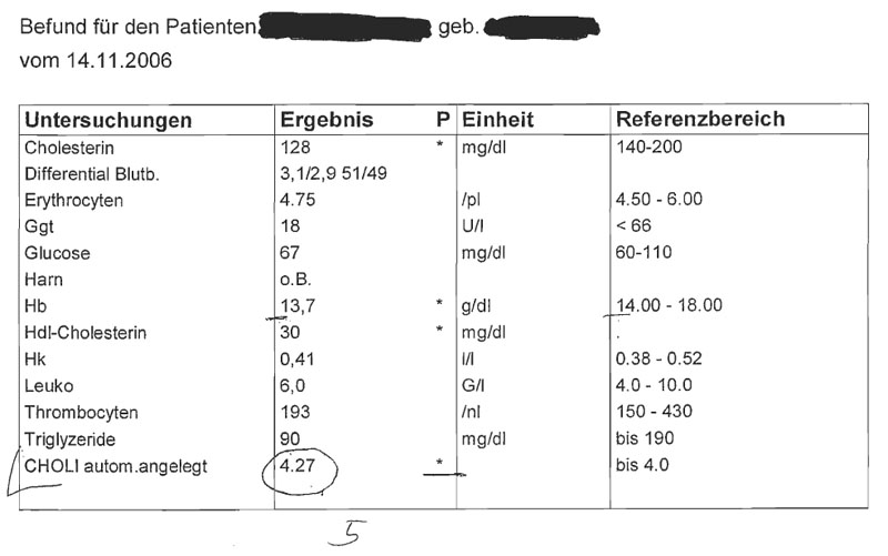
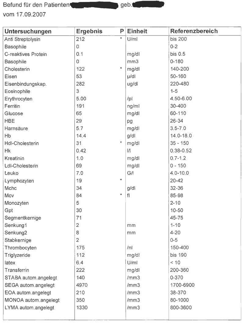
The main purpose of the visualization is to inform the patient about the results of it's recent blood checkups. There are many ways to do so, a common one is a sheet of paper like shown on top of the page, even though this fulfills the task to inform the patient about the blood values, it might be hard to understand by the patient. The example shown above just gives the patient a list of all it's values, to find out wheter a value is good or bad, patient has to look up the the interval of standard values for a certain blood component and than compare it to it's value.
Concept
Our main idea is, to give the patient a quick overview about it's bloodsample. The main overview has to be that simple that it can be understood with one view. For patientes with a greater interest in it's values, there is the otpion to take a closer look at each value, and also compare each value to those of previous blood tests.
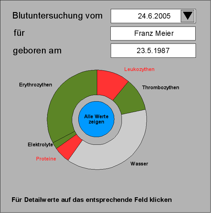
For the overview we divided the blood in it's main parts, to show this we use a cake-matapher which is easily understood by everyone. To indicate wheter everything is ok or not with one part of the blood we use the common used colors for good and bad, or in other words, "everything ok" and "alert", hence when every value of a bloodpart is in it's norm range, the slice is colored in green, indication no problem, if there is one or more values out of norm the slice is paintet red, to show, caution there is a problem.
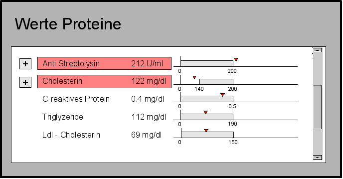
When a patient is more interested in its values and decides to go more into the deep, for each value a graph is created and indicates the patient how good or bad the value is. To keep the idea of understanding the information with one view we use a horizontal bar, where the norm range of a value is mapped to an interval of 0 - 1, to ensure that independent of the size of the value, all bars are of the same size, because the interesting part of the bar is not it's size but the indicator that shows the blood value in relation to the norm-limits.
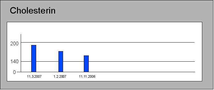
In case a patient is interested in the development of a value over more blood samples, it has the possibility, with one click to get a visualization how a value changed over time.
interaction - navigation
When starting the application the user is presented the overview of the most recent blood analysis, where it is possible, to view detailed values either divided into the major blood parts by clicking on the corresponded slice, or display all values of the selected blood sample. Because when a blood examination is performed not necessarily all values are obtained, sonee major blood part slice might be grayed out if there is no detailed value to show. If the user is interested in an overview of a blood sample from a different date it has the possiblity to chose an other date from the dropdown box in the upper right corner.
In the detailed view of the blood values, values that exceed the norm parameters are printed at the top of the list, to draw the patients attention to them, because most likely one is interested in the values that are outside of a normal range.
To get an overview of the delvelopment of an value over time the user can click the + - symbol left to the name of the blood value and is then presented, a chart that shows all ever measured values for the chosen blood part.
